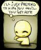
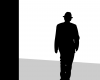
Here is the other one. ^-^ Its not as good, but Mr. Realms thought he would include it anyway. {You might notice some improvements, but the scratchy effect was reduced, somehow. Was using a different pencil, you might notice. messed it up.}
Attachments
sOulII.JPG (465.9 KiB) Viewed 106 times
They say the eyes Are windows to the soul I say the earth The sky The moon The very breath upon my lips All of these Are windows To you
I like the tile and how it connects with this picture. Good work. I like your style.
Well nitpicking this : 1.As much as I love the idea of an unsymmetrical heart, I think it would look better if it was symmetrical. Or if you gave it a defining outline. 2. The style you've used for the words "I love you" could be improved. It seems a little hasty addition of words, right now.
Besides that, awesome work. And the other nitpicks have been pointed out. Cheers, ~Lava
~ Pretending in words was too tentative, too vulnerable, too embarrassing to let anyone know. - Ian McEwan in Atonement
Here, as you requested. Right, I saw your original piece and I really enjoyed the message it had. However, in some of the new reviews some people are suggesting that you, yet again, put some more strength into defining. I'd disagree. The idea of the Soul Scratchings for me is the scratchy shading. I think its important that the white light is still peering through and the image is messier than what it perhaps "ought". You see, the way this comes across as individual is in the way it shows love so truly. Love isn't perfect, it's painful and messy. That's what I think you showed in your original. I think you're improvements make the image bolder and better finished, so technically it's a success and it is showing your art a lot better, but for me the original was more artistic. I think it had more power and affect. It meant something and it stood out. I think your work still does this... but I think the original was better.
Hey, this might just be me. I hope this helps for future works & improvements. Ben



 mwahahaha