Beach Photos!

13 posts
User avatar
Gender Female
Points 6396
Reviews 273
Hey! I went to the beach with my mom the other day and I took a lot of pictures. Sixty-four, to be exact. Here are some of the best ones. :D (Sorry if they're big; can't figure out how to make them smaller.)


Image
1. Aww, duckies! How cute!


Image
2. Seagull! Zomgness!


Image
3. Looks like someone dropped their hat. 0.o


Image
4. No clue why I took this picture, but I like it... :)


Image
5. Just a plain old rock... Or is it?


Image
6. Close-up of some faces drawn into the rock.


Image
7. Puppy paw print! :D


Image
8. That tree in the middle makes me happy. :)


Image
9. Big old root....


Image
10. See how nicely the crab posed for me?


Image
11. Pretty landscape. :D


Image
12. The backside of the rock I showed earlier.... And my shadow in the corner there.


Image
13. This was carved into the bench I was sitting on. I wonder who JS is?

Image
14. A memorial to someone. I like the way the light falls on it.

"You can love someone so much...But you can never love people as much as you can miss them."


User avatar
Gender Male
Points 7979
Reviews 111
i like the pictures...
firstly the scene is just beautiful...a perfect day
and i like the close ups especcially with the crab and the tree oin the middle...very well done


But i really like the comments especcialy the sign one...they are funny...
John McClane: Drop it. It's the police.
Tony: You won't hurt me.
John McClane: Oh, yeah? Why not?
Tony: Because you're a policeman. There are rules for policemen.
John McClane: Yeah. That's what my captain keeps telling me


User avatar
Gender Female
Points 3101
Reviews 51
Splodey!!!

So, these are some nice pictures! :) I like the first two a lot, followed by 7, 8, 10, 11, and 14.

In 3 and 12, I think the shadows take away from the picture as a whole.

14 is awesome in the lighting and the rainbow on the bottom right corner. It's a very cool picture. :)

Out of them all, the second picture is my favorite. It's simple and extremely cute. :D

Anyway, I'm not really good at judging pictures, but you did an amazing job! :)

Smiles!
~ Mira
"Smiles make the world go round." ~ Me


User avatar
Gender Female
Points 2527
Reviews 141
Howdy! These were pretty good. My favorite one was 8, 'cause the tree and all that looked cool and stuff... yeah... word vomit... Anyway, I do agree with what Mira said about the shadows. It irked me and my OCD. Another thing I noticed was on the last picture. It was good, and the lighting was cool, but the flag was cut off at the top and there was a lot of the parking lot towards the bottom. I would have moved the camera up a little bit more to fix that. Anyway, these were good.
So it goes.


User avatar
Gender Female
Points 1203
Reviews 228
Pen! Pen! Happy birthday, darling! :D


1. I love this picture. It’s like it all works out perfectly and nicely. The light is really nice and it just looks like an epic picture. And I don’t think those are ducks, darling. They are probably some type of geese, by the looks of them. Maybe swams…I don’t know. *rants*


2. That has to be one of the most epic pictures I’ve seen. I wish the seagull could be a little brighter and there could be some more contrast, but I love the picture. Great shot!


3. I like this picture too, but the shadows are very distracting. I can see a rock, another rock, you, another rock, and another rock. Along with the hat and the rest of the rocks and sand and shells. The shells kinda make the picture seem not as good as it could be,


4. Lol, stairs? Where? :P Anyway, I find that sign amusing, and it’s a pretty good shot as well. There could be some more contrast, because the background is brighter than the sign and it’s kinda confusing. Anyway, I love the idea.


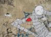
5. It’s a rock! But there is a pink towel in the background as well. But, the rock looks interesting! Is it completely covered in writing?


6. You can’t really see the smiley faces in this picture, because it’s just plain hard to see anything on that rock. It’s a great idea! It’s just…you can’t really see it.


7. This is an epic picture, and it looks so precise, you can see every grain of sand. At least, it looks like that. But anyway, you can see the footprint really clearly and it’s just an epic shot. I like it a lot. ^_^


8. It’s bare tree! Poor tree, all alone in the middle of all of the grass. I like the picture, and the thought behind it. Good job, El.


9. I like this picture too! I like how almost all the footprints are all going around the root, and one or two are going straight forward and stepping over it. I just find this picture really neat and a great shot. :D


10. This picture is pretty sweet, with the crab right there. I can barely see the crab because it looks so similar to the sand and shells! It’s pretty amazing that you got this picture, though .Good job!


11. Epic. The End.


12. there IS more writing on it! I like how on the other side, it’s all black and dull; but on this side, it’s more bright and has more colors.


13. This picture is awesome as well, but I always like pictures that show initials that are carved into something. But it looks all bluish which gives it a weird feeling…I really like it. ^_^


14. eh, this picture is kinda okay. I don’t like how the whole thing is in the shade though and the background is lighter, because it looks off and weird. It looks like a pretty memorial, but the lightning sets it off some.


I love this, El. What type of camera do you have, because it takes some epically awesome pictures. I love them! Keep taking pictures, darling!


Feel free to PM or IM me if you have any questions or comments.

~Linx
"A journey of a thousand miles must begin with a single step." ~ Lao-tzu

Attack, IM, or PM me at any time. I will respond. ;)


User avatar
Gender Female
Points 10554
Reviews 272
So I got here eventually to review your photos :P But I am doing this with serious hand cramp! lol I suffer for you! xD

Here we go...

1 - I love the light in this photo and the quality of the colours. I like how the green is really green and the blue is really blue. I love how the light catches the water. However I think there is a bit too much, what I would call, dead space in this photo. There is just too much blue around the swans. I think I would like this photo either to be cropped or I would have taken a closer up photo of the swans. Also the horizon is slightly off kilter which kind of detracts from everything that is lovely in the photo but the light is beautiful and I love the reflections of the swans in the water. (also they are all swans not ducks xD The little one is a signet or baby swan)

2 - This photo is good! All I would do is probably crop it a bit so you can't see the sand in the top right corner because it kind of makes the frame look a bit messy. Other than that though, I love the light again, just the way the light captures the light on the seagull and the water and the green rocks is lovely. I just like the seagull sort of contemplating the water :)

3 - Erm...It's a hat xD I'm sorry but the focus of this photo doesn't interest me lol In a photography sense it is in focus but you need to learn to bend your body so that your shadow doesn't go all over what you are trying to photograph. I know it may sound impossible but it is achievable :P Again this photo would have been better if you were closer in on the subject to really give it dominance within the frame.

4 - Hehe I kind of like little quirky photographs like this! I like how the sign is in focus and so is the background, it makes the photography work well. I like this one :)

5 - Again the light in this is just great, the way it makes the grass and the trees like shine is lovely. There are a couple of sun spots where the sunlight has hit the lens but I don't tend to mind those. As long as they aren't so huge and bright they don't ruin the photo then I think they are ok and here they aren't that noticeable. I think I would cut the towel out. It sort of makes the photo confusing because the viewer has two things to look at and your photo should really have one main focus, especially in this one I think. I would like all the focus on the cool rock! lol

6 - I like this photo. I like the faces the best! Just how worn they look and how cool they look against the rocks surface. I think I would be tempted to crop the top left corner because yes it is nice to see the edge of the rock but that space in the top left corner is just so devoid of any detail that it sort of makes it look like you have cut something out there in photoshop. But I do love the faces! They intrigue me :P The more I look at it, the more it looks like something was cut out lol

7 - Take the twig out, crop out the, what looks like, human foot print on the right and I love it! :) I like the light and the shadows and the pawprint. It's awesome :) It's tricky to talk about composition on a photo where it's the floor basically lol

8 - Awe I like this one :) It sort of looks like a deer's antlers or something. There is a sun spot in this photograph but it is less noticeable than the other ones I pointed out so I think that is fine. I love the different types of green. The deep green of the trees and the yellowy green of the grass it gives the photo a good and interesting contrast. Then you have this kind of stark tree in the middle that is so out of place amongst this green but it works. The subject focus is there and the composition. Well done.

9 - I love alot of the stuff that is going on in this photo. I like the fact that you haven't simply taken a photo of the tree root, which a lot of people would have been tempted to do lol You have included the beautiful background. It looks to me though, that you used flash in this photo...perhaps it was automatic on the camera. I know my camera does that sometimes. The reason I think it may be flash is because of the way the leaves look on the left handside of the frame. The look sort of artificial. I would crop them out. They detract attention from the rest of the beautiful photo, my eye goes straight to them. Other than that, the composition is great, the sort of sand path that sweeps your eye around the body of water. The bird that is flying close to the water. The grass in the foreground. I think I would also crop a little of the bottom out. Lovely lovely photo though :)

10 - Crab! Eeep! I think I would crop the shell out and go in closer on the crab so we can see more of it's detail. In a lot of your photos I think one thing I have noticed is that alot of the time you just need to go in that little bit closer and the photo would be amazing. I understand with animals though, that sometimes it is a little tricky t o get as close as you would like to them. But I like how you caught this crab in a stance :)

11 - Nice photo. The colours again are amazing. I think you had a very good day, weather wise lol I think you should crop the top a little, there is a bit too much sky. Sometimes I will add more sky into my photos because the clouds look amazing but here it is just blue, so I don't think it works so well having so much sky. Also I think if I were to take this photo, I would have gone closer to the...river? and framed it so that I was seeing the river flow up. So that when you looked at it, it would lead your eye up through the sand...dunes? If you know what I mean.

12 - I think I prefer the photo of this rock from the other angle with the trees behind. I do like the graffiti on this side but there is too much going on behind the rock really for the photo to work. Too many little things that detract. perhaps if you had angled the shot so you had the trees more behind the rock. Also again...bending to keep out your shadow. Unless that is what you intended of course.

13 - I think this is my favourite! I love the grain of the wood and how clear this photo is! so you can see all of the detail of where the initials were cut into the wood. It's also sort of inspiring to come up with a life for this J.S. person. I think maybe crop the to a bit so it is just the wood. I know you were probably trying to show the top of the...bench? But I think I would like to just see the wood and the initials. I really like how the nails were kept in though! They add to like the rustic quality of this photo.

14 - This is where the sun glare becomes a tad more noticeable and ruins the photo slightly. I love love love the rays coming over this memorial I think that is really pretty and sort of symbolic. If I was there I would have made you tilt the camera upwards, so you got less of the tarmac and managed to get the flag in. But I do really love the way the light falls on this photo.

Well there you go :) That was long! lol I hope I wasn't too harsh and I helped a little bit for next time you go out and take photographs!

I think overall you just need to think about whether you should be closer up to your subject or not and watch to see if there is anything in frame that can detract from the main subject of your photograph. In some places you need to consider your composition a little more aswell. But the light is amazing and the things you choose to photograph are not boring, which is a plus! And it looks like you are thinking about how to frame them, especially with that root photograph. Most of the time you don't just take a photo of the subject but you add in it's surroundings when it's called for which I like :)

Well good job! I look forward to seeing more photographs! PM me if you have any questions!

Bex x


User avatar
Gender Female
Points 1212
Reviews 47
I love the bird in number nine :)
"We played Pin the Tail on the Reason My Life Feels So Insufficient, and nobody won." -Megan Moriarty


User avatar
Gender Male
Points 890
Reviews 4
hi pen

all of those pictures were beautiful even the sign because the background is simple.
why did that tree in number 8 picture make you happy i'm a bit curous at it.
The puppy paw print was cute.
The memorial was my favourite, then the duck picture and my third was the pretty landascape.

thank for the post pen where was it anyway???
Dont Worry, Be Happy.


User avatar
Gender Other
Points 89625
Reviews 1272
Hiya Pen! Here as requested!

First picture: I find there's a bit too much blue in here. The composition is okay, but I find that the subject (the swans) are a bit too small on the picture.

Second: Again, not quiet enough zoom. Also, the seagull is a bit too low in the frame. If you were to crop what's cropped out by posting (if that made any sense) then it would put more focus on the actual subject instead of the ocean around it.

Third: This picture... I'd actually photoshop the hat out. xD The lines otherwise are really good (with all the shells how they line up with the rocks) and the hat detracts from the picture. Odd how you weren't trying to get that, but, I like things better without the hat. ^^

Fourth: Had it been less central, maybe showing the dunes or the stairs, I think this would have been better. Because it's got a lot of possibility for irony, and right now that's kinda wasted.

Fifth: I'd have put the rock in the bottom right hand corner. Have you ever heard of the rule of thirds? That says you divide your screen into thirds, and you try to focus the subject at one of the corners. It makes for more interesting pictures instead of sticking the subject right in the middle (unless you're taking faces, but that's another matter. ^^)

Sixth: Again with the rule of thirds. Only this time it's dividing your picture up horizontally instead of horizontally and vertically. If you put things in the bottom third that becomes your focus.

Seventh: This one would have been cool had we gotten more of the human footprint next to it. Also, had the picture been vertical we could have seen both sets of footprints going off into the distance. That would create a good line and give the picture a story.

Eighth: Having the sole subject in the middle actually isn't that great. We're left a bit lost in the picture and there isn't much to hold our interest. Keep in mind the rules I mentioned before. ^_^ (Also, sometimes it's good to break those rules, but most of the time you should follow them)

Ninth: I really like this picture. The root is in the bottom third of the picture, and the beach and river follow the same line going up. There is also the footprints and the bird taking off. Very nice work on this one.

Tenth: This one is where the subject in the center works. It's more like a portrait which is when you take a close up of the subject and stick it in the center of the picture. Keep in mind that I said close up there. I'd have liked to see this in closer (or, at the least, the edges cropped so there isn't so much dead space around the crab)

Eleventh: Wow. Another nice one. Although I'd have bumped up the picture a bit so we didn't get the path. I'd crop about an inch or so off the bottom, and maybe another inch from the top. As I'm replying and looking at the picture in the much smaller window, I can only see from the bottom of the reeds (the foreground reeds, closest to the path) to just above the cliff and it's very, very pretty.

Twelfth: I'd have cut about an inch or two off the bottom of that picture so we didn't see the beach and maybe cut some from the right side as well. Remember the rule of thirds? ;)

Thirteenth: I do not know who he is, but I would have liked to see his name in the corner. xD (Alright, I'll stop now!)

Fourteenth: Had that picture shown all of the flag it would have been just perfect.

Very nice pictures Pen! Just try to keep the subjects up close and/or out of the middle!
A writer is a world trapped in a person— Victor Hugo

Ink is blood. Paper is bandages. The wounded press books to their heart to know they're not alone.


User avatar
Gender Female
Points 5749
Reviews 106
Firstly, those are swans.

Now, onto the rest of the review! I like the pictures. Much much better than I'd ever be able to do.

I think my favourite would be the one of the rock. "Just a plain old rock ... or is it?" Yes, that one.

What I like about it is the sun that is reflecting into the lens; I'm not sure, but I love this sort of thing. The other reason I like it is because I think that the rock is cool with all the things written on it. It gives it character ... like there's a story behind it -- which, of course, there is!

Since I can't understand what the words are saying (which is good because they could be a sware) it makes it even better, so I can imagine what they're saying.

OVERALL:
Yeah, good job! They were cool. Especially the crab. He was pretty awesome ... just staring into the lense. Anyways, yeah, good job!
"Man is least himself when he talks in his own person.

Give him a mask and he will tell you the truth."

-- Oscar Wilde


User avatar
Gender Female
Points 1690
Reviews 11
Wow!


Those are so beautiful! You know how to do that right! Great job! Keep going!
He told me he love my blue, glossy eyes. Now he has left me stranded. It's over. I will never love him again.


User avatar
Gender Female
Points 15394
Reviews 1464
Hello, Ellie! Juniper here! I mean, that's *so* not obvious! ;)

Let us see!

You should crop the first picture! Too much vast blueness threatening to swallow us down into a hidden abyss-- it's pretty intimidating, though the colors are so vivid and beautiful. Focus in on the swans a bit more, and crop out some of the blue and the shoreline. Otherwise, it's a candid shot. Very beautiful.

In the second, I also think a cropping is in order! You have the sandy beach across the blueness, and it's kind of distracting, because it's not an even line. Also, crop a bit out horizontally, too. We don't need so much emptiness to stare at, dear.

Three! Lol, someone's missing a hat! Either way, it's not totally an interesting shot-- no specific focus, we're not really looking at anything, and your shadow kind of fuzzies out a bit of interestingness. :P

Four is an okay picture! We're looking at a sign; not much to it, but it's okay. :P

I like number five! The sunspots in the picture slightly bother me, but I like the focus of the picture otherwise!

Six >> Sand! Not so interesting, and not quite a pretty shot, but nice, anyway. (Oh, that's a paw print!) :P

Seven>> I like this shot, though I would like to kind of see a sharper focus on the tree-- pretty plain, but interesting enough!

Eight >> *steals prettiness* This is pretty epic, despite the fact that the sun has washed out the lake and the leaves of the wild cherry tree are so bright, it's distracting. And pretty seabird on the water!

Nine! Awww, cute crab!

Eep, okay, I think I skipped? Because I'm on... ten, which says eleven, and blah? So!

Eleven? Beautiful, perfect blend of colors here.

Twelve! I love that rock. :P Is it bad that grafitti makes me happy sometimes? XD I love the colors, and your shadow is distracting.

Thirteen! Too close-- back up a bit! JS is probably the person who made the bench? :P But, it's hard to tell with this is-- you should be further back. ;)

Aaaand, fourteen!

Cool memorial-- I've so been there before-- but, even though the light is cool, it's washing out some cool details and kind of distracting. Gives a sort of blur to this all and takes away slightly. :P


Nice work, overall, Ellie! Keep it up, and you owe me more soon. ;)

June


User avatar
Gender Female
Points 15394
Reviews 1464
Oh! Number Six. Okay, got it.

Image

(an indepth on this? Okay, um.)

For starting! You're close. I would suggest moving back, and approaching the photo at a different angle than you have here. It's kind of boring, and being so close gives us too much detail on the faces and we kind of need the whole picture-sorta. :P

And! Your composition isn't so awesome here, (duh, it's a close-up) and your focus is kind of... nonexistant! :P So, a confusing shot, but still cool. :P

I cannot get indepth on this photograph, Ellie. XD
"I'd steal somebody's purse if I could google it and then download it." -- Firestarter


Why can't I put the entire Bee Movie in the quote generator? Would you prefer if I put in the Shrek script instead?
— CaptainJack