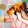
A character of mine. The drawing's a little smudged, the pencil transferred to the page opposite and rubbed against the drawing never mind. Is her head a little funny? I'm not sure, the back of the head right? *shrugs*
Attachments
img048.jpg (44.12 KiB) Viewed 290 times
Your = Possession. Your shoes are so sweet! You're = Omission. You're quite strange...
If you are confused about which to put, simply say in your mind "you are" and see if that fits the sentence. If not, you are looking for your.
Very nice work. A very delicate cartoon-like drawing.
I'll have to agree with Fower Child, her teeth look a little off, slightly beaver.
The shading is beautiful.
The hair, personally I really don't see anything wrong with stiffness except at the bottoms, even then it's not that bad.
Her eyes are very nice, good work on them!
Keep it up... you should add some of her body....
I shall but love thee better after death.
- Elizabeth Barrett Browning
Thank you for your reviews, Flower~Child, Awake and cnvalambrosia. very much appreciated, thank you.
The hair looked better before I coloured it in and the scanner has made the lines fade at the bottom of the drawing. I agree with you on the hair. And the teeth... well, it's the first lips-parted I've actually managed to kinda pull-off. So...
Thank you!
Emma
Your = Possession. Your shoes are so sweet! You're = Omission. You're quite strange...
If you are confused about which to put, simply say in your mind "you are" and see if that fits the sentence. If not, you are looking for your.
Ah, a beautiful cartoon-like drawing ^_^. Very nice indeed.
But, since I must review I will.
Tips
Okay so the eyes are wonderful but there are way too many eyelashes underneath. Eyelashes are often built in a couple then spaced, then a couple, then spaced. On the bottom there looks to be lines and lines and lines. Slim that down and the eyes will look beautiful.
I will also say that no one has perfect teeth but the mouth in itself is potioned wrong. It's too close the the right side. Move it more towards the left if you can for that would make it look more professional.
The shading on her hair is really nice but unrealistically shaded. Even in cartooning there is a light source. The right side should be darker shaded for the face would be blocking out some of the light.
One more thing is that you drew the face well but the back of the head is too sharp. Give her some more hair back there because it makes her head look less realistic as the head does go rouch at the top, the jawline below it.. I wish I could explain it better but the best way to do that would be through picture. Well, either way, it looks pretty good.
Overall
You got some talent. I loved the dark, thick lines and the beautiful shading on her face that made it almost glow. Very nice indeed. Reminded me of something by Roy Lichtenstein ^_^.
Nice job!
Is Walking in Death
~The.Dreamwalker
Suppose for a moment that the heart has two heads, that the heart has been chained and dunked in a glass booth filled with river water. The heart is monologuing about hesitation and fulfillment while behind the red brocade the heart is drowning. - R.S