Indie'S Kids.

5 posts
User avatar
Gender Female
Points 1335
Reviews 4
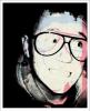
Over the summer we've been set a project to come up with 8-10 photos to illustrate part of our own cultual whether that be music, friends or racial background. I choose to do music- indie to be exact because it's about being different and individual, not relying on other people to create yourself which is something I believe in, in more the one way.

For this first I basically covered my floor in all of my jewellery, Cd's and NME Magazines to create different textures and patterns. The effect it created by putting a stamp effect on the photo in black and white then layering it on top of the original and reduce the opacity so some o the colours show through.
Attachments
3530696457_58a767c5ea.jpg
3530696457_58a767c5ea.jpg (208.05 KiB) Viewed 176 times


User avatar
Gender Female
Points 3888
Reviews 763
Oh WOW!! I love it it, especially with a slightly graffiti-ish look!
I would suggest a slight de-clustering the center as it forces my eyes to move away from it. Otherwise, I love your style. I know I haven't written much, but I'm not s'posed to be on this site right now.

Later,
Lava!
~
Pretending in words was too tentative, too vulnerable, too embarrassing to let anyone know.
- Ian McEwan in Atonement

sachi: influencing others since GOD KNOWS WHEN.


User avatar
Gender Male
Points 890
Reviews 7
This is pretty sweet. I am an avid indie kid, too. :) So I love to find other people with that kind of passion.

I would say your picture is a good starting point. In my opinion, it's too cluttered and too messy. My eyes don't focus on anything at first, and then when they do, I'm not entirely sure what it is. For me, my eyes were pulled to the line of jewelry in the center, just below the face on the magazine.

Overall, the concept is great, and I'm really digging it, but it seems a little forced. Let it... happen more. Think indie, you know? Don't make this picture be indie, just let it be indie. I hope that makes sense. Good luck.


User avatar
Gender None specified
Points 8205
Reviews 62
Your picture has a good composition.
It's interesting, it keeps the viewer's eyes moving.
It captures the idea/subject well.
I think the colors could be brighter, but not so much that it changes the mood, too much black. But not too much by a lot.
The top left-hand corner is too "empty."

I think you did a good job.
Where there is No Love, there is No Question.

A dream shared becomes reality, a dream alone is a nightmare.

"She tastes lyke raiyn
and sumtimes kiwi-fruit;
and wunce...
she tasted lyke a pen-ny." <3


User avatar
Gender Female
Points 5749
Reviews 106
Hey there!

So, starting with my review ... I agree kind of with Hen hug about the "cluttered" look or it, but I disagree all the same. I think that the cluttered look keeps the eye jumping from place to place ... and that's good, right? You want the person looking to actually stop and take a good hard look at it before moving on, instead of just a quite once-over of the picture and shrugging it off.

And as Mandorelute said, the top left-hand corner is too empty. It needs a little something more, I guess, but you want the focus to be on that certain object, so I guess it's okay too.

OVERALL:
Not much of an artist myself, but this was pretty cool. I hope you do well! I'm sorry I can't provide any more help if you need it!
"Man is least himself when he talks in his own person.

Give him a mask and he will tell you the truth."

-- Oscar Wilde


Writing is the geometry of the soul.
— Plato