Fonts

49 posts1, 2, 3, 4
User avatar
Gender Female
Points 2999
Reviews 438
Errr... or I'm just that bored?

Anyways, I was looking though (*cough*stalking*cough*) the Novelists usergroup, and I saw a post where they discussed fonts they liked to use. But since I'm not writing a novel at the moment, I figured I'd post here instead. xD

So... thoughts? I personally hate Times New Roman, and loooove Veranda.

I actually hate Times New Roman so much that when writing essays for school I switch to Veranda. Teachers look over my shoulder and yell at me, and I'm like 'I'll change it to the required font before I print! I just like Veranda better!' and they just look at me strangely. xD

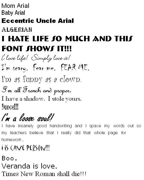
And I felt like giving the fonts personalities, as seen below. xD
Image

~JFW1415


User avatar
Gender Female
Points 6517
Reviews 402
Jelly, you are so silly!

Actually, I am completely different - I can only use Times New Roman! I have to switch to that before I start writing or it bugs me to death.

Seriously, it's all I ever use.
How am I not myself?


User avatar
Gender Male
Points 7740
Reviews 713
You are weird, Jen. I don't know you.

-Jared
Just write -- the rest of life will follow.

Would love help on this.


User avatar
Gender Male
Points 6070
Reviews 277
I honestly don't care want font I write in. I used to, kind of, but now the writing takes up so much of my focus, I only care that I can read the words. But I did use to be nitpicky about that stuff, but I guess I grew out of it or something. *shrugs*

Times New Roman is fine with me, it is sort of the standard, so I guess I've got used to it by now. ^_^

[s]BlackGhost[/s]


User avatar
Gender Female
Points 890
Reviews 47
I like Garamond best, currently. I usually fiddle with fonts, tho.
Frylock, please, no books! I can't read; I'm not a loser!
-Master Shake


User avatar
Gender Male
Points 32885
Reviews 2058
I am a TNR addict. This is kind of a habit that I started since I learned that was the font that editors preferred. I fight with the new Microsoft word because it insists on using Cambria or Calibri or something, terribly annoying.

My teachers used TNR too. TNR FTW! :P
“It's necessary to have wished for death in order to know how good it is to live.”
― Alexandre Dumas, The Count of Monte Cristo


User avatar
Gender Female
Points 9692
Reviews 3900
Yes... I like Times New Roman too, but now I can't write with it anymore, because I'm not accustomed to it anymore. Instead, I seem to only be able to write in manuscript format. That is, Courier, 12 pt, double spaced. Still, that only goes for large documents. I get stuck writing if I see too much white.

But yeah. I think Unicorn Killers is in some weird font, like Garamond or something, just for fun. XD
Ubi caritas est vera, Deus ibi est.

"The mark of your ignorance is the depth of your belief in injustice and tragedy. What the caterpillar calls the end of the world, the Master calls the butterfly." ~ Richard Bach

Moth and Myth <- My comic! :D


User avatar
Gender Male
Points 15698
Reviews 369
It's usually Courier New for me. It makes it look like a typewriter, and that helps me. Though lately I've been switching to Bookman Old Style, for a change of pace.
Garrus Vakarian is my homeboy.


User avatar
Gender Female
Points 5890
Reviews 758
Serif fonts in general are better. I'm kind of a huge litmag nerd and i can identify fonts just by looking at them. In magazines and newspapers, serif fonts are generally used for body text and sans-serif fonts for headings and such. This is because serif fonts are easier to read because the serifs help move your eye from letter to letter.

What is a serif font, you ask? Those are fonts like Times, Georgia, Palatino, etc. They have those nicked-looking edges or however you might describe them, those little added parts, which are called serifs. Sans-serif fonts, like Arial, have smooth letters. YWS uses sans-serif fonts.

So yeah, I like Times or Times New Roman. Georgia is also really attractive, and we used it as the main typeface for body text in last year's litmag, but I rarely take the time to switch to it in documents.
"My pet, I've been to the devil, and he's a very dull fellow. I won't go there again, even for you..."


User avatar
Gender Male
Points 18178
Reviews 1259
Georgia is definitely the best. I use it for everything.
Nate wrote:And if YWS ever does become a company, Jack will be the President of European Operations. In fact, I'm just going to call him that anyways.


User avatar
Gender Female
Points 3214
Reviews 137
I'm not so sure... I've always used Times New Roman, but I have caught myself thinking it looks ugly. But I'm used to it, so if I use anything else, it makes me itch...

I like the fancy fonts with the loops and the cool funky letters, but unfortunately, my computer has none of those... my documents look so boring... D: And I hate boring!

I like Constantia, Candara, and Plantagent Cherokee. Sometimes Sydnie. xD With the robotic look.

Heh...

I've actually memorized fonts... Like Trebuchet MS and Comic Sans and FangSong...

I'm nearly as strange as JFW. But not quite there... xD
eviscerate your fragile frame
spill it out in ragged form
a thousand different versions of yourself.


User avatar
Gender Male
Points 3925
Reviews 160
I switch between Courier New and Times New Roman...I use the former mostly though.
I'm advertising here: Rosetta...A Determinism of Morality...out May 25th...2010 album of the year, without question.


User avatar
Gender Female
Points 890
Reviews 192
Tee hee. This made me smile.

I don't mind TNR, but I'm a little tired of it. Veranda is a favorite of mine, too. I usually don't type in anthing else.


User avatar
Gender Female
Points 890
Reviews 12
Depends on my character's personality or point of veiw.
-SaraRose


User avatar
Gender Female
Points 2999
Reviews 438
I actually end up getting bored easily. After a few weeks I'll switch fonts or colors. xD

And I hate the fancy ones - you can hardly read them.

*Stabs TNR fans.*

~JFW1415


Live your life how you want, but don't confuse drama with happiness.
— Ron, Parks & Rec