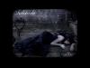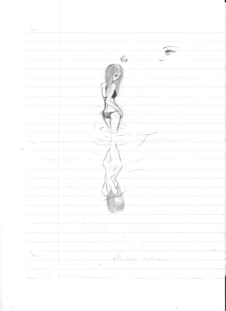
I like the reflection. The lines need to be a little more faded and you need to make the water stand out more. Also it helps to distort the reflection because the it is more obvious the it is a reflection.
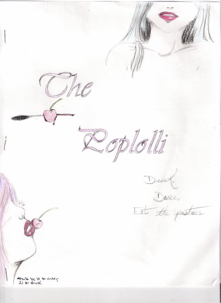
I think I've seen the second before. I like the lady at the top. The colors are good and really help everything pop.
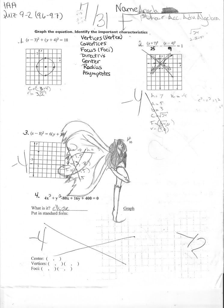
The fairy is cool, her body isn't proportioned quite right, but she looks like a happy little sprite. And maybe next tome you can crop it our of your math quiz so we don't have to see it? Just a suggestion.
Overall you draw quite nicely and I am jealous.
"Maybe Senpai ate Yuka-tan's last bon-bon?" ----Stupei, Ace Defective
Well, you ordered your pictures from best to worst in my opinion.
The first one is extremely good, and I really like how you did the reflection. I personally like how you made the water and the darkness of the lines, and I wouldn't really change to much with it.
The second one is actually better than I thought, now that I am looking at it again. The top drawing on the paper just doesn't look right. The head and lips just seem "off." However, the body is drawn very nicely. The bottom drawing is a lot better than the top, and may be the best drawing on all of the three papers. The hair, nose, lips, and chin look fantastic. And nice coloring as well. Usually coloring drawings like that mess it up, but the pink enhances the image.
And the third drawing I am not to fond of at all. I think I am just too distracted by the math. I think it is cool that you had drawn on it, but it is a bit distracting.
Hmm, well, for the first one, the thing that bugs me is that in the reflection, the elbow looks kind of like a hand, and the hand more like an elbow. And, there seems to be something about the girl's face that doesn't seem feminine. Maybe you should try making the lips a little plumper, or add tiny lashes around the girl's eyes, or change something about the hair so she looks a little more feminine. But, still, it's better than something I would have drawn;).
The second one I have nothing to say except that the 'L' (I think it is, correct me if I'm wrong) looks kind of like a 'D' and an 'L' connected, so you may want to make the fancy loop just a bit smaller so it isn't as confusing. I loved this though! Very nice; I would go to that club;)!
The fairie; I love the wings but it is rather... odd. For some reason, it looks to me like it's arm is cradling a stub of a leg. I don't know what that is so I would like some clarity and perhaps understand it better. Maybe you should trace it onto a regular sheet of paper,; the math is rather confusing (and an F! I thought that you were an ingenious young writer:D). But another thing that bugged me was that you couldn't see it 's face either and it's body seemed kind of short while it's legs were pretty long.
Overall better than anything I can do! I really liked the second one! Just fix the loop a little and it'd be absolutely PERFECT! You really are a good artist; you just need to tweak these a bit. Ta ta for now! 0(o.o)0
I will review for you! PM about it if you need one!