I recently found my digital camera, looked through the photos on it and though I'd share some =D Unfortunatly my laptop does not like my SD card and wants to format it O_o Luckily it turns out I already transfered some of them to my computer.
None of these have been edited yet, I don't have any good programmes for that -__-" I know a good few of them need cars and fences cropping out, so, yeah.
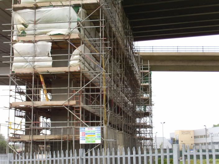
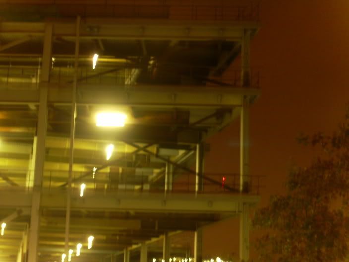
Scaffolding!
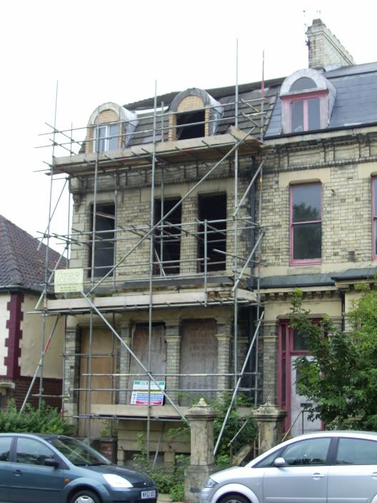
Moar Scaffolding!
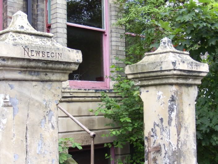
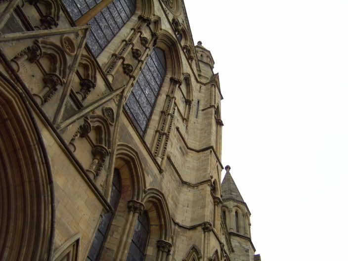
York Minster, pre-tourist filled.
please grant me my small wish; (love me to the marrow of my bones)
Haha, yeah, those first two need to be cropped to have any real potential. The third one is yummy, but not particularly outstanding? Meh. I like what it says on the posts there, could be interpreted as something interesting. [/nonsensical]
The fourth one is so blurry! It would've been good if it wasn't blurry. Ah well, such is the bread of an everyday life. xD
The fifth one is truly yummy. Blue skies would have been nicer, but that's really out of your control, isn't it? Heh. But the facade is a nice one, very antiquated and shiny.
Er, that was a contradictory statement. O_o
*shuts up*
-Saint Razorblade
The Official YWS Pirate
P.S. Caterpie, Caterpie, yeah. ♪♫♪ xD
"2-4-6-8! I like to delegate!" -Meshugenah "Teague: Stomping on your dreams since 1992." -Sachiko "So I'm looking at FLT and am reminded of a sandwich." -Jabber
these bulidings are beautiful.
I like how in the first one the fence looks older, has more history to it
and the new buliding is just begining its history.
and the last one, amazing structure of the building.
gorgeous :]
I think the first one could be good if 'MacMillan Academy' or whatever it's called was cropped out and there was some more interesting lighting. Do you have Photoshop? If you do just go and muck about with the hue/sat and brightness/contrast and other stuff on there. Also try the auto contrast, level and colours. Sometimes they can totally transform a picture where the lighting is slightly poor. Othertimes not unfortunately >.<
The second one would be instantly ten times better if you cropped the cars out of it, but I really liked this one. I think the delapidated house is so cool Perhaps make it a bit darker too :/ Just to add to the effect of the picture
Don't change anything about the third one! It's great. I love the angle and all the little details like the cracked window and how the pillars have the name of the house on them (:
The third one would've been great if it wasn'y fuzzy >.< I like the angle though. See if you could edit out the tree(if you know how to do that) or just crop it out. I think it takes away from the industrial feel of the picture.
Fifth one = fantastic as well. I love the angle and how even though there is a huge white space you just focus on the building. I would perhaps see what happens if you cropped some of the white space out.
I really liked you choice of subject for all these photographs. I think they are all really interesting (:
1) This is a little blurry, but I think it will look great if you remove the excess area (the gate and building in the background). Not bad, however, it might look better if you sharpen it up.
2) I like this one a bit more--for best result crop away as much car as you can without affecting the quality of the building, and even remove the house to the left so we can focus on just the central houses. You like scaffolding?
3) This is one of my favourites, I don't think you should make any changes to this one at all, but if you really want to you might want to dull down the pink in the background, it's a little distracting.
4) This one's really blurry and quite messy. The angle's quite off too--you could sharpen it but even then it seems a bit boring. You could centre the light in the car park if you want or improve the contrast.
5) This is my favourite, the kind of off-angle makes it seem really real, but you might want to lop off the white background so we get a grander feel.
Bravo!
"A man's face is his autobiography. A woman's face is her work of fiction." ~ Oscar Wilde
I really like the last two.
The angle of the last was really intresting and cool and I liked the color in the third one.
The first two i didn't like as much and they need to be cropped a bit.