Ooh... I love the last one. The dislocated brick does something that just ties it together. Not sure what, but I lubs it. ^^
I love all of them except the first one, which is a good picture, just not my cup of tea.
*snuggles I Write, Therefore I Am*
-Saint Razorblade
The Official YWS Pirate
"2-4-6-8! I like to delegate!" -Meshugenah "Teague: Stomping on your dreams since 1992." -Sachiko "So I'm looking at FLT and am reminded of a sandwich." -Jabber
Very nice, all very nice. I'm wondering if you wrote any of these, (I suspect the last?) or if you found them by yourself. Looks like a fun field trip. You do some marvelous things with color here, great work!
1. I love the angle of the picture- contrasting with the seemingly straight view of the illustration.
2. Very nice. The tape, and the fantastic color contrast makes it even better.
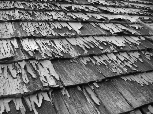
3. My favorite; it really is beautiful- especially the three shades of grey that I count.
4. A fun shot, but there's too much clutter around it. The vine is interesting, but it adds little.
5. Eh, not quite as interesting as the rest, it's a little blurry in spots, and it's pedestrian, this shot doesn't show it from anything but a normal viewpoint.
6. Lovely. Easily ignored is the small piece of chalk in the middle...
7. The painting on the wall is really interesting, and you didn't do much except show the blue-hued floor. But it is still pretty.
8. A dead on shot of a slightly interesting stencil. My least favorite.
9. And fittingly, a message last. I do like the faint traces of previous graffiti, as well as the depressed brick at left. But the color is uninspiring.
The woods are lovely, dark and deep. But I have promises to keep, And miles to go before I sleep, And miles to go before I sleep. - Robert Frost
I love the second and third one! "Love in the Rain" and "With Age Comes Beauty".
I'm a sucker for anything that randomly says "love" on it, apparently, but the waterspots and the tape and designs and especially the font of the word make this amazing. Mind if I save it?
The third is very lovely as well. Most of all it's black and white, and that makes me obnoxiously happy. But the contrast between the greys is amazing in itself and nothing could really be changed to make it better at all.
The others are all nice too...but because your talent is so great they aren't as good as the others
Whoa. These are all very original. I love them all. They all have this originality and difference about them. If you put them in a pile of photos these would be the few that actually stand out.
-MID
"The things that we're frightened of, or told to be frightened of, are not necessarily the things that we need to fear."
-Michael Moore
These are simply gorgeous, inks. Favorites include--well, most of them, actually. No point in listing them. ^_^ I particularly liked "Blood Haunts The Prisoner" and "I Write Therefore I Am," though. The only one I didn't care for is the "Cars Suck" one. It seemed sort of amateur--it lacked the professional angle and lighting and, frankly, feeling of the others. You've got a gift, and it doesn't really come out in that one at all.
These are all really amazing! I love pictures of graffiti... where do you find so much of it?!
1. This one is really nice. I like the blank (or nearly) green wall and the off-center faces. But I do feel like you cut off a bit of the plastic/tile/whatever it is that the faces are painted on.
2. I like this one, but I think I would like to see more space above "LOVE" and less below it. As it is, it feels a little bland to me.
3. This is really beautiful. I love all the texture and the multiple shades of gray. However, I feel like the perspective is a little bland. I think it would be really neat if it was from a more dynamic angle.
4. I think this is one of my least favorites; it just feels too cluttered. Maybe it's because the vine is cutting right across the guy's face?
5. This one's okay. I like the contrast of the bright garbage can (?) with the dark pavement, but it feels more like a snapshot than a professional photo--which the others are. I think it's the lighting or the angle...
6. This one is alright. The graffiti is pretty cool, but I feel like a more interesting angle really would have spiced this picture up a bit more.
7. I REALLY like this one. The colors are amazing. Where the heck do you find graffiti like that?! But I do feel like you cut off the top of the "father's" head...
8. I don't really like this one. It feels too bland and it's kind of hard to make out what the picture is. >.>
9. Haha! This one is SO fitting to post on here! ^_^ By the way, is it okay if I steal that slogan for my custom title?!
Where did you go to take all of these? They are prety much AMAZING. I really like the angle of picture number 1, it draws the eye directly to the "drawing" or whatever of the people.