Pastels by the Pair

10 posts
User avatar
Gender Female
Points 3454
Reviews 694
Woo! Pastels! Oil, of course.

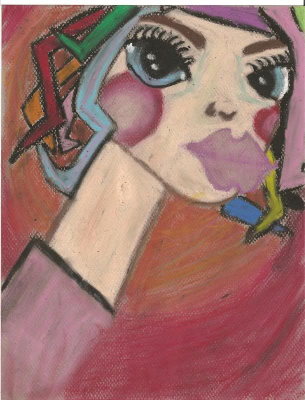
First one: a copy of something I found on the internet, though not 100% carbon copy...I kind of made it my own a little. But, I was just trying to get the feel of the pastels again so it was good for that. Thing I already know: lips are a little too pertruding.

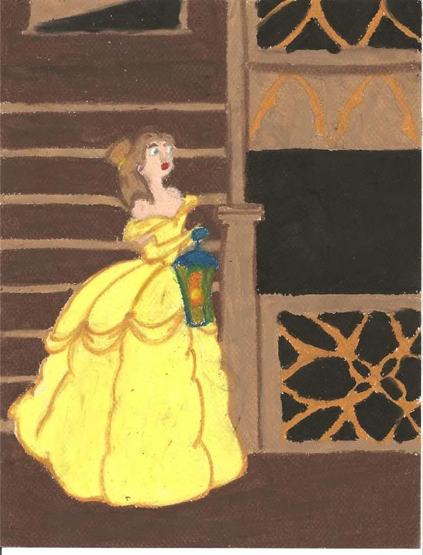
Second one: a scene from "Castle of Otranto". Pretend that it's not Belle, that it is infact a lady named Isabella who is running down the stairs from a guy that is trying to attack her. Things I already know: her eyes are freaky.
Image

Image
My Literary and Arts Blog

"I think I'd miss you even if we'd never met." -The Wedding Date


User avatar
Gender Non-binary
Points 1979
Reviews 1176
I like the first one. The eyes are really nice, and her (its? lol) hair is crazy.

With the second one, the dress is good, but the face is weird, and the background is a bit boring. ^_^
"TV makes sense. It has logic, structure, rules, and likeable leading men. In life, we have this. We have you." -Abed Nadir


User avatar
Gender Female
Points 6235
Reviews 2631
The first one is uber abstract which isn't usually my style but I kind of like it. The use of colour is great though perhaps some careful smudging and more gradual tone changes could improve it. Also, I think the eyes and hair are fantastic but a little over the top with the long neck, the blush and the lips.

In the second one, I love the dress and great work with the lantern but I think the hair needs a little work and the shading could be improved. Oil pastels aren't great for minor detail so you've done a good job with the chosen media and I love the pattern in the bottom right corner. Maybe angle the stairs a bit though so they don't just look like lines on the wall.

Generally, both very nice. Good work.
Writing Gooder

~Previously KittyKatSparklesExplosion15~

The light shines brightest in the darkest places.


User avatar
Gender Male
Points 9022
Reviews 647
The first is very vibrant. It makes me think of a Picaso, but it has a bit more smoothness to it. It is bold and has some great mixing.

The second one is nifty. I like the dress, but I think you could have shadded it more, added some light and dark places to really add dimension to her dress. The lantern could really give a cool lightning effect as well.

Over all nicely done, just needs a little more detail I think. What kind of paper do you use? I use roofing paper when possible with pastels. It has a nice effect.
"Maybe Senpai ate Yuka-tan's last bon-bon?"
----Stupei, Ace Defective


User avatar
Gender Female
Points 3454
Reviews 694
Ha, thanks Adam. Yea I think I may add a few shading details before I turn it in for the scene (yellow dress, not crazy girl). I use pastel paper? Like, literally there is a specific pack of "pastel paper" that I use haha.
My Literary and Arts Blog

"I think I'd miss you even if we'd never met." -The Wedding Date


User avatar
Gender Female
Points 1609
Reviews 602
Wow, Via!
The first one is my favourite--I love the abstractedness, and the eyes are amazing. The lips do protrude, well, a lot, but you have a disclaimer for that one. :P

The second one is cool but the background is a tad dull. But her dress is really cool! 8)

Cheers,
Ayra :D
everything i loved
became everything i lost.


Would you like a review?
http://www.youngwriterssociety.com/topic73903.html


User avatar
Gender Female
Points 890
Reviews 441
I think I like the first one better.
Maybe you should stick to abstract. =]
Your second one is nice but I think the face and the upper body needs improving... As well as the lamp.
Bells surroundings are some what plane and boring. I think you should add some fancy expensive looking things. To the background.


User avatar
Gender Female
Points 6400
Reviews 497
Whoa. The first one is creepy. The good kind of creepy, though. I love the colours and the bright happy vibe I get from it. And at the same time I'm freaked out and wondering what kind of LSD you're on. xD

(and she kind of looks like a giraffe. xD)

The second one is wonderful, with the exception of her face. Looks like Cogsworth superglued himself to her nose or something. She's got a huge nose and has a facial expression like "What the..."

But that's my only complaint there. Well done!

-St. Razorblade
The Official YWS Pirate :pirate3:
"2-4-6-8! I like to delegate!" -Meshugenah
"Teague: Stomping on your dreams since 1992." -Sachiko
"So I'm looking at FLT and am reminded of a sandwich." -Jabber


User avatar
Gender Female
Points 890
Reviews 516
The first one is funny. The lips are like, huge! And the colours used were really bold and vibrant.

The second one looked like a Disney princess. I don't know which one, I don't really watch Disney movies. But it was good.

I wish I could draw like that.
*Don't expect to see me around much in the next couple of weeks. School has started again, and it'll be a couple of weeks before I've settled in. If you've asked me for a critique, you will get it, but not for a little while. Sorry*


User avatar
Gender Female
Points 1040
Reviews 411
Good, but I have seen better pastel works.

The first one is very arty and I love its vibrant hues.

The second one, well, the details are missing.

And what's Mac Donald's "GOlden Arch" doing above Belle? (just kidding)
Calvin : You can't just turn on creativity like a faucet. You have to be in the right mood.
Hobbes : What mood is that?
Calvin : Last-minute panic.


I was flummoxed by fractious Franny's decision to abrogate analgesics for the moribund victims of the recent conflagration. Of course, to display histrionics was discretionary, but I did so anyways, implicating a friend in my drama to make the effect cumulative. I think a misanthrope would have a prosaic appellation, perhaps one related to autonomy and the rejection of anthropocentrism. I think they wouldn't think much of the prominence of watching the coagulation of tea to prognosticate future malevolent events, not even if those events were related to jurisprudence.
— Spearmint