I got the Idea from Stirly, since I do a fair bit of things I thought it would be better to simply to make one thread and update it every now and then.
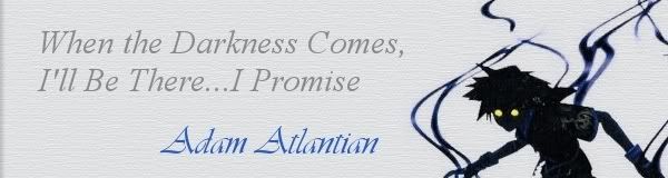
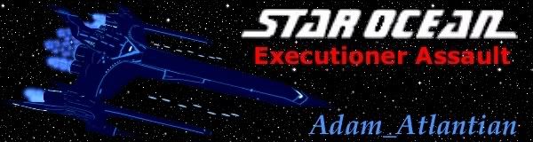
So to start off my little thread here is a signature I made for another site.
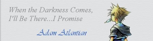
I've got some other 3d art I'll have finished soon.
Last edited by Alteran on Tue Nov 20, 2007 5:53 pm, edited 1 time in total.
"Maybe Senpai ate Yuka-tan's last bon-bon?" ----Stupei, Ace Defective
I love the red bubbles in this second one and the keyhole at the bottom is really pretty, sort of celestial. I'm not as fond of the key, I think the colouring on it could be more realistic, but I do love the crown part. Keep up the good work,
The kh picture looks really good, but the only thing I think looks a little odd is the heart thing at top. I looked at the larger version, but still something about it just looks off =/ I'm not sure what.
But it still looks really good.
“It's necessary to have wished for death in order to know how good it is to live.” ― Alexandre Dumas, The Count of Monte Cristo
The first one is really great. I like the stance and everything. It looks as if it would really move on a game. and Great quote.
The second one I like, though a little less just because of the key. It seemed less...shiny to me than everything else. lol. But it was a beautiful pic. Awesome job.
Keep it up!
~Rieda
I love, love.
*This wonderful crit is brought to you by CCF!*
You'll all think I'm crazy, but I edited the original Signature and made this one. It fills the space much better and i hink it just looks cool to be honest.
The character has like 6 forms so I thought I'd make an animation to switch between them
"Maybe Senpai ate Yuka-tan's last bon-bon?" ----Stupei, Ace Defective
Holy crap! That's freaky looking, man. I love it! haha Yeah, I like the second version better than the original. So are you going to do the other four forms?
[url="www.royacrystaldoesnanowrimo.tumblr.com"]Follow my 2011 NaNoWriMo progress on tumblr[/url] or [url="http://www.nanowrimo.org/eng/user/734471"]friend me on the official NaNoWriMo forums[/url]!
Oh WOW! I love the second version. I think it works better with the space, plus it just looks awesome. Love it, love it, love it. Way better then the first. Matches the theme of the quote better, too.