z

Young Writers Society


colourful musings

by Hijinks


Here's the poem in normal text, to make quoting it easier in a review ;) I've ordered it pretty much from top to bottom and left to right, but I didn't actually write it in that order, and I don't personally feel that there's a right order to read the "stanzas" in, so don't take this to mean that this is the correct order to read it.


"don't eat yellow
snow", they say
so here I am
eating black
and
white

smudge of green paint
a forest for my thoughts
I bask in the glow
of the sunlight that seeps
between leaves

I know that blue
and red
are meant to make purple
but I can never
get them to mix;
is there
something
wrong with my
palette?

tidy square of
orange
I sweep the autumn
leaves into
a fiery pile
of red and
yellow;
these flames
can't
burn
me

will you sail this turquoise sea with me?
let's sink below the waves and find
all the remnants of refracted colours

where does pink start and
red stop?

orange and purple
are so pretty
yet they merge into
brown
not mud, heavy
with water to cool the plants; no,
a dry
lifeless
heap of dirt

don't look the sun
in the eyes;
some things are just
too bright, so you
have to use
your imagination and doze
in the
peaceful
shade


Edit: I realized (belatedly) I should probably clarify I didn't make the background for the poem, I was browsing Unsplash and found this really beautiful photo by Steve Johnson and had a bunch of ideas so was inspired to write a poem to go with it. Here's the link to the original photo!


Note: You are not logged in, but you can still leave a comment or review. Before it shows up, a moderator will need to approve your comment (this is only a safeguard against spambots). Leave your email if you would like to be notified when your message is approved.


Is this a review?


Comments


User avatar
1227 Reviews


Points: 144125
Reviews: 1227

Donate
Thu Sep 24, 2020 4:13 am
View Likes
alliyah wrote a review...


Hey! Here to review!

(I'm glad I saved some good poems still; since I am soooo close to giving up on team tortoise RIP)

Ah I really love this poem, and like a gazillion aspects to it. I think it's really clever overall.

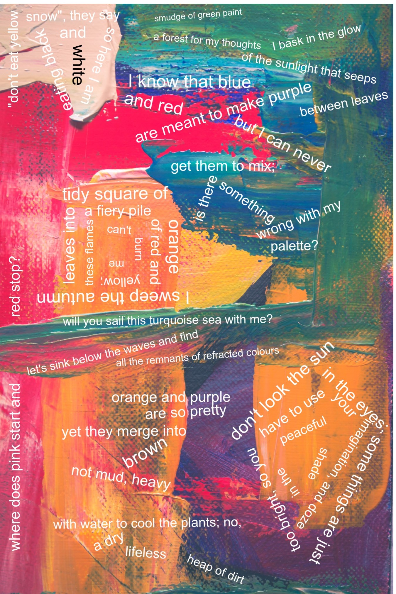
So I really like that this poem is non-linear, and the effect is kind of a visual splash of text where the reader really meanders from text to text. I get some word-cloud vibes from this [and man I used to love word-cloud poems back in high-school, so am feeling nostalgic just thinking about it]. One neat things about this format & word-clouds is it puts a lot of agency into the reader's interpretation and experience - they can decide to tackle reading it however they want, line by line or all at once etc. To that end... I am actually really against the writing out of the text I'm glad you added a note that the text doesn't "have" to be read in that order, but it feels a bit like making a movie and then putting in an abbreviated copy of the script in case the viewer doesn't feel like watching the visual part -> you lose so much! Just something to consider - I know on the flip-side that writing out text can be good for accessibility for those who have trouble with images, but I'm not sure it's worth sacrificing the artistic aspects of the piece. :)

My favorite sections are where you did go a bit more imaginative in your phrasing -> for instance

have to use
your imagination and doze


now that is incredibly interesting and really feels like you're just making up new ways to use language which I am all for - even feels a little bit like e e cummings in that moment.

Another connection I had to this piece was in thinking of the works of Mark Rothko - he did a lot of different modern art pieces but is famous for color-blocks, which I absolutely adore. The thing I say about color-blocks is that in the absence of concrete depictions the viewer is forced to create meaning in their own mind, which allows for a projected introspection -> ie. the painting becomes a mirror rather than a photo. And I think poetry that is similarly abstract can do a similar thing of not just being "meaningless" but actually prompting serious internal reflection just based on it's lack of concrete depictions. I would be really curious about your intention of conveying meaning with this piece - and if you consider it more of a process piece, an experimentation in form, or if you had a desired meaning you wanted the reader to come away with.

I think if you were going for something more abstract / blank, you might want to highten some of the whimsicalness of the words - > at times your grammatical choices in this poems feel imaginative and unbounded and these are absolutely my favorite and really done well!, but the words themselves are pretty 1+1=2 ie. in sections about yellow, you talk about yellow etc. I think being a little more imaginative and maybe more figurative in your word choice would give a more interesting interpretive lens.

I think the image itself is a little overwhelming (not necessarally in a bad way), and the formatting is wild - but I don't think your phrasing necessarally matches up with the same unboundedness. I think you could have even more text in here! And maybe even some things that aren't obviously linked to colors, but could evoke color-thoughts

Some of the upside down ones I think aren't as suited to text being presented on an online medium, just because there's no way to flip the page, but all the text is perfectly readable which is always a challenge with these types of things!

I think that corner with "don't look the sun in the eyes" that spirals around is really clever -> because at first readers are going to take "don't look the sun" as a typo for "don't look at the sun" (which could actually even be a purposeful omission to highlight the "not looking at something dead-on") but I like how that section spirals and almost looks like an eye.

A few miscellaneous suggestions:

I don't feel like you really linger on any image quite enough for it to just implant itself in my mind after reading. On one hand, the entire poem is an image so maybe that's being nitpicky - but I think taking a few of the images you've got and going one step deeper will help make this poem easier to connect to.

Related to that, I really longed for a more narrative string in this - > I'm not sure what I'm supposed to be imagining is happening or even what the theme is except for a splash of colors. You delve into a few different images in the piece tiredness, visibility, sailing, weather, seasons, separation, advice, flames, confusion - and I think that's almost too much for the reader to somehow connect in their head. For a poem like this, I think it's okay for a lot of randomness, but I would advocate for either 1) an amplified randomness, where randomness itself is the theme or 2) a more related randomness -> where words are put in randomly, but they are all in the same theme family -> so that although the connections aren't made explicitly between the words in the text, the reader could conceivably imagine them all existing in the same universe.

I read through some of Meherazul and starlit's reviews and MAN they did some good poet-analysis, I'm finding it a little hard to get an overall vibe / theme from this without just dissecting each individual phrase for meaning -> in other words I don't get a sense of any "overall theme" maybe because of some of the disconnectedness with the images outside of color. If I needed to nail down one particular theme, I think I'd say this poem is about a speaker who is confused at trying to make sense of the world, they want things to fit into categories but is met with resistance -> can't eat yellow, can't look at the sun etc. They try to find beauty beyond just categorization, but they keep cycling back to it. There's sort of a visual conflict between the sections where there is blended color and distinct color and I think that speaks to that similar tension; which could also maybe be the tension between rigidness and spontaneity.

Overall, you did some awesome imagining in this piece! And I love love love the creativity in this, it's the type of idea that inspires me and makes me want to bust out my high school word-cloud poems again. It's a great idea and executed fairly effectively - this poem has big impact power. I think the main areas it could use improvement would be continuity through making your themes a bit more connected and also maybe diving a bit deeper into some of the great images you've already got!

all the best,

alliyah

It's the most wonderful time of the year .... .... .... RevMo!


Random avatar

Points: 20
Reviews: 0

Donate
Mon Aug 24, 2020 1:36 am
View Likes
Flamefeather says...


OMG! THIS IS SO GOOD! The art is fascinating, the idea is inspiring, vivid adjectives, a hint of amusement. It's also made me question the colors. It's like you are featuring what colors mix into in reality and some other quotes blended in smoothly into the poem. Good job! 5/5 stars.


User avatar
83 Reviews


Points: 1356
Reviews: 83

Donate
Sun Aug 23, 2020 6:59 pm
View Likes
MeherazulAzim16 wrote a review...


Hello whatcha! (i consciously made sure i got the capitalization right :) )

First of all I wanna say the artwork is BEAUTIFUL!!!!! SO GOOD. The poem mixed with the artwork... it's not a poem anymore. It's something else now. Something MORE. I don't know how common this kind of work is (a hybrid between poetry and painting) but it's so interesting that it should be considered an art form of its own (I'm familiar with some works by the artist Zarina that combine the two but that's still different). I can't put into words how GOOD the piece made me feel. Which is ironic, because I'm reviewing it and stating how it made me feel is exactly what I'm supposed to do.

And, uh, I'm sorry if I sound too excited (I kind of am), but here we go.

The elements in the left and right sides/columns of the piece are my favorites. Specially the right side. The colors (of the leaves and the sun) are incredibly pleasing. My eyes are happy just glancing at them. The effect is amplified once I take the poetry into context. But, wait, before that—

don't look the sun
in the eyes;
some things are just
too bright, so you
have to use
your imagination and doze
in the
peaceful
shade


I'll interpret this as the narrator, quite cleverly I must add, indicating that we'll have to appreciate this piece a little differently. Just the way we can't look straight into the sun, we can't look into the painting or the poem individually to feel the intended effect. I could be wrong but I like thinking that's true. I think it's important because—

smudge of green paint
a forest for my thoughts
I bask in the glow
of the sunlight that seeps
between leaves

...

don't look the sun
in the eyes;
some things are just
too bright, so you
have to use
your imagination and doze
in the
peaceful
shade


There is a significant gap between these two stanzas in the text, BUT, I feel they create meaning together (callback to "I don't personally feel that there's a right order to read the "stanzas" in"):

We can see clear instances of yellow/orange (sunlight that seeps
between leaves
) in the green of the upper/right corner. It looks peaceful how the green extends into the sun (that is, if the location of the last stanza indeed represents the sun, which of course it does!).

That reminds me, the piece is ALL ABOUT finding meaning in colors. In a literal sense, it's just colors. Greens and oranges. The "meaning" does not arise from looking the colors in the eyes. No! We have to "use our imagination and doze into the peaceful shades." It just makes sense!

So, if we open ourselves to the artwork, the lower-right orange quite obviously becomes the sun. Then again—

Why is the sun placed at the bottom? How can the sunlight seep through the leaves and reach down to us if the sun isn't behind the leaves at all? It doesn't make sense...

UNTIL IT DOES.

will you sail this turquoise sea with me?
let's sink below the waves and find
all the remnants of refracted colours


I don't know if I'm misinterpreting the piece but... everything in the bottom half of the art work is underwater, isn't it? It's not the sun. Of course, it's not. We couldn't look directly into it even if we wanted to. That's why you gave us a reflection instead.

red stop?


At first when I saw "red stop?" (as I was tracking the texts and slowly scrolling down) it seemed to be meaningful on its own (and I'll argue that it still is). Red traffic lights flashed into my imagination ("stop"). I thought about some things we associate "red" with and the next moment my mind slipped to other elements. When I went a full circle and reached the full text...

where does pink start and
red stop?


I thought "Oh so that's what it means, how silly of me to jump to conclusions." But maybe that's the point. This piece is about how we find meaning in colors, right? So, of course it's the point! What the point? It's that "red stop" makes sense to us, because there is a preexisting relationship between that text and that color. So, when we have the revelation later (that we effortlessly attributed meaning to a phrase that was out of context), it proves that finding meaning in colors is not arbitrary at all! Sure, we aren't born with this instinct/connection. But the instinct to connect does exist and it's a consequence of our SHARED experiences. That's what's amazing! Even we live in different regions, leaves are leaves and they are green. Some of these things in life we experience the same way. The turquoise sea, rays peeking through leaves, red lights, dust and mud. In that sense, our ability to give meaning to colors freakin' unites us!

I think that's the review. I think. I just hope this ramble I went on wasn't too convoluted, (OR DUMB), or WAY WAY WAY off the mark (no, seriously I'm panicking). I had an absolute blast thinking and writing about it though. Quite simply, this piece has brought me happiness. In fact, it's probably my 75th review and that means the third star. So, I guess thank you for inspiring the heck out of me and helping me reach that! :D

Keep on creating!

~MAS


Hijinks says...


Thank you so much for the review and encouraging words!! I love your interpretations (they aren't off the mark at all!) and I'm glad the poem brought you happiness <3

(also thank you for capitalizing my name correctly xD)


You're welcome! :D


User avatar
66 Reviews


Points: 94
Reviews: 66

Donate
Sat Aug 22, 2020 11:03 pm
View Likes
Storybraniac says...


It's insane how good this is.


Hijinks says...


Aw thank you so much!!


User avatar
465 Reviews


Points: 29825
Reviews: 465

Donate
Fri Aug 21, 2020 1:46 am
View Likes
starlitmind wrote a review...


Hey you! THIS IS AMAZING AHH. I was thinking of waiting till this was out of the Green Room to make sure you'd get a good review, but alliyah said she'd review it in September, so here I am cx (thank you for writing out the “stanzas” for reviewing purposes haha <3)

You review so many of my works, and I always feel guilty since I haven't reviews much of yours. Honestly, I just don't know what to say or critique cause every single piece of yours is so perfect! (that's why I'm looking forward to that workshop on Saturday) But I want to try and review amazing stuff like this. I don't think I'll be able to realize the message behind this; I'm not very good at analyzing poetry/finding the message, so just a heads up that this will mostly be my thoughts while reading, but hopefully they might help you in some way :D

Okay so to start, the format is wonderful. I could totally see this being in some literary book or magazine or something amazing like that, but this could also be in art museum. Like I could definitely imagine myself seeing this while walking around an art museum. I like how it's a bit hard to separate one "stanza" from another, because thoughts/musings are never really organized. Also, it kind of shows colours blending/running into one another, just like your "stanzas"/thoughts are blending/running into one another. I think you nailed the formatting (you nailed everything, really).

And then the poem itself is amazing. Each little section could honestly stand alone by itself without the formatting or anything. And that's what I really like about this, because you didn't compromise the poem for the formatting; you made both work together. The formatting is strong, your poem is strong, and together they create magic c: You did such an amazing job <3

"don't eat yellow
snow", they say
so here I am
eating black
and
white


(quick thing, isn't the comma supposed to be inside of the quotation, not outside of it?)

Ah, I love the idea of eating colours. This reminds me of when healthy people tell others to "eat the rainbow" or something so you eat a variety of fruits and vegetables, but black and white aren't part of the rainbow. But then black absorbs all other colours, and white reflects all colours, so you're eating two contradictory things, one which in a way includes the rainbow and the other doesn't. Also, since "a black-and-white subject or situation is one in which it is easy to understand what is right and wrong," it's playing, for me, at the idea that it's obvious you're not supposed to eat yellow snow.

I've noticed that you have all the other colours mentioned in the poem somewhere in the formatting/colour background, or at least a shade of it, so I was just curious if you thought of adding white and black colours to the background as well? Or maybe just black since your font is white. But then again, if you're eating colours, they might not show up because, well, they're in your stomach xD It's just a thought! Also, I'm curious behind the choice to make the word white in the colour black. I thought it might be to make it stand out, or switch the colours of the words black and white to show a contrast, but then you don't put any other words in colour. Did you want a sort of emphasis on the word "white"? That's just another thought I had while reading. You probably have a purpose for it, and I just missed it :)

smudge of green paint
a forest for my thoughts


The main line that stood out to me is "a forest of my thoughts" since it's a play on that expression "penny for your thoughts." It's interesting that you chose the word "forest" because a penny has the smallest value, but a forest is the whole thing. I tried replacing "forest" with "a tree for my thoughts" or leaves since you mentioned that later in the "stanza," or something smaller in a forest, but it just doesn't have the same ring to it. So I like the idea of "a forest of my thoughts." It's not like you have to stick to the format of the old saying - this is yours.

Since you used forest, it makes it sound like to me that you're unwilling to share your thoughts so much that it'll take a whole forest to get it out of you. Or from forests, you get paper, and maybe this is saying that you're more of a writer than a talker and you'll write your feelings down - and maybe that's what this whole poem is. This poem seems like a dump of thoughts, like the way you dump paint on a canvas, kind of like the almost-randomosity of the background. That's why each "stanza" isn't so "neat" but instead scattered over a page, not written in order like on a piece of notebook paper. I don't know if my thoughts on this are even making sense any more or if it's just me making things up that wasn't meant to be there xD

Rereading this "stanza," I find it interesting that you say "smudge of green paint," a singular smudge, and then go on about a forest. Like a forest is huge, and that smudge of green paint isn't necessarily talking about or referring to the forest, but it makes me wonder why there is just one smudge. If you were referring to the forest, I imagine a thousand different smudges of a variety of shades. But perhaps one smudge shows wholeness and togetherness of the forest (I don't really know how to describe it), like it's all one being. Just another thought while I was reading!

I bask in the glow
of the sunlight that seeps
between leaves


I like the way that this stanza is formatted. To me, it resembles the leaves because of the way they're spaced out but all together in the same spot, and you have space between the lines for the sunlight to seep through.

Since this poem is about colours and you previously mentioned eating black and white, I read this like you were "absorbing" the sun, or its colour. Perhaps you're exploring different colours and the meaning behind them (like later you talk about orange and purple and discuss what happens to them when mixed - that's exploring and experimenting with them). But then here

don't look the sun
in the eyes;
some things are just
too bright, so you
have to use
your imagination and doze
in the
peaceful
shade


you say not to look at the sun, like you've learnt your lesson last time with trying to bask in it. Maybe this plays with the idea that "ignorance is bliss" - some things are better not knowing, or "some things are just too bright." Maybe that "some things are just too bright" part is talking about light sensitivity but in a metaphorical way. Perhaps there's a reason you shouldn't look at it because it will only bring you pain. The truth hurts. The grass isn't greener on the other side. Things like that, if that even makes sense?

I know that blue
and red
are meant to make purple
but I can never
get them to mix;
is there
something
wrong with my
palette?


Ah, so I think this has to be my favourite stanza. This to me gives the message that society has often shown that if you have this thing and this thing, you'll be loved by everyone. Or the idea that if you don't have what everyone else has, there's something wrong with you. If you're different, there's something wrong with you. Just because you can't do what everyone else can do, there's something wrong with you. And then you go on and try to force a change within you that will fix your "problem," but it doesn't work - you can't get them to mix.

I don't really have much to say about this part, but I just had an idea formatting wise. I was thinking you could make the lines really spaced out with each other to show the colours can't mix, but you do have a space limit or a limited amount of space you can cover, so that would be a little tough. But how about putting the lines really close and smushed together, but perhaps not quite touching? I feel that it could show how you're trying really hard to get blue and red to mix (them being quite close together), almost forcing the mixing, but it never works (and that's why the lines won't be touching, because it doesn't work). This is just a thought and suggestion :D

tidy square of
orange
I sweep the autumn
leaves into
a fiery pile
of red and
yellow;
these flames
can't
burn
me


I love your imagery here. It seems simple, but since you have such powerful words like "fiery" which gives this an overall powerful feeling. I was thinking, you mostly use "ordinary" or standard colours, like the rainbow colours. But you have used turquoise, which isn't so ordinary, if you get what I mean by that. So I was thinking, what if you switched out red and yellow for some more vibrant, powerful colours?

Some red colours:

Spoiler! :
Image


Some yellow colours:

Spoiler! :
Image


You formatted this section into a square, so I really like how the formatting matches the words! It's interesting to me how you chose a square, because when I imagine raking autumn leaves, it's usually messy or a big pile instead of something neat and tidy, like a square. But when you say "these flames can't burn me," it shows to me that you are in control; you won't let the flames have power over you. Instead, you have power over the flames. And that would make the square make sense, because since the idea of a square gives a neat and tidy image in my mind, it shows me that you're in control, that you can keep things organized and under control. You don't have a big clutter of leaves, a big mess. It's neat, organized, tidy, and you have everything under your control. So basically, square = flames under control. I hope that makes some sense haha! xD

will you sail this turquoise sea with me?
let's sink below the waves and find
all the remnants of refracted colours


Just imagining refracted colours under a turquoise sea puts such a pretty image into my mind <3 I also love that little instance of alliteration with "remnants of refracted."

I don't really have much to say about this one! I'm just wondering if you could dive deeper (haha, get it? xD) into the imagery here. The words put a pretty image into my mind, but why not show it to me instead of me imagining it myself? You may have your reasons for already not doing so (space limit or something), but I just felt like this could be such a cool spot for imagery, especially the refracted light.

And just a suggestion for formatting; maybe you could structure the words/lines so they look like waves? Like having one word lower and then the next higher, then lower, etc. But since there's already a lot to the piece, adding more formatting could make it a bit too much, but it was just a thought that ran through my head!

where does pink start and
red stop?


That is a great question, haha. I'm assuming this is referring to an ombre sort of thing, and that is a great question xD

It's cool how you wrote it this way instead of the other way around ("where does red start and pink stop?") because "red stop" reminds me of a traffic sign/stop sign. I think that was clever. I also like how in the picture, there's a break/separation between "where does pink start and" and "red stop?" to show that action of stopping and/or to perhaps point out and show that the speaker is thinking "the pink starts and red stops in this area, but I can't find it" idea, if that makes sense.

but seriously, what's the answer?

I interpreted this section as the events of the speaker's life or perhaps the events of a section of their life/particular moment is blending into one another. For example, a "when did I start becoming sad and when did my happiness stop?" sort of thing. Like you're trying to remember where everything went wrong, or what caused something to go wrong, or you're just wondering how did you get from Point A to Point B. I hope that makes sense! :D

orange and purple
are so pretty
yet they merge into
brown
not mud, heavy
with water to cool the plants; no,
a dry
lifeless
heap of dirt


I interpreted this as sometimes, two great things just don't do well together. Like they can be amazing on their own, but the put/mixed together, it's just a mess. This could also apply to people as well; some people are fantabulous on their own, but when you put the two together, they fight and don't get along well and whatever and act all mean.

You later emphasize the idea that the two mixed create a bad thing, because together they don't even make mud - they don't bring anything positive about (water to cool the plants), but it's basically useless (dry lifeless heap of dirt).

I love how you put "a dry," "lifeless," and "a heap of dirt" on their own "lines" or separated from each other, because it made me read each line with strong emphasis, or like in music, an accent on each phrase. I really stressed on each of those negative things, emphasizing how negative and useless the two colours are when merged. That was pretty clever. Just a formatting idea; maybe you could do the same thing I mentioned with the red and blue section for the first part of the "stanza" when you're talking about the colours merging, but whereas in the red and blue section I said not to make the lines touch, these lines could touch since the colours have merged, unlike the red and blue section. Just a thought!

don't look the sun
in the eyes;
some things are just
too bright, so you
have to use
your imagination and doze
in the
peaceful
shade


I think this is a great way to end this, because like I mentioned briefly before, throughout this poem, you're experimenting or musing about different colours and wondering about different parts of them. Like for example, mixing colours, where does one start and another stop, etc. So I read this like you don't need to find out the answer to all of your questions; your imagination and simply the process of wondering about them is enough ("so you have to use your imagination). I feel like I said this before, but this is also my favourite "stanza" haha xD

I also think that this stanza is saying to play it safe, in a way. Like in all those fantasy novels, some dude always wants the narrator not to venture in the forest or the locked attic or whatever because you don't really need to know what's there. This ties back into my "ignorance is bliss" idea, and that, like you said, it's best to stay in the "peaceful shade" and just stick to imagining whatever is out there. I mean this could be completely wrong, but hey, this "stanza" is still amazing xD

Also I love the way you formatted this. As the "stanza" goes on, your lines are closing in each other, and when you're done, you end up in the middle of it. To me, it shows that you're safe where you are. The lines around symbolize the boundaries that protect you if you don't cross them. It's like you're safe tucked in your little corner ("peaceful shade") and you don't need to venture out and "look the sun in the eyes."

Well, I don't know if half of this review made any sense, but hopefully you got something out of this xD While proofreading, I found a lot of spelling errors, and I probably missed a ton, so be warned haha. I really hope my thoughts made sense; it's so hard to put into words what I'm thinking xD

In short, this poem is absolutely stunning. This poem is amazing, you're amazing, this poem IS AMAZINGG. Gah, it's just so good. I didn't really provide any things to work/improve on, I just gave my analysis and some suggestions, and I hope that's okay with you <3 You probably already know that you have a masterpiece, so I won't go on and on about how much I love this piece. I can't wait to read more of what you publish in the future! I hope this helped in someway <3


Hijinks says...


Oh my gosh Star this review MADE MY DAY and you are SO KIND!!! It's so long and thoughtful and in-depth and I love hearing your interpretations <333

You got the meaning of the red blue, autumn leaves, red pink, don't look at the sun, and brown dirt stanzas pretty much bang on!! I totally agree I should use more specific colours in the autumn "stanza", and your other formatting suggestions are definitely things I'll think about. (Also you got the "red stops" = stop sign idea, yay!! I wasn't sure if it was too subtle)

Just hearing your reaction really is as helpful as a lot of critiques, it lets me know what sort of message and emotions the poem is creating. So yes, this is INCREDIBLY HELPFUL and Star you are amazing <333

Thank you so much for such a thoughtful review, you really don't know how much I loved reading this <3


starlitmind says...


AW, I%u2019m super duper glad you found this helpful!! <33 YAYAYAYAY this made my day, thank you, you wonderful poet <3 <3


User avatar
158 Reviews


Points: 6160
Reviews: 158

Donate
Thu Aug 20, 2020 8:55 pm
View Likes
Hkumar says...


Omg! This is so great :D You have beautifully played with all the colors and made such a nice poem.


Hijinks says...


Aw thanks Hkumar! :D


User avatar
1227 Reviews


Points: 144125
Reviews: 1227

Donate
Thu Aug 20, 2020 7:58 pm
View Likes
alliyah says...


HELLO, I LOVE YOUR NEW POEM <3 I'm going to save a review for it until RevMo, :] (I need to save some nice pieces to motivate me to review) but I really like it, great usage of form blended with language and interesting to consider overall as a composition, reading it feels very immersive.


Hijinks says...


Aaah thank you so much alliyah!! I found your definitions of poetry in AvantCoffee's thread really interesting so you inspired this poem in part <3 And I'll look forward to an alliyah review in September! :)


alliyah says...


<3


User avatar
465 Reviews


Points: 29825
Reviews: 465

Donate
Thu Aug 20, 2020 7:33 pm
View Likes
starlitmind says...


WOAHHH this looks so cool! :o


Hijinks says...


Thanks Star! :)


This is a house of homes, a sacred place, by human passion made divinely sweet.
— Alfred Joyce Kilmer