
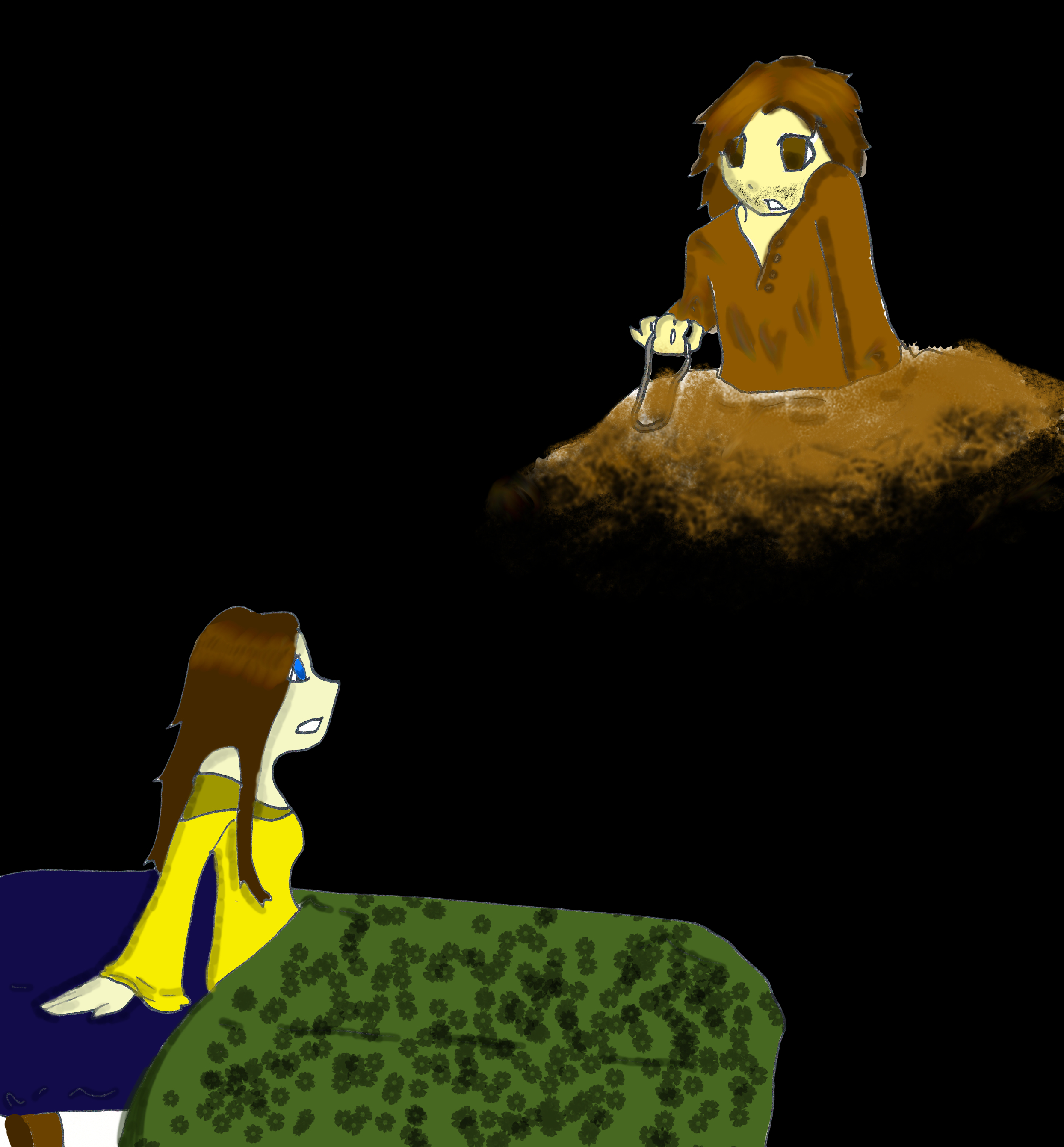
Aragorn and Arwen from Lord of the Rings. My all-time favorite LotR couple :)
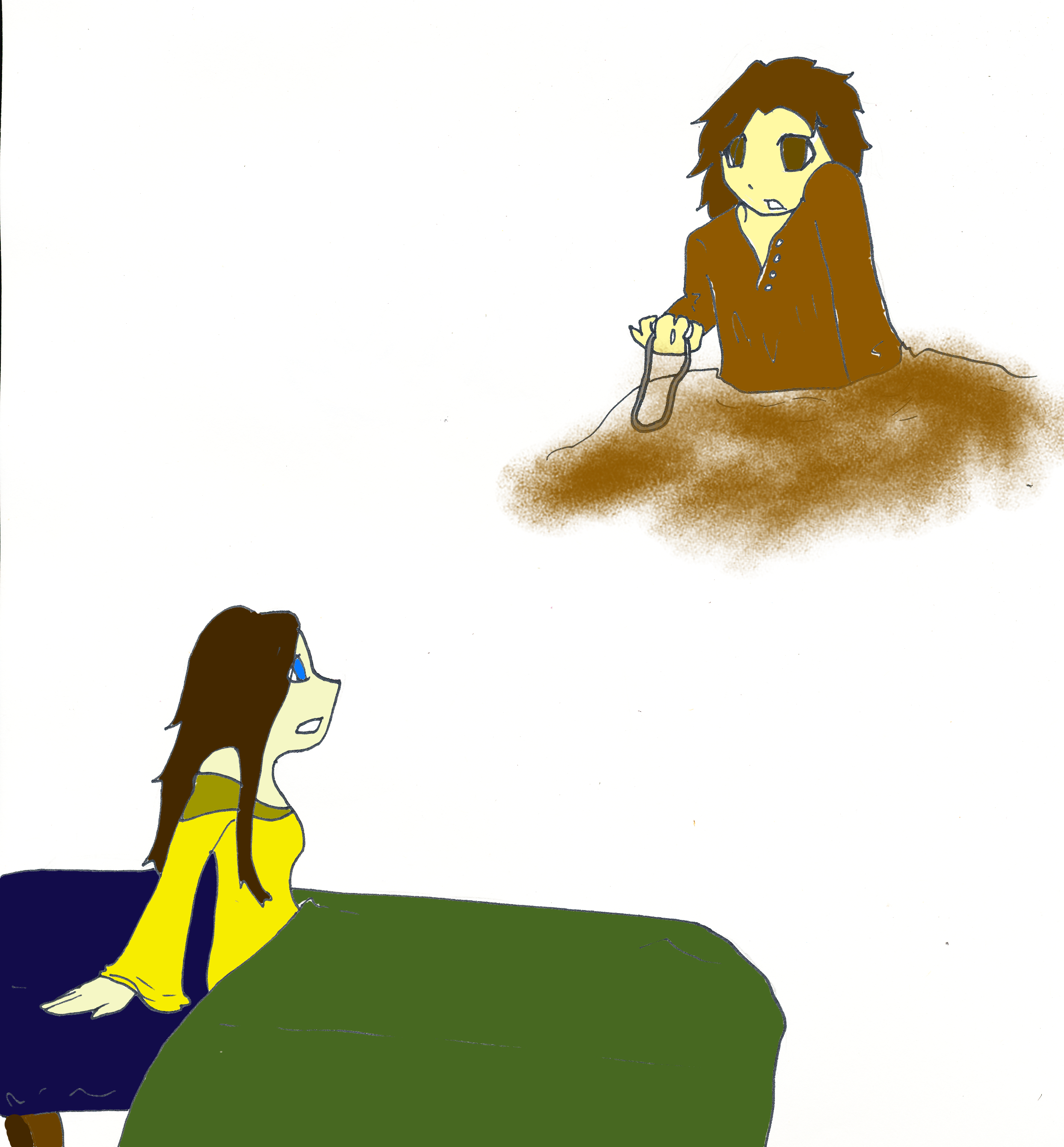
And here's the same pic again, but with shading!
 Oh, and a correction- when I say 'My First Fanart', I mean my first fanart [b]on this site[/b]. I've done loads of fanart before X3 skills.
And are there any other Aragorn fangirls out there? Sometimes I feel like I'm the only one. Everyone likes Legolas. I can't say I [b]hate[/b] him, and he's hot and all, I just think he gets [b]waaaay[/b] too many reaction shots, he was a minor character in the books (so minor they never even state his hair color!) that got his role blown up in the movies for no reason.
Arwen is my favorite elf by the way. Though her role is larger in the books than the movies, I think PJ did a good job of keeping her character true to what Tolkien intended. As a Legolas/Aragorn shipper I'm both frustrated by and love her relationship with Aragorn- it's so unbreakable.
'Nuff rambling! Please review!
Points:
Time spent:
Canary word: Present
Possible AI signals:
Original Text:
Are you sure you want to delete this comment? This cannot be undone.
Mark this comment as a review? Points will be awarded to the poster.
Your comment was posted, but it wasn’t long enough to count as a review. Reviews need about four complete sentences (at least 250 characters). Try writing another review that explains your thoughts in more detail — the author will appreciate it, and you’ll earn points for it.

125,018 Literary Works • 672,861 Reviews

Hey! Hadj here to review your art!
 This was incredibly distracting to me, and I think that if his left shoulder matched his right, the entire picture would be more enjoyable to look at
I'm only going to review the second one, because its more of a finished product
Criticism
Anatomy
Looking at this, I think the biggest problem I saw was Aragorn's left arm. I'm sure you're aware, that shoulders don't usually cover one's cheek
It wasn't as noticeable, but his head is also rather squashed into his neck. Overall, Aragorn's upper body is pretty sloppily connected.
Lighting
The lighting in this is weird. The lighter strip on Arwen's hair doesn't appear to match the lighting of her clothes. The bead lacked shading, which looked a little bit awkward, and a mysterious white spot was sitting under her bed. This was probably meant to be part of the bed, but it was so white, it looked unnatural. I would recommend shading the side of the bed, as if an overhead light is somewhere in the room, and then adjusting the lighting of Arwen's hair and clothes accordingly.
Design
The flowers on the bed annoyed me quite a bit. They looked like a little kid took a flower stamp and tried to color in the entire bed (no offense). I think if there was more of a pattern and less overlap between flowers, the bed would look much more artistic.
Praise
Overall, nice work. I'm a huge LOTR fan and have read the trilogy, along with Silmarillion and Children of Huron multiple times. I think you're definitely a talented artist, but you still need work.
Keep on drawing
Hadj
Thanks!
The white under the bed is an accident XD
As for his shoulder, note that he is supporting himself on it, so it's not as off as it would be were he standing. And for it being off, still, by a little- yeah, it's wrong. I know. I'll re-draw this in a few years, when my art has improved.
Lighting is hard. I'll work on it though.
The flowers are a stamp from an art program, and they look worse when they don't overlap. Would it help if the bed and the flowers were closer in color?
Thanks for the review. Most people are either 1) Afraid of criticizing, or 2) Can't say anything past 'It Sucks'. Thank you, again, for not being either one!
Hey! Thanks for the follow! I would reccomend not using that stamp at all. To me, using stamps is almost like cheating, and it also doesn't look that good. I would either leave out the pattern on the bed, or draw the flowers yourself
Nice work though and keep drawing!
Hadj
This is so cute! I love how detailed you made her quilt, with the flowers. They are flowers, right? They look like that to me.

Scooby Dooby Doo,Where are you
Your style of drawing is pretty cool (and way, way, waaay better than I can do) and you did a great job at drawing hands.
Are they meant to be looking at each other? I suggest you add something that connects them; some ground cover or part of a wall, maybe. At the moment, they look like two different pictures.
I'm just going to put the Scooby Doo theme song below (because I'm in The Mystery Machine) in an attempt to get this out of the Green Room. You're welcome to sing along.
Spoiler
We got some work to do now
Scooby Dooby Doo,Where are you
We need some help from you now
Come on,Scooby Doo,I see you
pretending you got a sliver
But you're not foolin' me,cause I can see
the way you shake and shiver
You know we got a mystery to solve and Scooby Doo,be
ready for your act
Don't hold back!
And Scooby Doo if you come through you're gonna have
yourself a
Scooby Snack!
Scooby Dooby Doo,here are you
You're ready and you're willing
If we can count on you Scooby Doo
I know we'll catch that villain!
Thanks! I like the flowers as well
It's supposed to be that Aragorn is out doing LotR stuff and Arwen is at Rivendell, so I didn't want them looking at each other or else it would look like he was in a tree above her head or something.
And as for Scooby-Doo- I cannot stop making reference to 'Stoner Shaggy'.
I'm guessing Aragorn is holding the Evenstar?

Also, is that from the scene when he had a dream that the Evenstar shattered?
Awesome drawing, by the way.
Yeah, that's the evenstar.
No, it's not from the dream. I forgot all about that...
and thanks ^w^
Awwww! The drawing is so cute ;w;
I really like it! Though Aragorn x Arwen is my passive otp, I still find it adorable. This picture makes me love it more. I personally like Sam x Rosie more (I haven't read the books in a long time I forget what Sam's future wife's name is-) but yes. This is particularly adorable, and I'm in love with it.
I apologize for the run-on sentences, I'm just a sucker for cute drawings.
Thx!!! I didn't know you liked LotR!!! Sam x Rosie (Her full name is Rosie Cotton. You got it right.) is really cute too! My otp is Legolas x Aragorn, though. You gotta admit they're adorable together.
Omfg yas
I love Legolas x Aragorn too xD
It's just such an adorable couple. A lot of couples are adorable.
And I love LotR xD