

Warning: This work has been rated 16+ for mature content.
Points:
Time spent:
Canary word: Present
Possible AI signals:
Original Text:
Are you sure you want to delete this comment? This cannot be undone.
Mark this comment as a review? Points will be awarded to the poster.
Your comment was posted, but it wasn’t long enough to count as a review. Reviews need about four complete sentences (at least 250 characters). Try writing another review that explains your thoughts in more detail — the author will appreciate it, and you’ll earn points for it.

125,018 Literary Works • 672,857 Reviews


Hiya,
I realize I am late to the party in terms of when this was put up, but out of interest (and as an Art Teacher myself) I've been recently looking at all the artwork on this website. I love writing, but it's like a breath of fresh air when I stumble across something visual.
I had to post a review, if only to say how much I really love this piece.
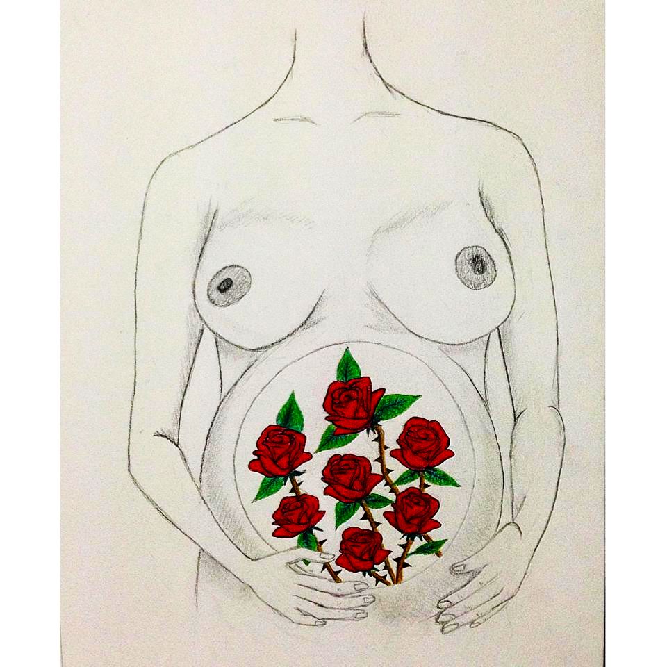
To begin with the pencil work. I think it is so delicately done that the intensity of the colours of the roses is complemented. You have achieved a realistic sketch of a 3D form, without falling into the all too common trap of over doing it. You have shaded in all of the right places, and with a perfect balance of highlights and shadows, so that despite this being an artistic interpretation it still looks realistic.
One thing I would say, if you hadn't already done it, is to map out in shapes the various limbs and block areas. It will help with getting everything in an even better proportion. Whilst you have not let it distract from the beautiful work on the flowers, sometimes no matter how good the details are on a piece of art, if it is not in proportion, and it is meant to be, it can take away from other spectacular areas. The only slightly out of proportion element I notice is the arms. You can clearly see you made the effort to try and bring the arms to the foreground. Perhaps a little more work and you can have it photo realistic in no time!
The composition of the figure is great. I really really like how you didn't include a face, and where the pencil lines fade out is really beneficial for the piece over all. I am a firm believer in "less is more" so the minimal approach to this is great.
The flowers. I love them. I love the deep intensity of the colour of the roses. Although you have only used one shade of red (correct me if I'm wrong please!) the dark outline of the petals gives it that bit more depth. The volume of the petals and the amount you included in each flower is also something that lends itself to the realistic appearance of them. I love the leaves and the stems with the thorns. The way you did the different colour thorns to the stem is great. Even the composition of each flower against another, all within a circle, looks very well planned out.
Overall I love this piece. Well done! I know it was over two years ago, but I hope you have still kept drawing up. I'd say your pieces now are amazing!
Wow can't believe it's been 3 years! Thank you SOOOO much for your constructive feedback, you don't know how much your review means to me. :') xo
I'm really appalled to see only one review for this sensitive, meaningful and an "original" drawing.
Yes, the quotes are quite deliberate. I wanted to say two things.
1. This is driven by a heartfelt message.
Your work is done in a way, which conveys a need-of-the-hour message. Though it was done for
poem, it can stand alone very powerfully on it's own and I really mean that. We have all kinds of drawings, but I personally love works which are driven by message. Be it poem, story or a painting.
Like I said in my comment,
2. A grade stuff with neat sketching and fantastic painting.
As a kid, I was very very bad at drawing. I couldn't draw human body without messing up a vital part of sketch. You're drawing a very sensitive body part and the message really blossoms up thanks to the fine touch with which you sketch and paint.
I really love the way you haven't shown the face of mother. A strong subtle message that every mom, irrespective of any boundary loves, cherishes for her child.
If a sketch can convey something this good, what more you want? Sorry for zero nitpicking because I really like it. One of the very rare occasions where I have both commented and reviewed a work. Great Job! This by the way, was my first review in arts department!
Thank you so much, DrFeelGood!!! You've made my day. <3 Tbh I've given up on posting anymore artwork in this website because nobody seems to notice it. :/
Hello, I've never reviewed just an image before, so we'll see how this goes.

The quality of this drawing is good, I can understand right away what it is, and I can guess at possible meanings. It is poignant and thought-provoking too... "Why does this lady have roses growing where a baby is supposed to be?" Art pieces that make the audience ask questions are good. I'm not saying that the actual drawing itself is good-- I'm not qualified to say that. If I was saying things like that, I'd point out that the right wrist looks way too skinny and that the left thumb looks awkward etc etc. I do like how the roses are the only things covered, though I wonder why the womb isn't black... I think it might look better that way.
Because I'm not well-versed in art, I will review this as a symbol on how it relates to the poem.
I like how the poem talks about pain: I would think having roses grow in you would be very painful, but still beautiful. It's like the roses make up the metaphor of the poem, and the body makes up the literal, because there are no roses mentioned in the poem.
I think this image illustrates the poem very well, despite not being the most technically accurate drawing... The audience gets some emotion from it, and that's always good.
A few comments on your poem because I felt it was necessary:
The content is good, but the rhymes are so forced it just made me want to stop reading. Rhymes can be cool, but they're so difficult to do correctly that most of the time I just advise the author to drop them entirely. I'm doing the same for you. They distracted from your message which is your strong point in this. Your message is greater than even the most flawless rhymes.
I hope this constitutes a comprehensive review for this. In the future, I would suggest putting this picture with your poem, because more people will understand how to review it in conjunction with the poem, and also because this is a writing site, and none of us here (well maybe some of us) really know how to review these kinds of things. ^-^
Or put it in the art thread!
Keep writing/drawing~
-fortis
That was really helpful and comprehensive, fortis, thank you so much! Really appreciate it... I published this under the 'art' section though.. ><
Yeah, I don't know if art was originally intended for... art, but now-a-days it's used for... other things. I dunno. I can't really explain it. I've been wondering the same about that art section myself >.>
If I ever find out, I'll let you know. ^-^
Haha alright
I ain't any expert, but as a general viewer, I can say that I got your message in a fraction of second. Kudos for that!
THANK YOU :') <3