

I only really took this to show off my shoes haha, edited in PSP8.


...I'll stop now. XD
MeadowLark wrote:Hey there!
Awesome pictures! Really!
1) They're pretty cool looking shoes if you ask me. It looks kinda weird the way you did it though o_O
2) I love how the birds and the tree are silueted against the sky. I love that blue!
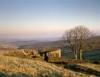
3) Sweet sky! It has that lonely feel to it. Must be the lone bird there. It's cool how the colours just blend in with each other and that dark patch at the bottom. Good job!
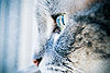
4) Okay, for some unknown reason, this one is my favourite. My eyes were immeaditly drawn to it. It has that creepy touch to it. But it also feels old.
5) I just love stain glass windows! They're always so colourful with an assormant of colours! I like how everything is black except the windows. Really brings the colours out.
6) The blurred effect of the colours in the background is nice. I like the design of whatever that black thing is. But that big wihte patch in the corner is distracting.
7) Hmm...well, it's a nice shot. It's nice and centred.The red in here is cool! It feels almost...haunted.
Overall: These are great! They're so clear and well centred. Excellent job and a gold star! Keep up the good work! Oh, can I save the skull one? I just really, really like it ^_^
Meadow


120,614 Literary Works • 651,077 Reviews
Gender:
Points: 890
Reviews: 14