z

Young Writers Society


Holiday Madness


User avatar
116 Reviews


Gender: None specified
Points: 10241
Reviews: 116
Wed Dec 24, 2008 7:59 pm
Maybe says...


Content deleted by user.
Last edited by Maybe on Mon May 23, 2011 3:38 am, edited 2 times in total.
Be the cartoon heart. Light a fire, light a spark. Light a fire, flame in my heart. We'll run wild, we'll be glowing in the dark.


User avatar
287 Reviews


Gender: Female
Points: 1650
Reviews: 287
Wed Dec 24, 2008 8:26 pm
Maki-Chan says...


These are some really nice photos. I really like them. Especially the Wall art one. I just love graphity (Wel only the ones that really look like art!) the "Stop and GO" one is really cool too. Nice use of dark and light!
check out my deviantart account ^_^
http://maki121.deviantart.com/


User avatar
273 Reviews


Gender: Female
Points: 890
Reviews: 273
Thu Dec 25, 2008 12:43 am
Lost_in_dreamland says...


Wow :shocked:
you are great at taking photos ;) You must have a natural eye. No seriously though, the first couple look holiday brochure standard. Let me explain more clearly, they look so good that real companies would use them on their brochures ;) They would.

You take photos from interesting angles too ;) Which makes them more enigmatic and pleasant on the eyes.
You have the perfect contrast too, did you edit these? Or are they exactly how they were taken?

Stop and go is beautiful, you've captured the clouds just right, everything blends together in a good way.

The wall one and the miller one, wow. They look done by a professional. They really do, how did you take the last one? I'd be interested to know. Sorry, I kind of know nothing about photograph :lol: heheh

but they are great ;)
x
for what are we without words and stories?


User avatar
1272 Reviews


Gender: Other
Points: 89625
Reviews: 1272
Thu Dec 25, 2008 2:54 pm
View Likes
Rosendorn says...


Very, very nice.

First pic- If you hadn't titled it, I would have had no idea what it was. I really like the ice in the foreground with the trees in the background.

Second pic- Sweet effect with the sun going through the fern.

Third pic- How did you acomplish that one? That's amazing!

Fourth pic- Very pretty. I like the different coloured leaves in the background.

Fifth pic- A little bland compared to the rest of them (this is the first one that doesn't have some shine to it), but still a nice play of monochromatic style.

Sixth pic- Nice abstract.

Seventh pic- Very nice silhouette. I really like it when you only see the foreground objects as black and then you have colour for the background.

Eighth pic- Interesting for sure, and the black and white makes it look really "inner city," which is probably what you were going for, correct?

Ninth pic- Cool. I like the scaling we get from the person on the sidewalk.

Tenth pic- Rather uninteresting compared to the rest of the city pictures. But, on it's own it's rather nice.

Eleventh pic- Absolutly stunning!

You, my friend, have a very good eye for photography.
Last edited by Rosendorn on Fri May 21, 2010 2:52 am, edited 1 time in total.
A writer is a world trapped in a person— Victor Hugo

Ink is blood. Paper is bandages. The wounded press books to their heart to know they're not alone.


User avatar
763 Reviews

Supporter


Gender: Female
Points: 3888
Reviews: 763
Fri Dec 26, 2008 9:50 am
Lava says...


These shots are astounding. I am forced to echo Lost_in_dreamland in saying you are great at taking photos You must have a natural eye. No seriously though, the first couple look holiday brochure standard. Let me explain more clearly, they look so good that real companies would use them on their brochures They would. "

I'm not going to praise every one of them, because they're all too good.


Here are my suggestions for improvement:

Gray Leaf : The only sort of 'not-s-good' as compared to the others. Try changing the white balance and contrast.

Millers: You should have moved the white pole thing closer towards the edge of the photo. It would make the man slightly more visible.

Art Walk: The scaling is good. But there's somethingabout the top of the picture where the wall meets the sky that seems weird. I really can't explain it in words but it seems different compared to the sidewalk and bottom of the picture.


Anyway, brilliant photos. Keep it up!
~
Pretending in words was too tentative, too vulnerable, too embarrassing to let anyone know.
- Ian McEwan in Atonement

sachi: influencing others since GOD KNOWS WHEN.


User avatar
245 Reviews


Gender: Other
Points: 2570
Reviews: 245
Fri Dec 26, 2008 1:20 pm
LowKey says...


Favorites:

--Framing the Sun

--Stop and Go

--Lounge


They're all so awesome! Wow! I mean, I'm amazed. These are really, really, really good. It was torture to pick out which ones I liked best. They're all so cool looking. The sun one, though... that required an eye, I think. How you were able to frame it prefectly... wow. I'm very much impressed. That's inccredible.
Necropolis SB / Necropolis DT

Once was Dreamer, is now LowKey_Lyesmith.

Everybody is a genius. But if you judge a fish by its ability to climb a tree, it will live its whole life believing that it is stupid.


User avatar
116 Reviews


Gender: None specified
Points: 10241
Reviews: 116
Sat Dec 27, 2008 2:59 pm
Maybe says...


Thank you all so much! :smt053

Here are a few more I took for a school project due once I get back. I had to take a self portrait, so needless to say, the girl in the picture is me. :smt001

Image

Image

Image

Image

And if any of you are wondering, these were taken with a small tripod and a 10-second self timer.

Thank you again for all the lovely comments!
Be the cartoon heart. Light a fire, light a spark. Light a fire, flame in my heart. We'll run wild, we'll be glowing in the dark.


User avatar
1272 Reviews


Gender: Other
Points: 89625
Reviews: 1272
Sat Dec 27, 2008 11:22 pm
View Likes
Rosendorn says...


First pic- I really like it! To me it represents freedom.

Second pic- It looks like you were a little slow getting in front of the camera.

Third pic- A little stiff in the posing.

Fourth pic- Something about this picture that I like. The understated calm and mystery in the pose.... I really like it.
Last edited by Rosendorn on Fri May 21, 2010 2:52 am, edited 1 time in total.
A writer is a world trapped in a person— Victor Hugo

Ink is blood. Paper is bandages. The wounded press books to their heart to know they're not alone.


User avatar
1464 Reviews


Gender: Female
Points: 15394
Reviews: 1464
Sun Dec 28, 2008 1:55 am
Juniper says...


Hey Maybe!

Brilliant photos! Great job. Amazingly done!!

My favorite in the first post is the holes. It's perfectly done-- simply amazing. I love the one of the traffic lights too.

In the second post, I love the second photo. It reminds me of southern America :D I don't know why either.


Keep it up! They're great!!

xxJune
"I'd steal somebody's purse if I could google it and then download it." -- Firestarter


User avatar
263 Reviews


Gender: Female
Points: 4362
Reviews: 263
Mon Dec 29, 2008 9:38 pm
Angels-Symphony says...


:smt040 
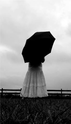
I think stop and go is brilliant! It captures the sky perfectly, it captures TIME perfectly. It looks professional. The image itself is amazing. If I were to freeze time for just a moment I'd hope for the sky to look like that. In your pictures you captured reality. The pictures are still, but the images are moving. Great Job
You cannot dream yourself into a character; you must hammer and forge yourself into one.

The writer, when he is also an artist, is someone who admits what others don't dare reveal.


User avatar
135 Reviews


Gender: Female
Points: 890
Reviews: 135
Wed Dec 31, 2008 3:05 pm
niccy_v says...


Awww, oh my! Magical!

Truly, you have them perfect. The contrast is beautiful, the effect it had on me, wonderful.

I had a real issue with the ice. It was the only one I could not manage to like... it's just that the ice is so clear, against a background that makes it difficult to determine that is really is ice.
I would suggest using a darker background, or centering the ice so that is it dominating, rather than tucked more to one side. I like it, but... just... not as much as I thought I should.
Maybe it's my obsession over vibrant, dominating images :D

As for the rest, lovely contrast, brilliant centering, the colour is amazing, and you picked very interesting subjects! I love the way they capture time so perfectly.

Keep up the good work
Writing gives my life purpose


User avatar
8 Reviews


Gender: Female
Points: 890
Reviews: 8
Fri Jan 02, 2009 7:20 pm
Behind Scene Walls says...


Those are very good but there are a few flaws,
first photo: maybe if you centered the ice more it's a little to abstract for me.

second photo: Me personally I like this photo. I think it would be better in a black and white tone because the background distracts me

third photo:I love this photo. I totally like how it is framing the sun. I think this is really cool. I like how the background is not distracting it's just the sun and the plant that you are focusing on.

fourth photo:I like how this photo is centered on that leaf and it's on top of other leafs

fifth photo: personally think this photo would have been better with a more colorful background. It'd to depressing.

sixth photo:I like this photo. I like how the brick wall is ti the left it brings out the holes.

seventh photo: I love this photo but maybe if you lightened it up a little it would be better.

eighth photo: I love this photo and the color tone.

ninth photo: I think this photo should be centered more

tenth photo:I like this photo. I like how it's centered on her because the background is only on
patteren

eleventh photo: I like how this is abstract


anyways I love these photos! Good job no Great job
Regret is the main thing you hate in a society
because you are always regretting the thing that was regretful.


User avatar
64 Reviews


Gender: Female
Points: 890
Reviews: 64
Fri Jan 02, 2009 7:35 pm
writ3rindisguis3 says...


Wow. Really good photos! :)

In the first photo, I can see your outline. I'm not sure how to prevent this, because I have done it many time, but maybe try a different angle?

I like the close-up of the leaf in the second photo. Very artistic!

I really like the framing the sun picture. Really and truly beautiful. Was this taken during a sunset?

The fourth picture is okay. Not my favorite...But...

The fifth picture is kind of bland. A gray leaf just doesn't do anything for me.

I like the sixth picture. Shows height! Great!!

The stop lights against the sky is so beautiful. Love the shadow!

I also like the last picture. Awesome!!!

That is some cool artwork on the walls. Wish I could do that! :lol:

Becca


User avatar
8 Reviews


Gender: Female
Points: 890
Reviews: 8
Sat Jan 03, 2009 1:06 am
Teardrop_on_the_fire says...


I love the first one with the icicles, I really wish I had an eye for angles like that. You really made the icicles seem like a striking border to the rest of the soft image, drawing attention firstly to the icicles.
N/A


User avatar
73 Reviews


Gender: Female
Points: 2721
Reviews: 73
Sat Jan 03, 2009 1:19 am
Confused.pirate says...


I love these!
My favorite one is the stoplights :)
"The differences in life are what create the challenges which open the door to discovery."


Why can't a full plate of food just teleport into my hands?
— WeepingWisteria