z

Young Writers Society


My Arts :)


User avatar


Gender: Female
Points: 890
Reviews: 3
Tue Nov 25, 2008 10:46 pm
jothelioness says...


Everyone else was doing it, so... ;)

Tell me what you (honestly) think and what I can improve on!


oops! have to put links to my DA because I couldn't get the pictures to wrok, sorry. ):

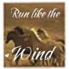
http://jothelioness.deviantart.com/art/Horse-93694473

http://jothelioness.deviantart.com/art/ ... -103345768

http://jothelioness.deviantart.com/art/Teaser-100006289
I am the kind of girl that can watch any horror movie without getting scared...
but screams like an idiot when the waffle pops out of the toaster....


User avatar
6 Reviews


Gender: None specified
Points: 890
Reviews: 6
Wed Nov 26, 2008 4:26 am
andfromnowon says...


I personally believe that you would do well to pay attention to the spaces that you're subjects inhabit. The dog and both horses are sort of floating off in oblivion; next to the very detailed figures, the sparse backgrounds are very distracting.

I feel that your overall drawing skills are great. You seem to pay a very nice amount of attention to structural detail, and that is tres cool. I like the "Teaser" drawing you did- the horse looks very nice and there's a lot of specific detail, but it seems that his proportions might be a little bit off. I don't really know horses, but the head seems a little big. But then again, I don't really know horses.

I feel like you could push the tonal values a little more in the "Horse" drawing. The bare bones drawing is nice, but it has a definite textural and tonal sameness to it. You might want to try pushing the darks in your shading a little more. It seems kind of weird that the horse is the same color as the background. Also, the shading seems to imply it has some sort of otherworldly halo/glow...Holy horse! xD

In both the "Horse" and "Monochromatic Dog" drawings, you have a square and dead-center composition, and I feel that a different sort of composition or presentation might help your images more. There's nothing inherently wrong with the compositional choices, but to me they're rather chilling- disembodied animal heads in space.

But I like your artwork. The Doggy's picture is very sweet, but imo it can't compete to the picture of the horse with legs. Hope you finish it. Good luck, and I hope that I was able to help you.
Yvan eht nioj!


User avatar


Gender: Female
Points: 890
Reviews: 3
Wed Nov 26, 2008 2:24 pm
jothelioness says...


Wow, thank you for your great advice!

By backgrounds, I am thinking you mean you want actual objects/landscaping for a change? Or perhaps I need to suggest the rest of the dog's form with some paint or something?


I totally agree with the horse head; he lacks any tonal value and blendsin with the back, and looks like part of the background. Poor fella. ;)


Thank you, very, very much. This tips will help me alot!
I am the kind of girl that can watch any horror movie without getting scared...
but screams like an idiot when the waffle pops out of the toaster....


User avatar
118 Reviews


Gender: Female
Points: 2374
Reviews: 118
Fri Nov 28, 2008 5:37 pm
myfreindsavamp says...


The horse's head seams to be a bit big for it's neck. Maybe make it bigger somehow.

The dog is beautiful. I like that it's all done in black. It makes it pop out more.

I love the teaser too. It's beautiful. *As you can tell I don't get out much.*>.<

All in all your a great artist.
We've all been broken in some way. It's just how we express it that makes us dffrent form eachother.

“This precious book of love, this unbound lover,
To beautify him only lacks a cover.”
~William Shakespeare, The Tragedy of Romeo and Juliet


User avatar


Gender: Female
Points: 890
Reviews: 3
Fri Nov 28, 2008 6:55 pm
jothelioness says...


Thank you!
I am the kind of girl that can watch any horror movie without getting scared...
but screams like an idiot when the waffle pops out of the toaster....


User avatar
273 Reviews


Gender: Female
Points: 890
Reviews: 273
Mon Dec 01, 2008 6:10 pm
Lost_in_dreamland says...


*claps and bows* :lol:
I really love these, you're so talented. I'm not too sure about the proportions but I don't think they're bad or anything, maybe just need a little bit of fixing. I'm not very good at art, so I can't offer you much besides praise. Wow! I love these! You should post more for us un-artistic people to dwell over your amazing-ness :lol:
I especially love the second, although I'm not really sure why, I just love the style you've used in it. When you post more pm me so I can see them :lol:
I love these! *clapping manically*
- Kirsten xxx
for what are we without words and stories?


User avatar


Gender: Female
Points: 890
Reviews: 3
Wed Dec 03, 2008 1:58 am
jothelioness says...


Thank you. You're too kind! I've got a lot of room to improve, but I feel like I'm kind of heading in the right direction!
I am the kind of girl that can watch any horror movie without getting scared...
but screams like an idiot when the waffle pops out of the toaster....


I have lived through much, and now I think I have found what is needed for happiness. A quiet secluded life in the country, with the possibility of being useful to people to whom it is easy to do good... then rest, nature, books, music, love for one's neighbor - such is my idea of happiness.
— Leo Tolstoy