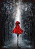
This started out as Liv Tyler. You know, the elf girl from Lord of the Rings? You can definitely see it in the face shape. But then, as I was sitting there almost 1 in the morning drawing this, I realized that there was no way I could get it to look like Liv Tyler. So then I started adding my own things and changed her up a bit. I like the way she looks. So far, I think this is one of the best things I've ever drawn. My scanner did it some justice too! I had no idea it'd pick up on the darker parts so well, but it made everything darker, which added a really nice effect. I'm trying not to have a 'squee!' moment here. There still are a few mistakes. Like one eye has a lumpy thing, which I've fixed now but I didn't want to rescan the picture. xD
Attachments
Scarlett-1.png (561.02 KiB) Viewed 425 times
eviscerate your fragile frame spill it out in ragged form a thousand different versions of yourself.
You did her hair and face great. Your shading is very good. the only piece of advice I can give you is put some wrinkles on her shirt sleeve. (I know that no matter how much I try to get a wrinkless shirt that alas, it can never be done) Anyways agian great job and I commend you on your drawing. You paid quite a bit attention to details. You did a great job here. Good luck and keep drawing. *gives applause*
As your pretty, so be wise, Wolves may lurk in every guise.
A good drawing. -applause- but she has an unrealistically long and uh, skinny nose.
The proportion is off, her head's too big, and her shoulders are way too small, not broad enough. And her face is extremely narrow. If it was wider and her nose wider, and her shoulders broader, the detailing on the shirt's cuff/the lace was less, uh, scrawled looking, this would be the most accurate realism I've ever seen. You can do a little better with the above, but I don't want to sound too harsh-you're a really good artist. And the thing with the wrinkles, also, as the person above mentioned. Also, there's this lack of cheekbones to be concerned with...make a little ridge thing between the highlights and the shadows. And the wider face/shoulders thing, I'd like to stress. And nose. If you do that, she'll be perfect. Absolutely perfect. I'm an artist too, so I know how hard those things are to get right.
I love her hair; the way you did the individual locks and the little tendrils, I envy that part-so much. And the hightlighting is wonderful. Your shading is impeccable too. Keep drawing!!
This is good and I can definalty see the Liv Tyler influence in there
I agree with Vox about the nose thing it is a little unnaturally long, and the left eye needs shading around the pupil, you did it on the other it just dosen't look as deifned on that one.
I love the hair, when I draw I always get fed up with the hair and end up scribbling which is never good so well done o nthat! For the highlights did you just shade lighter or rub bits out? It looks really good whatever you did, very effective!
How lovely, we're doing portraits in my drawing class right now and I must say this is quite lovely. I think she has a good quality as far as shading and rendering that gives it the look of realism but it also has a very expressive feeling.
My only qualms with this are her right eye (the iris and pupil) are to far to the right. It makes her look goggle eyed a bit.
I think her shoulders are fine, simply because it looks as if she is tilted in her stance and her head is just facing forward.
A good thing to remember when working on the nose, eyes and mouth is this:
the eyes should be exactly one eye width apart from each other.
the edges of the nose should line up with the inside corners of the eyes.
the corners of the mouth should line up with the center of the pupils.
That's how my art teacher taught us the proportions of the face.
"Maybe Senpai ate Yuka-tan's last bon-bon?" ----Stupei, Ace Defective
Nice job. The shading for the face was amazing, I love the way you drew her hair. Her lips are also really nice too, and her eyes have feeling in them. There are only two things tha need to be changed.
1. The nose, it seems strait and well, just drawn on there. (If that makes sense) I have problems with noses too, maybe you shouldn't draw the entire nose, from top to bottem. Maybe just the top part and the bottem part. Just to make it look better. ^_^
2. The clothing. It looks flat and plain. You need to ad wrinckles and shading. To make it look more like real clothing.
Other than those you did a really great job. I am very impressed ^_^


Gender:
Points: 3214
Reviews: 137