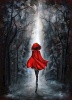
Something I drew while staying up very late... past my bedtime. -cough- Anyhow, I'm beginning to curse my scanner because it used to make it so big and now it makes them super small. Ugh. So, she turned out a bit more cartoonish than I'd imagined, but I like the overall look. The rock, surprisingly, was harder to draw than the main part of the drawing. Sorry you can't see her nose. Stupid scanner...
Attachments
Girl on the rock2.jpg (14.72 KiB) Viewed 418 times
eviscerate your fragile frame spill it out in ragged form a thousand different versions of yourself.
I think this overall looks really nice! You have a lot of artistic potential, and I definitely think art is something you should focus on. I like the form of her body, and the proportions are all right. The details are good too, but then that takes me to some helpful criticisms...
Try to be more bold with your lines. Darker lines, with shading and outlining, look better and allow the picture to stand out more. Also, as for parts of her anatomy that are off, her feet look a bit strange - the foot in the back is kind of at a strange angle and there's something about it that seems off.
This is still very nice, and I give you a big star. Keep drawing!
This drawing was really good, and I agree with Clo about the shading. It will just add more depth to your drawing.
I think her feet look a little strange because they're a little on the small side. I'm not sure.
Her head is sort of at weird angle. Her neck looks like her head should be facing forward, but it's not. Profiles are hard to do, I know, but it looks like her head is just sort of resting on her neck.
Her skirt really caught my eye. The folds and waves in it were very interesting the shading was good.
You might put some more stuff in the backround, though.
The rock does look beautiful, and it's obvious you spent time on it:P! hahahaha;)
Yes, this is a good piece, overall, though I must say that it is a bit cartoonish, as you mentioned. Try shaping the lips differently and making the head a little less to the side and I think you'll have it how you may have wanted it. I like it though. It;s pretty and simple. Toodlez!
0(o.o)0
I will review for you! PM about it if you need one!
OKay, I think you do need more shading and as mantioned before it does add depth. The face in my opinion needs more than an oval shape. Her hair looks like an outline that was just colored in. Let it go everywhere, the wind isn't going to blow it just right. I think that you could add some wrinkles to the shirt, because realistically, it would be. Overall my nitpicks, it is a pretty good picture, especially because of your age. Please dont take my critique too harshly. It just things take time. I had to learn them myself, and believe me, shading is a big part. Good luck and keep drawing.
As your pretty, so be wise, Wolves may lurk in every guise.
This is simple and sweet but you have some issues here with the girls body, her feet for a start are wayyyy too small! And her face dosen't look very realistic. Other than that I like the hair the the shading you have used, and If you say it was supposed to be cartoonish then it dosen't matter if some of the features aren't seen properly
make her hair less flat. if it's windy, her hair should be going about more. and its too flat anyhoo. give it LIFE, my friend.
aaannd like other people said, you need diffferent graded pencils. get yourself 4h-8b. the ones higher than 4h are pointless. But the darker pencils will totally radicalise your drawing, mon.
xxxx
I just hit my computer
Because it was being slow
I need my daily Smallville fix
And it will not load the video.


Gender:
Points: 3214
Reviews: 137