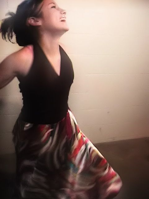
The grainy-ness of the picture detracts from the overall effect. You can tell your friend is really enjoying herself, but the blurriness of the picture doesn't give you the clarity I'd like to see in a picture like this. In addition, the background leaves something to be desired.
And now the second:
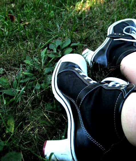
Amazing! The only thing i would recommend is to put it in black and white to sharpen the contrast between the grass, the shoes, and your legs. Nice job.
I dream of a better tomorrow where chickens may cross the road without having thier motives questioned.
I agree with Chosenofair - your first picture would be beautiful if it wasn't so grainy. I've battled the bad-equipment bug myself, and I have to say that photography is a little dependent on it.
Beyond that, your first picture is beautiful. I really like the colors in the photo. The girl seems so happy! It kind of makes me want to hop up and dance with her. And if the quality was better, the motion blur of her moving skirt would be simply awesome.
The second photo: I like it. It's fairly cute. I think you should find some better grass to take it by, though - the leafy weeds are a little distracting. Good framing, though, in my humble opinion. The black-and-white idea is good, although I think it would look better with simply 50% saturation.
"...I laugh, and laugh, and laugh. Sometimes I can stop laughing before people start edging away and talking about soothing drinks." - Lord Raould of Goldenlake and Malorie's Peak
i didnt really like the first one
like someone said before it does look grainy
plus the background and the floor make it look like you were in a basement
or garage thats not a bad thing but a better background would make it look better
the second was I good idea alot of people tend to do that where they take a picture of their shoes
then realize it was actually a really nice picture
i do have to say one thing... where in the world did you find those shoes
hey now, the first picture is just really awkward. her pose is funny, the lighting is bad and you really could have picked a better place to take the picture. (sorry for the harshness) the second one looks ok, but there is something about it that just doens't seem right. i will admit, it is kind of cool, but i think that you could have put it at a better angle or something. these have real potential and i think with the tips that everyone has givn you, you could make these look really cool


Gender:
Points: 2384
Reviews: 107