Hi there! I think my main problem with these is the color and tone of the images. The sky is all white and washed-out...what is the white balance on your camera set for? I think these could also do with a basic workflow in Photoshop to improve the tone.
A problem also in images 1, 2, and 4 is that your subject is lit from behind! How are we to see her face if the sun is behind her, eh? Consider when you're shooting where your light is coming from and what effect it's going to have on your subject. You can definitely use the landscape more to your advantage. Try also using the frame of the image more to your advantage. Either fill the frame with your subject or zoom way out to make her a part of the landscape; a lot of these seem very awkward for portrait shots.
-Colleen
"My pet, I've been to the devil, and he's a very dull fellow. I won't go there again, even for you..."
these pictures are pretty good 1) on this picture i think that you could have done something different with your hands. it looks like you aren't looking at what your hands are doing, so it looks like they are just there.
2) i think that on this one, if you would have just had your hands holding the flowers, then it would have looked better. also, the finger nail polish is chipped a little. i know that i am getting picky right now, but it would have made the picture look better because the chipped nail polish take away from the picture.
3) ithink that you should have found a straight tree that would have covered the whole other half of your body. that would have made the picture have more of an edge to it.
4) these next two pictures look really similar to eachother. i think that on the 4th picture you should of had her walking away from the camera with her head up, and for the 5th picture you should have had her head down at an angle instead of straight down.
these pictures are great but they just need little work.
hope this helps if you have any questions please pm me
I love them so much!!!!!!!!!!!!!!!!!!!!!!!!!!!!!!!!!!!!!!!!!!!!!
It looks cool and you have a great sense of style, if thats you. I like the one where your standing next to the tree, its abit synester on the pretty side is you get what i mean.
Also you are very pretty.
*Huggles*
Rebbecca
Every rose has it's thorn.. Just like every night has it's dawn.
I've matured a lot and I realised it was time to come back.. for good!
i think that the ones without the flwoers with just the girl standind would be much more effective in black and white. The ones with the floers benefit more with colour as hey, the flower is such a pretty yellow
I do think though you may need a bit more variety in the girl shots as she isn't really doing anything apart from standing there and behind trees, which we have seen a lot of in photography, try to think of something to make it more original, and these will be much much better
Like Cade's already said, the sky is a major problem in all the shots. Can you re-take them on a blue-sky day? The pictures look over lit-up and the sunlight kinda bleaches the tree tops.
The flower pic needs perfection with the nail-polish.
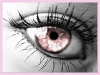
For #3, I wish the other eye is half seen too. Something tells me that it'd be a cooler effect.
And for variety, maybe a different location would be helpful with another costume for the girl?
Oh, off-topic blabber: the girl's outfit is awesomely adorable.
Calvin : You can't just turn on creativity like a faucet. You have to be in the right mood.
Hobbes : What mood is that?
Calvin : Last-minute panic.
I love like, the sense of space and freedom and how nothing is especially perfect but it's alot more, I dunno, real. When I look at them I can imagine what the weather must have felt like and stuff.
People are saying it would look better if you did up the nail varnish, but I think it would be better to just get rid of it; the blackness just kind of goes against the natural aspects of the rest of it. I love the landscapes, but I think you need to get different, happier lookin' clothes. To fit in with the whole out doorsy aspect of it.
I would kill for your hair, btw.
xxx
I just hit my computer
Because it was being slow
I need my daily Smallville fix
And it will not load the video.
For beautiful eyes, look for the good in others; for beautiful lips, speak only words of kindness; and for poise, walk with the knowledge that you are never alone. — Audrey Hepburn


Gender:
Points: 890
Reviews: 17