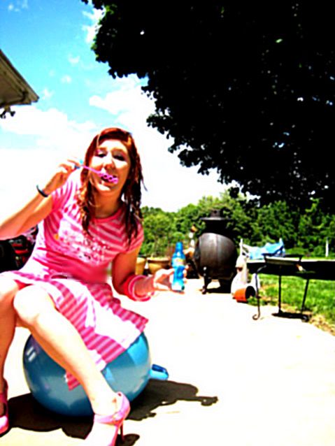
Picture 1: I don't like this. It's just... not very well taken, I guess? But I've never critique any photos before, so this is probably completely useless. There is just a lot of distracting things in the background.
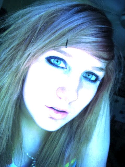
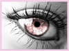
Picture 2: This one was the best. I love it. Your hair is awesome, except for the little (bobbypin, isn't it called?) in it. It's kinda distracting.
I wouldn't really say the second one really counted as art. It's just a photograph you took of yourself, and you see plenty of those on the internet. Compositionally its just not very exciting. Your hair is nice though
The focus is a bit off in the first one, but I do like the composition. Its fun, and the bright colours really suit it. I love your shoes, they're awesome! They're a good attempt, but I've seen better. x
"Sometimes we see a cloud that's dragonish,
A vapour sometimes like a bear or lion,
A towered citadel, a pendant rock,
A forked mountain, or blue promontory,
With trees upon't that nod unto the world,And mock our eyes with air.."
The first picture: Like Muse pointed out, this is not a very good picture. It is extremely blurry and way out of focus. But on the brighter note, it looks like you were having fun in the picture.
The second picture: I like this one. You're very pretty. You captured the light very well.
I agree with Jared, the first one...isn't all that good. I do like the second one though, I really didn't notice the bobbypin at first, until I read what Jared said.
Nice, ^_^
~Arris~
[Griffinkeeper] 10:45 pm: The guard appears "We have weasels now!" [Firearris] 10:45 pm: askes the guard for the weasel! [Griffinkeeper] 10:45 pm: The guard gives Firearris the Weasel. [Firearris] 10:46 pm: aquires the weasel and renames it "Cat" Take that, Lumi.
first pic: I disagree with the other's comments. I think it has quite a bit of potential. I think if you were a bit more centered it'd be great. The thing is, is that my eyes tend to stray towards that blackish brownish blob in the back (I'm trying to figure out what it is. It reminds me of an elephant butt o.O) So if that wasn't there, I think it would be better, because the coloring is fantastic! It really does give it a retro type of feel, expecially with your outfit on. I really like it.
second pic: This one, I completely dissagree with this not being art. It may be a pic taken of yourself, but it's the lighting on you that is turning it from just a plain picture of you. The way the lighting is reflecting off of you and turning it kinda purplish is a really neat affect. And your face is almost whited out except for little bits which adds a little bit to the photo, and draws the attention to your perfectly there eyes. The bobbypin does affect the photo a little bit, I agree with bigbad on that one.
Yeah, overall, I do like them. They each have a little flaw, but not everything's perfect.
--meow
Climb inside my belly button beanbag plastic world!
I love your shoes in the first one! GORGEOUS! I actually really like the first one, i don't think that there is anything wrong with it. Despite what other people think, i think that the background is pretty good and it isn't distracting at all. I think it actually makes you pop out more. This could so be and ad for a perfume!
I love your eyes in the second one! So intense! But it's not really creative, it's just a nice photo of youself.
And i know this has nothing to do with the picture but i love how you the smokey eyes and then an almost nude lip, this would look reallly good with a sun-kissed cheek or a very pale pink cheek! And also you look better blond!
Nilou
"Security is mortal's chiefest enemy"- William Shakespeare
Oooh! This is new and rather interesting! I haven't seen stuff like this in other art and photography forums. And I like it better than the Andy Warhol pop portrait of Marilyn Monroe, too .
In the first one the girl (who I should probably assume is you) and the overall background is nice but there are somethings in the background that kind of distract you from what is overall a pretty good picture. There is what I believe to be a grill, a wooden desk and some toys. Wait, is that thing an iron bull or a grill? I don't know. But either way they are only minor adjustments and I think they can all be moved.
The second one I wouldn't change a thing about. There are no distraction, the coloring is amazing, the girl is pretty; it's just all-around nice.
Oh, and one more thing; with pictures like these you really should have made a couple more pictures like these and posted them.
Well, that's my crit! 0(o.o)0
I will review for you! PM about it if you need one!
I see what you were going for in the first one - bright colours, pumping up the contrast to get the pop art feel. But pop art is usually in sharp focus. This is very blurry, and it makes it hard for the eye to settle on anything. However, I think if you took it again, with the girl in focus, and perhaps less things littering the background, it would be good. It's got a good composition, and the fun feel to it.
For the second, it just looks like a MySpace profile picture. Which is fine, but I think that the contrast needs to be taken down a step.
1) I think that all of the colors on this one really made it look....cool. The way the picture was taken really added some edge to it and I like the composition of it.
2) I think that this looks like any other picture of a teenage girl. You could find these anywhere so it just looks like another picture. If you want to take a picture of yourself and make it art, then make it pop like the first one.
Out of the both the first was my favorite! I love the shoes and awesome colors in it! You should do more like that!
1. I actually really like this picture. The colors are fun and bright, I love how you're balancing on the ball with your knees bent in and blowing bubbles, and I just like all the roundness of the objects around you, from the stove to the ball to the bubble-blower, and the contrast of all the stripes. Some really cool stuff there!
2. This picture... well, the hair looks interesting, but the colors look weird and not right. And, no offense, but this looks like a myspace picture and it doesn't really seem very artsy. So yeah. :/
The first one wins the world!
Ubi caritas est vera, Deus ibi est.
"The mark of your ignorance is the depth of your belief in injustice and tragedy. What the caterpillar calls the end of the world, the Master calls the butterfly." ~ Richard Bach
the first pic is pretty cool
did you photobucket on it?
and the second picture i love!
your hair looks soooo cute
"isn't it supposed to be like this? the glory of first love, and all that. it's incredible, isn't it, the difference between reading about something, seeing it in the pictures, and experiencing it?"---twilight
He began to wonder why he had felt uneasy at all. It was like a man wondering in broad daylight why a dream had appeared so terrible to him at night. — Chinua Achebe, Things Fall Apart


Gender:
Points: 2384
Reviews: 107