z

Young Writers Society


Character Designs


User avatar


Gender: Female
Points: 300
Reviews: 0
Wed May 14, 2008 11:06 pm
Silverwit says...


http://fc05.deviantart.com/fs26/i/2008/ ... verwit.jpg
http://i57.photobucket.com/albums/g220/ ... 001-30.jpg

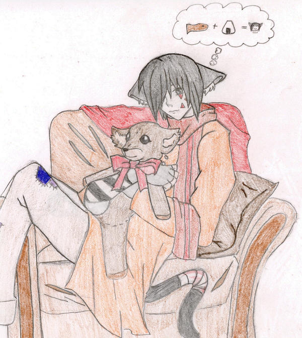
This is Jing. :3 He is one of the main characters in a series of fantasy stories I am working on. He is one of my favorites but probably the hardest person to draw. I am still working on his color scheme and the different outfits he would appear in through out the books. By the way, he is tan...not pale skinned...the scanner faded it.

http://fc07.deviantart.com/fs27/i/2008/ ... verwit.jpg
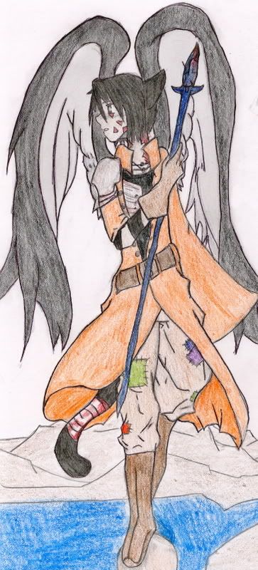
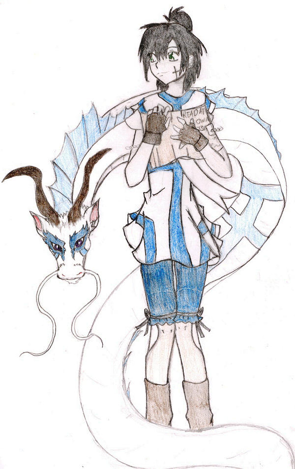
This is Haven. She is also a main character...and one that I have yet to work out all the quirks in. The dragon is named Tirian.

Tell me what you think of the designs. I know I am not the best drawer and made plenty of mistakes. >.>


User avatar
721 Reviews


Gender: Female
Points: 7241
Reviews: 721
Thu May 15, 2008 3:12 pm
Azila says...


Drawing #1>> Very nice! I don't like that the legs are cut off, but that's probably just your scanner. Also, it kind of looks like he's not wearing pants, which makes the patch look REALLY weird. :lol: Maybe try making the pants a bit baggier? Also, I love the teddy bear, but the arm that is holding it (the boy's right arm, I believe) looks like it's coming out of his (the boy's) ribs. That could just be me, but that arm looks awkward. And what's that coming out from behind his head?! It almost looks like a hood, but I'm not sure... :?

Drawing #2>> Wow! The pants are soooo perfect! The wrinkles, and patches, and everything. Good job! The only awkward part is the boots (they look a little too stiff). Other than that, though, this is really good! The hand, the face, the coat... all very, very well-done!

Drawing #3>> Haven looks a little awkward. Her hair is perfect, but I'm not so sure about the book she's holding to her chest... it looks a little too flat, and it looks like it's sticking to her, almost like clothing. Her legs look a little strange as well. but that might be intentional. *shrug* The dragon's great! I love the fact that you didn't do too much detail on it.

Overall, you definitely have a knack for that anime/manga style! Keep it comin'.

~Azila~


User avatar
368 Reviews


Gender: Female
Points: 1125
Reviews: 368
Thu May 15, 2008 3:30 pm
View Likes
Shine says...


Drawing 1:Thats I think is cool.The detailing has been done nicely.

Drawing 2:The outfit is perfect.I wish the head of the weapon had some definite shape or a structure signifying something,i don't like it being of a crooked shape instead it perhaps can have a nice shiny edge or something.I just am giving my views on what may look good.Thats your idea ofcourse and it isn't at all bad.

Drawing 3:This one is the best I think. The design is superb.I think the dress you made is nice and teh creature behind is even better.Atleast I think so.Trying thsi character out with other colors can be intresting.

The designs of the character are definitely appreciable.Well done!
"A good plot is like a dream.If you dont write down your dream on paper the moment you wake up,the chances are you'll forget it and it'll be gone forever"-Roald Dalh.


User avatar
2631 Reviews

Supporter


Gender: Female
Points: 6235
Reviews: 2631
Thu May 15, 2008 9:15 pm
Rydia says...


1. It would be better if part of the drawing wasn't missing but I like this. The hair is a bit too smooth - but then that's anime for you - and your shading needs work. You need to ad definition to this; shadow and tone so that it looks more 3D. Also, the teddy's leg is very flat and a little long and the thought bubble is a touch unclear - what's the second picture? On a more positive note, I think the clothes are very well drawn and the chair is good.

2. The same comments apply as to your shading and I think he looks a little slim here but the clothes are excellent (other than the boots which are a little flat and need more detail) and I love the wings. The water and background in general could be improved; try to make your lines smoother, water isn't straight.

3. This one is easily my favourite. Her hair and face are very well drawn and the outfit is lovely. The book is a little flat, maybe draw the thickness of the pages to give it some depth, and her knees are strange. Is there some sort of white part of the trousers or something? The things that look like petals. Those need work. Also, the dragon looks great. Shading could still be better but in general, I like it.
Writing Gooder

~Previously KittyKatSparklesExplosion15~

The light shines brightest in the darkest places.


User avatar
411 Reviews


Gender: Female
Points: 1040
Reviews: 411
Fri May 16, 2008 12:52 pm
Sohini says...


Great job!

Those are really nice drawings with fresh expressions and postures. The colours are new types too.
I adore the way the dragon (is it a water dragon?) is spiraled around its owner.

My favourite is Haven too. Love her attitude.
Calvin : You can't just turn on creativity like a faucet. You have to be in the right mood.
Hobbes : What mood is that?
Calvin : Last-minute panic.


User avatar
28 Reviews


Gender: Female
Points: 890
Reviews: 28
Sat May 24, 2008 1:42 pm
tdownes says...


I don't really have any interest in Anime/Manga, but it's clear you know what you're doing with that style. :D

1st drawing: The body doesn't look out of proportion in any way. You've got the folds and creases of the clothes perfect. I love the teddy: it's got this innocent look about it (and that it looks like its got this canine-ish look about it)! You could use different tones of the pencil. although (or slightly different shades of the colours you're using), this would build up the anatomy and make it look a tad more 3-D

2nd: I love the way you've drawn the wings: the way they're not too detailed is effective. You could do with making the weapon a little more 3-D - shade in the right side darker than the other -works for me!

3rd: I LOVE THE DRAGON!!! Ahem. :lol: Yes, the whiskers on its snout and the mask-like markings/patches surrounding its eyes are decorative. Plus, I love the colour blue. The sail-like protrusion running down its back is cool.
Is the dragon, like, a guardian to the girl in the picture? 'Cos it gives off that aura, to me...

Altogether... c'est fantastique!

Helpful tip: I know you've drawn in the folds of the clothes, but what wolud make it even better is if you shaded in the folds (with the same colour used for the garment ,is best), and go about 1mm past the edge of the fold
when it coming towards the garment, not away from it.
It really works, Trust me.


User avatar
1176 Reviews

Supporter


Gender: Female
Points: 1979
Reviews: 1176
Sat May 24, 2008 1:53 pm
Twit says...


The first is pretty good, just a bit squashed. The second is the worst, as it looks quite flat. The third is the best, as the girl looks great and the dragon is fantastic, though it perhaps needs more shading to make it more 3-D.
"TV makes sense. It has logic, structure, rules, and likeable leading men. In life, we have this."


#TNT


The most important thing is to have fun! Stress makes for distress and neither of those belong in writing!
— Kaia