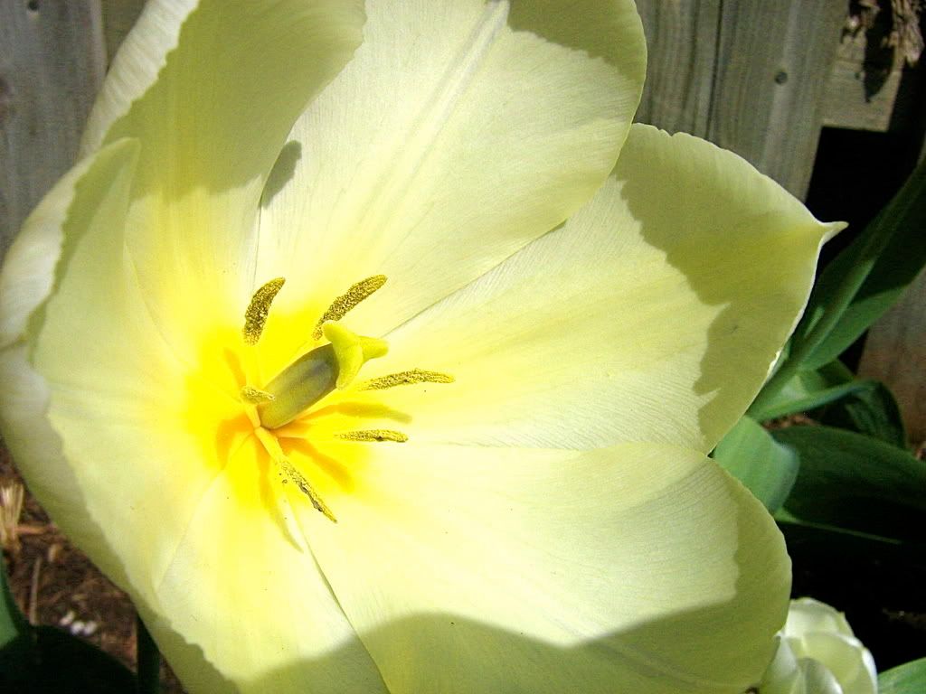
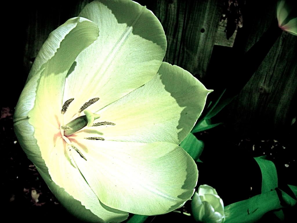
Ohh pretty!! I'm a sucker for flowers . I specially liked the first one. The yellow in the middle is very bright and cheerful, though I don't like how the rest of the flower looks so pale. The wood in the background also diminishes the effect. But it still looks beautiful. The second one... I have to admit I'm not too fond of that one. Perhaps the quality isn't that good thats why, I can't seem to point out exactly why...
I'm a godmother, that's a great thing to be, a godmother. She calls me god for short, that's cute, I taught her that. --Ellen DeGeneres
I really like the second one. Even though the quality is sharp, it has a sci-fi grainy look, to me anyway. It looks plasticy, and modern, like a solar panel thing in a futuristic movie. XD
I like the top one as well, but I think you should crop it so that the flower is centered. The yard behind it is too busy, and doesn't add anything to the overall composition. Is there a way you could brighten it up? The shadows make it look a little dreary.
Flowers in general are pretty, but I see a lot of photos of them so they get a bit boring. Do you take pictures of other things as well? If so, I'd love to see them. PM me if you ever need another art forum critique!
Jennafina's Love Your Body Already Dammit Campaign
I agree that the first one would look better cropped. The colour of the flower is gorgeous though! I think that you could maybe dim out the whole background so it doesn't retract from the main focus and it would create a nice contrast.
With the second, I love the sci-fi aspect to it and the background is great, how you've picked out the green in it and the bit of leaf in the top corner, the leaves across the bottom corner. All very pretty. The touch of pink in the centre of the flower is fantastic and generally, I like this one much better.
This is a gorgeous flower, but not really a unique take on it. The background is too busy, and the flower seems almost washed out-looking to me. The angle is also lacking. It looks sort of like the camera was just shoved up into the middle before the picture was taken. Generally, it's like I'm seeing too much of the flower and at the same time not enough.
So like Jennafina said, everyone sees a lot of flower pictures, so you really have to do something/find something to make them stand out from the crowd. The effects on the second picture are neat, but I still have the same problem with not being able to see enough detail in the center of the flower.
Nevertheless, it is still a purdy flower, so thanks for posting it.
Got YWS?
"Most of us have far more courage than we ever dreamed we possessed."
- Dale Carnegie
Ye, I would suggest cropping them both, as even in the first one, I feel they are lost. The first is very pretty, but a bit bland also. Focusing it a bit more on the flower could resolve that.
I am picky about pictures of flowers because they are so common, you see. The second one... is interesting but it lacks colour. I think improving the contrast may help to resolve this issue.


Gender:
Points: 890
Reviews: 26