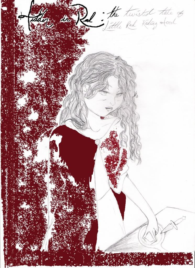
This is the cover for my story Hidden in Red (posted in the fantasy section). It's Little Red in her Grandmother's room at the end of the story. Yeah, I was messing around on the computer and liked how it turned out, though I never finished going over the title. The Red is supposed to be the only color on the cover.
Climb inside my belly button beanbag plastic world!
I like the way the red sort of takes over from one side, but you could use it a little more sparingly--use it more on her body and around her, I think. The title "Hidden in Red" should be easier to read, I think--either larger or more white space around it. You should go over the drawing in a darker/heavier tone as well.
"My pet, I've been to the devil, and he's a very dull fellow. I won't go there again, even for you..."
the only thing id fix on this is her left cheek, the one thats on the side wehre teh red is. it looks a bit big to me. id take it in a bit. but othe rhtan that its really good.
I agree that your font needs to be clearer and maybe outline the girl's body with either black or red - the pencil looks a little unfinished or unprofessional.
The idea of just using red is pretty cool and stylistic but it doesn't quite work. Maybe if you coloured the whole picture in different shades of pale red as a sort of under-tone and then draped the darker, blood like red across? Also, I think you should try to make it a little more like blood rather than 'spray' if you know what I mean.
The drawing in general is quite well done, though I think the head is a little large for such a slender body and she looks quite old... was that intentional? The mirror needs to be just a touch more symmetrical - the handle should be further left so that the angle is correct, that or it could be positioned ten or fifteen degrees further clockwise.
This picture is very well done, in spirit. The pencil work is great, for the most part, and the idea is excellent. Your execution, however, could use a little work.
Take this, for example:
Her fingers are misplaced. Her middle finger is her longest finger, no? So the fact that middle finger is below her index finger means that the index finger is actually hovering above the mirror--you don't want that, I'm sure. Furthermore, the last two fingers of the hand are overlapping the middle finger, which you also don't want. If you don't get what I mean, go ahead and pm me and I will see what I can whip up to explain better. Her hand is also extremely small compared to her face.
The face is probably too wide. I would slim down the right side (looking at her) of her face, and perhaps shorten the jaw line on the left side.
As for the colors: Listen to what the others have said. Good advice all around. I think you should definitely go over the pencil work with ink, so it looks more clean, more crisp, and so that it doesn't get lost in the boldness of the red.
Work on it. Revisit it. Detail it. It'll be excellent with time.
--King
“Yesterday we obeyed kings and bent our necks before emperors. But today we kneel only to truth, follow only beauty, and obey only love.”


Gender:
Points: 1683
Reviews: 121