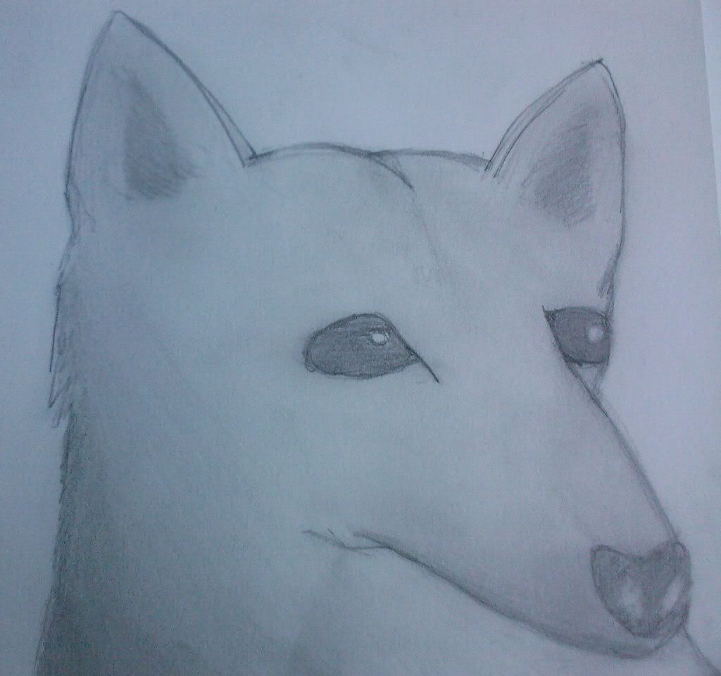
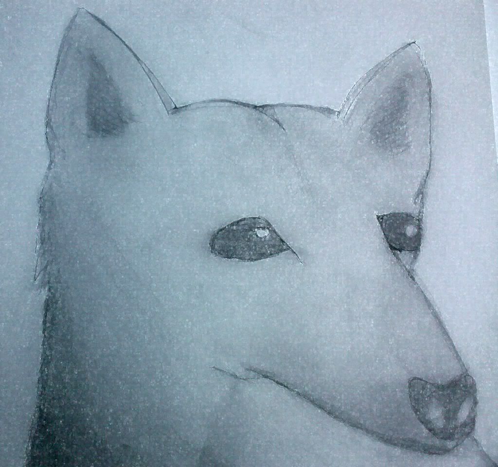
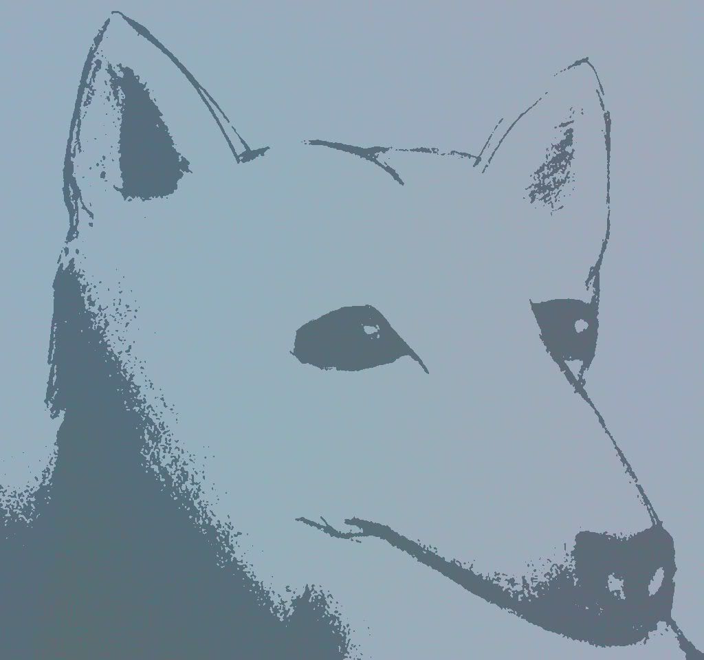
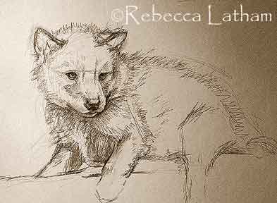
Hiya! I did thiese partly for my novel, and was inspired by the 'Save the Wolves' usergroup that I joined. The first is the original that I drew, and the others are computer changed versions.
I like the splotchy-effect of the second one (as does everyone else, apparently ^_^).
But they all seem a little bit... surreal. One thing, (the major thing in my opinion) is the fur issue Sleeping Valor noticed... your wolves look like dolls. Another factor is that the nose is too long (as Izzyeyore said). Another thing is that the eyes seem a little too big and not shiny enough.
What you have here is a nice, clean start. Work on the fur and it will be really nice!
My favourite is #3; it looks sponged on. Very cool. ^^
I agree with Azila that this is a good, clean start. At this stage, it's easy to add things to give the drawing more substance, like fur.
Some points for your consideration...
- I think you should go over the eyes with black pen/outliner to make them look more shiny and realistic.
- The nose is a bit too long, I'm afraid. It looks too sharp and not very canine... wolf muzzles are long, but kind of blunt at the end, more rounded.
I really like the nose, though. Great job there -- it looks quite realistic.
Overall, I think these are good drawings. A bit bare at the moment, but it won't be too hard to add fur and shading, right?


Gender:
Points: 890
Reviews: 370