Last edited by whence on Sun Mar 08, 2009 10:21 pm, edited 1 time in total.
The good parts of a book may be only something a writer is lucky enough to overhear or it may be the wreck of his whole damn life — and one is as good as the other.
Ernest Hemingway
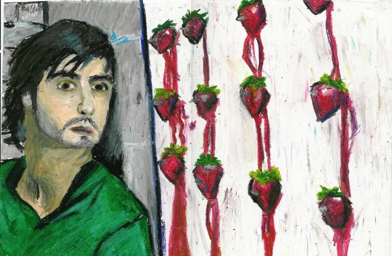
Haha, when I saw that first one, my head exploded and screamed, "Across the Universe!" It could have used some brighter color, especially on the strawberries. And Jude's head does look a little misshapen down at the chin, as Matt pointed out. I also think his hair looks funny. As in, not real.
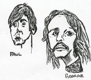
The last is my favorite, but I am fond of the Beatles sketches. It's like the album cover of Let It Be, right?
-Colleen
"My pet, I've been to the devil, and he's a very dull fellow. I won't go there again, even for you..."
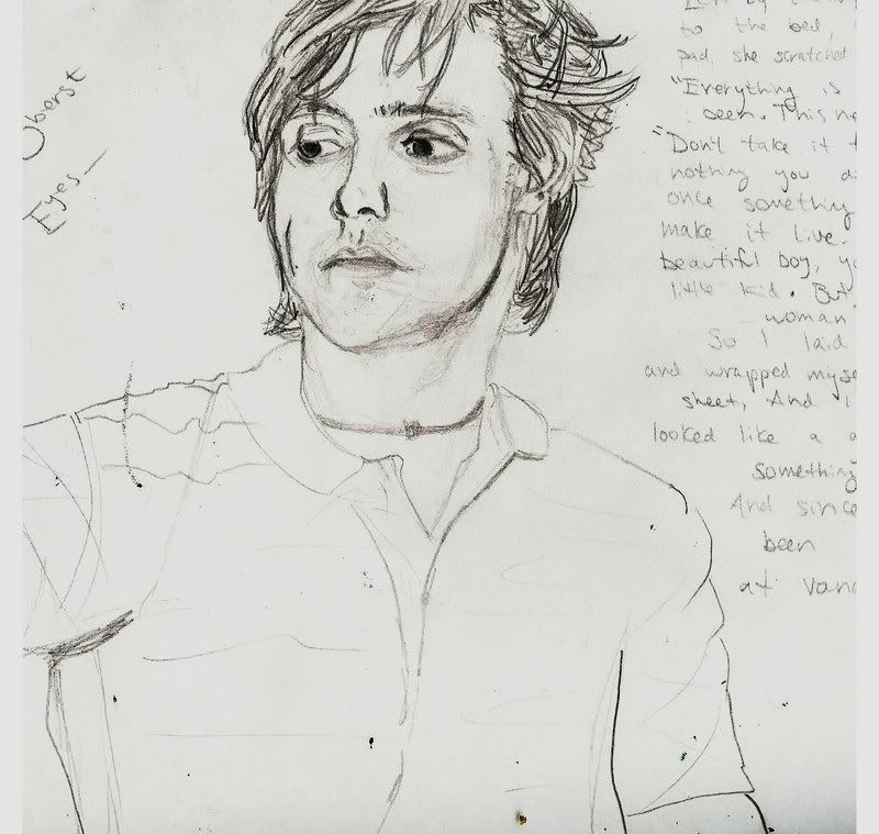
All except for Paulsies, who's is from mid-early years :p
Thanks for the feedback! It's too late to fix the chin and hair, but I'll definitely keep that in mind for next time
The good parts of a book may be only something a writer is lucky enough to overhear or it may be the wreck of his whole damn life — and one is as good as the other.
Ernest Hemingway
I loved the first one--it was from Across the Universe, but if there never was a movie like that, then this will probably win some award somewhere or other. And the unrealisticity of it makes it so much more artistic and mature. Picasso-style.
You captured the scene well. Is that in oil pastel? I like the sharp, defined lines.
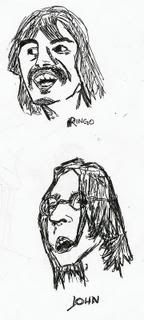
2-5 are all very well-done, especially 3, I love the Andy Wharhol thing even if everyone does it, and the one of Ringo especially looks just like him on the Let it Be cover. Well, except all distorted. But yeah.
6. Not my favorite... it's original and interesting and all, but the colors hurt my brain, and it looks a bit too... cluttered.
Awesome work overall, though!
"I myself am composed entirely of flaws, stitched together with good intentions."- Augusten Burroughs
The first one is definitely my favorite. I love the strawberries, but do watch the chin and the creepy eyes!
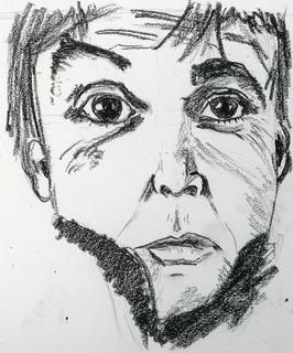
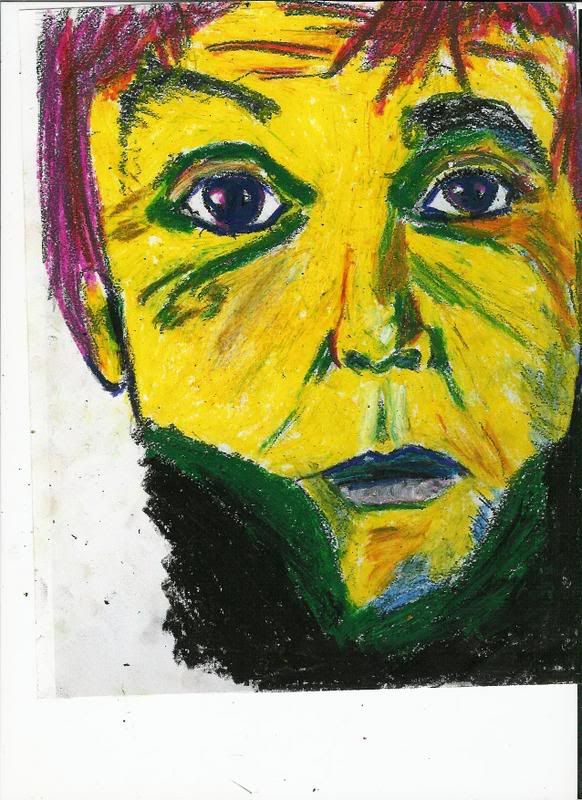
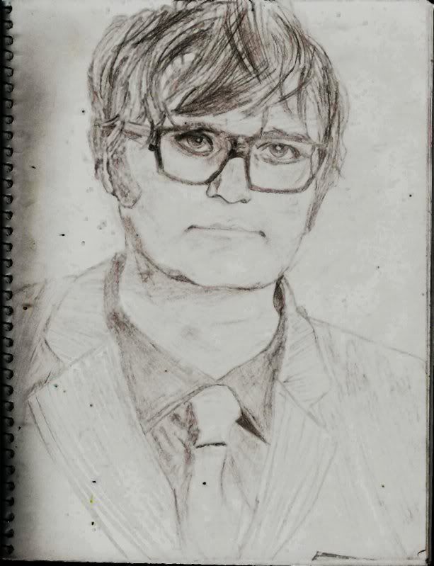
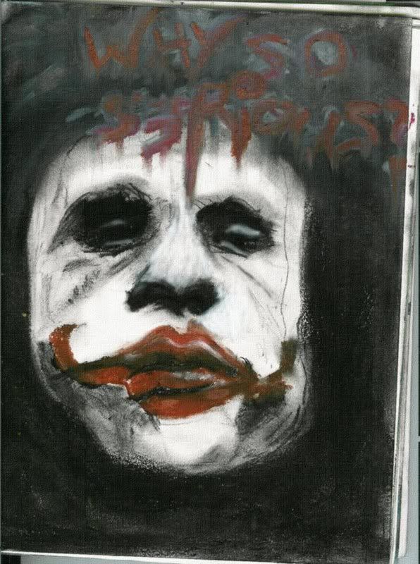
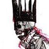
The first drawing of the guy (black and white) is pretty well detailed, but the next where the guy in yellow really kind of scares me! It's okay, but I think not having him yellow and possibly using a lighter green would have promoted less of a freak out. And is that a collar or a neckbrace?
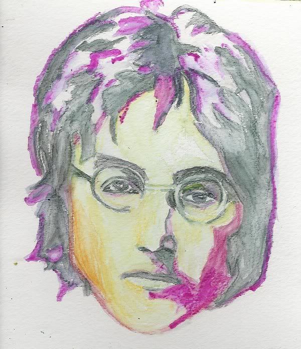
The next drawings: Ringo is pretty good. I enjoy the details. Paul, George, and John really freak me out (again) haha. Paul's mouth is really drawn down, George's face seems kind of crooked and he only really has one eyebrow. John is pretty good except for his mouth, which is crooked ;]
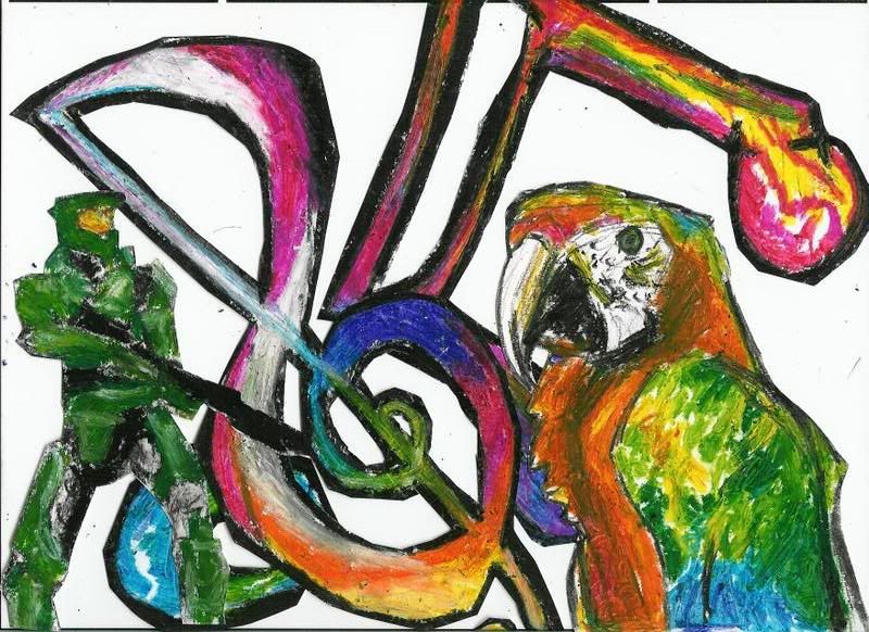
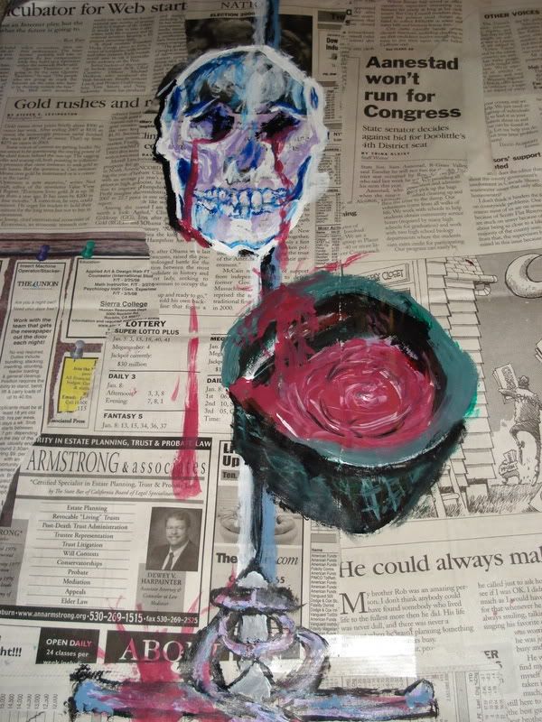
The parrot I love, but my only suggestion would be more definite lines (but, not on the parrot, of course). The army man kind of needs the definition, he's just kind of there and not really never straight and to be honest it took me awhile to see him.
All in all, definitely some pretty good stuff. Plus I'm currently in love with pastels
the following are all old, but those above are older still, so I figured a sort of updating is necessary.
uhhhh, I think that's enough for now.
The good parts of a book may be only something a writer is lucky enough to overhear or it may be the wreck of his whole damn life — and one is as good as the other.
Ernest Hemingway
The good parts of a book may be only something a writer is lucky enough to overhear or it may be the wreck of his whole damn life — and one is as good as the other.
Ernest Hemingway
And the people you chose to draw -- Benjamin Gibbard and Conor Oberst? Brilliant. I'm no art critic so I can't really tell you how to improve. Just thought they warranted a comment. Really, really good.
Nate wrote:And if YWS ever does become a company, Jack will be the President of European Operations. In fact, I'm just going to call him that anyways.


Gender:
Points: 890
Reviews: 316