z

Young Writers Society


angel from hell front cover.


User avatar


Gender: Female
Points: 890
Reviews: 4
Tue Mar 20, 2007 7:45 am
silent_halo says...


it took me 4 days to do this.
Attachments
front cover.jpg
front cover.jpg (240.24 KiB) Viewed 610 times


User avatar
245 Reviews


Gender: Other
Points: 2570
Reviews: 245
Tue Mar 20, 2007 8:13 am
LowKey says...


Pretty good.
Necropolis SB / Necropolis DT

Once was Dreamer, is now LowKey_Lyesmith.

Everybody is a genius. But if you judge a fish by its ability to climb a tree, it will live its whole life believing that it is stupid.


User avatar
227 Reviews


Gender: Male
Points: 890
Reviews: 227
Tue Mar 20, 2007 8:22 am
Mad says...


It's nice. I like it :)


User avatar
566 Reviews


Gender: Female
Points: 890
Reviews: 566
Tue Mar 20, 2007 8:37 am
miyaviloves says...


Ooooh did you get ther pose thingy from an anime drawing book???
I like this, much better than all my attempts to draw anime!
Bag.

Got YWS?


User avatar
657 Reviews


Gender: Female
Points: 6523
Reviews: 657
Tue Mar 20, 2007 12:40 pm
Jennafina says...


Other Fiction is just for stories. There's a forum for artwork too. *moved to art forum*

I love the boy's face, especially his eyes and nose. The line work looks easy, and relaxed. The background, above his head is also really pretty.

his legs look a little short, proportionally. Also, if the wings are literal, they'd have to be a lot bigger to be able to hold him up without him constantly flapping them.

Really nice shading, it makes him look 3-D. Is that colored pencil? Pastel? Some of the background looks kind of like crayon. Maybe you could add a little shading to the wings?

The text looks a little out of place, but I like how you wrote it, with the arrows.

Thanks for posting!

-Jenna
Jennafina's Love Your Body Already Dammit Campaign

forum353.html

(To find out what it really is, just click.)


Random avatar


Gender: None specified
Points: 2020
Reviews: 87
Wed Mar 21, 2007 2:37 am
View Likes
gymnast_789 says...


Really good...i like it!


User avatar
210 Reviews


Gender: Female
Points: 6040
Reviews: 210
Wed Mar 21, 2007 2:11 pm
Meep says...


This is actually really good; I'm five years older than you, and I don't draw that well.
My only big crit. is that you really shouldn't have !s in the title, and especially not a lot of them. (Also, his pants/shoes look a little funky, but that's not such a big deal.)
✖ I'm sick, you're tired. Let's dance.


User avatar
694 Reviews


Gender: Female
Points: 3654
Reviews: 694
Wed Mar 21, 2007 4:58 pm
Via says...


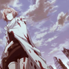
I like it, but I think it should maybe be a little more professional. However, I am not big on anime so this could be what normal anime covers look like and I wouldn't know it.

Sorry I can't be more helpful.
My Literary and Arts Blog

"I think I'd miss you even if we'd never met." -The Wedding Date


User avatar
78 Reviews


Gender: Female
Points: 890
Reviews: 78
Wed Mar 21, 2007 10:10 pm
bkwrm says...


You're doing well so far. I love the front cover and I haven't had time to properly read the begginning yet, but I have scanned and it looks pretty good! PM me when you do more.

Bkwrm :lol: (Guess who?)


I don't think so alliyah, but don't quote me on that.
— TheBlueCat