z

Young Writers Society


Erica


User avatar
12 Reviews


Gender: Female
Points: 890
Reviews: 12
Fri Feb 23, 2007 1:26 pm
View Likes
Nyame says...


any c&c on these pictures?
The first is my most recent one~

Image

an older one here, but i put much more time into this one n__n;;;
Image


User avatar
820 Reviews


Gender: Female
Points: 890
Reviews: 820
Fri Feb 23, 2007 2:11 pm
View Likes
Myth says...


I love all three dress, nice colours too. I think the first girl's left hand is not as great as her right hand, you could work on that by looking at your own or asking someone to pose.

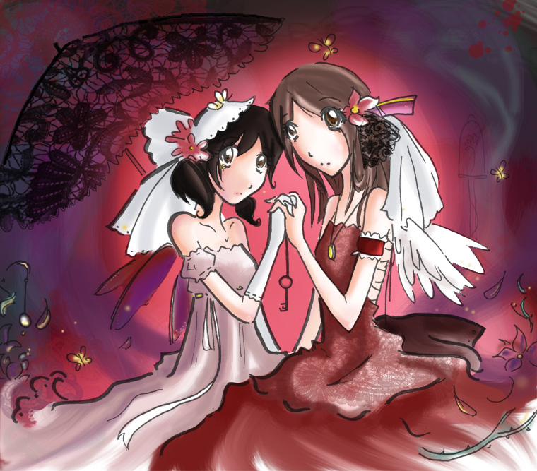
The parasol in the second picture sticks out, looks as if you added it in just to get rid of some of the background. Why don't you have one of the girls holding it?

I would love to see your other pieces.
.: ₪ :.

'...'


User avatar
12 Reviews


Gender: Female
Points: 890
Reviews: 12
Fri Feb 23, 2007 2:18 pm
View Likes
Nyame says...


Thanks very much n__n
the parasol was really added as a background kind of thing; the picture is rather random and not meant to be a particular 'scene'.

I have more art at my Deviantart page, here~


User avatar
758 Reviews


Gender: Female
Points: 5890
Reviews: 758
Sat Feb 24, 2007 10:47 pm
View Likes
Cade says...


I adore the parasol!

Yeah, the first girl's left hand is really awkward. The fingers are held strangely and I think the arm is too long.
"My pet, I've been to the devil, and he's a very dull fellow. I won't go there again, even for you..."


User avatar
134 Reviews


Gender: Female
Points: 890
Reviews: 134
Mon Feb 26, 2007 4:27 am
View Likes
Empress Kat says...


I really like your style, it's very cute.
Plan B is always "Die Trying."


User avatar
76 Reviews


Gender: Male
Points: 516
Reviews: 76
Mon Feb 26, 2007 5:42 am
View Likes
KingKamor says...


I like the dress she's wearing in the first one. The wrinkles in the clothing are subtle, yet effective, and the colors are well done. The only thing that I would add to the first one are legs. ~_^

In the second drawing, the wings on the girl on the left are a bit too subtle. I couldn't see them until I saw the pic for the second time. But that might just be me not paying attention. The outline for the umbrella/parasol thing looks a bit odd, so you may want to fix that.

Good job! I can't wait to see more.


User avatar
3821 Reviews

Supporter


Gender: Female
Points: 3891
Reviews: 3821
Mon Feb 26, 2007 6:57 am
Snoink says...


So pretty! I love the colors... and everything. ^_^!!
Ubi caritas est vera, Deus ibi est.

"The mark of your ignorance is the depth of your belief in injustice and tragedy. What the caterpillar calls the end of the world, the Master calls the butterfly." ~ Richard Bach

Moth and Myth <- My comic! :D


User avatar
12 Reviews


Gender: Female
Points: 890
Reviews: 12
Mon Mar 05, 2007 4:39 pm
View Likes
Nyame says...


Thanks everyone! <3


User avatar
594 Reviews


Gender: None specified
Points: 6831
Reviews: 594
Tue Mar 06, 2007 12:48 am
View Likes
Crysi says...


Wow, these are really good! I love your shading and coloring in both of them! :)
Love and Light


I regret everything.
— Ron Swanson