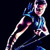
Here's one of Hunter, drawn in the style of my friend, the INCREDIBLE artist, shown on my lap somewhere in the post your pic 2 thread. I drew this pic, but the style is more Mark, not me.
Last edited by Ego on Tue Aug 30, 2005 7:18 pm, edited 1 time in total.
Got YWS? I do.
Lumi: Don't you drag my donobby into this. Lumi: He's the sweetest angel this side of hades.
You know, you being a more expereinced artist, should have more line weight. It would make the picture so much better and appealing, drawing the viewer's eyes towards the spots you want.
Also the sword is see through near the tip.
You shouldn't judge a book by it's cover, instead, you should read every single book to see what every book is about before you even come close to judging its viability.
Probably not. Err, even the earlier works didnt have it.
You shouldn't judge a book by it's cover, instead, you should read every single book to see what every book is about before you even come close to judging its viability.
I use the computer, I dunno why your getting mad at me for a critisism.
But anyways, Ill tell you, notice how the line is the same width? It makes the picture seem bland, especiallly when its with pen, using different widths at the right places will bring it out, for example, the artist "Erwtenpeller" is known for extreme use of line weight. Line weight is also used for shading without the shades.
You shouldn't judge a book by it's cover, instead, you should read every single book to see what every book is about before you even come close to judging its viability.
*laughs* I'm not getting mad, it was just some sarcasm dude--in any case, ALL of these are just drafts--the only reason they're penned is so you can see the damn things lol.
Got YWS? I do.
Lumi: Don't you drag my donobby into this. Lumi: He's the sweetest angel this side of hades.
Jealous? Naw, you learn to stop being jealous when theres a million people better than you.
You shouldn't judge a book by it's cover, instead, you should read every single book to see what every book is about before you even come close to judging its viability.
yeah, well...in any case...here'es a new one...you might recognize the character from earlier in the Gallery....
Keep in mind that this is pretty rough still, the inking is crap...my GF would like to try some dynamic inking on it, so maybe I'll post the results of that later on....but as a draft, whadaya think?
Last edited by Ego on Tue Aug 30, 2005 7:20 pm, edited 1 time in total.
Got YWS? I do.
Lumi: Don't you drag my donobby into this. Lumi: He's the sweetest angel this side of hades.
Sweet, man! In some ways, I like the old one better (probably just because it's colored lol) but the new one is much better in most ways. The expression on the face is a bit awkward, but other than that it's better than the first. As for line weight, I have to agree with Sponson that it makes the pic more interesting, but the coloring, IMO, is really what matters in the end, not the line art. But yeah, I can personally tell you that line width makes things pop more.
Finally- I wish I had your ability to do more than one draft. I never like to draw the same thing twice, so my pics always get stuck at the first draft. I should change that, but...