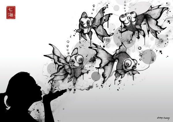
Want to blow fish?

25 posts1, 2
User avatar
Gender Female
Points 3454
Reviews 694
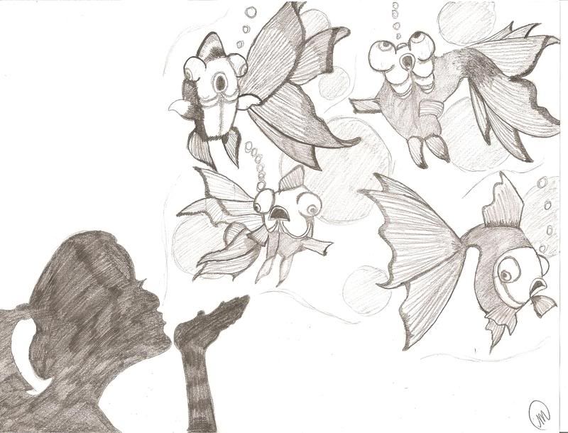
I did this based off something from online, but I don't have the link to it anymore due to several years in between finding and drawing haha. Oh, and please excuse the lame scanning. It is darker than this. And I know the fish in upper right hand corner is retarded. I know this.

Image

I darkened it up a bit here:
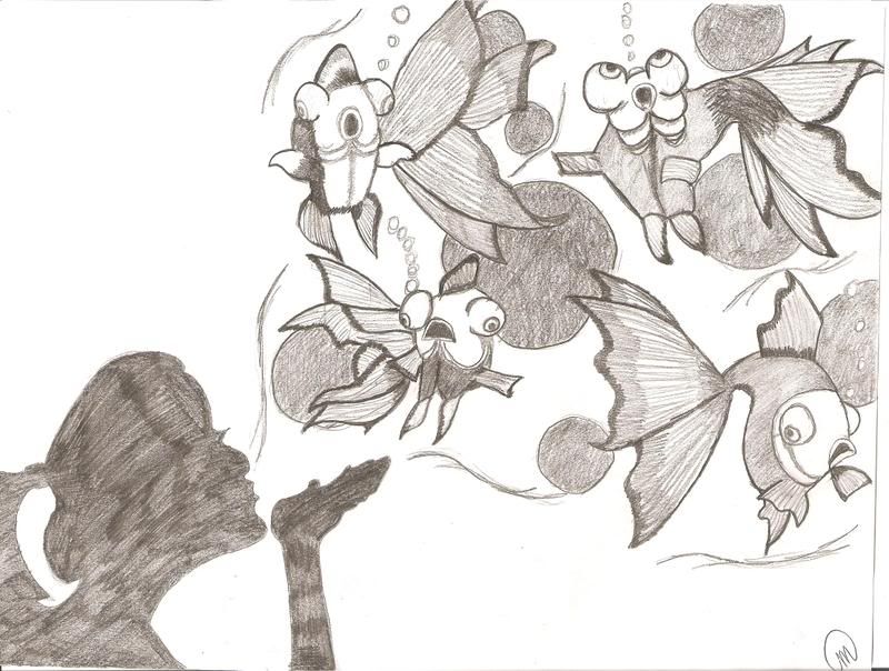
Image
Last edited by Via on Mon May 05, 2008 8:47 pm, edited 1 time in total.
My Literary and Arts Blog

"I think I'd miss you even if we'd never met." -The Wedding Date


User avatar
Gender None specified
Points 890
Reviews 18
Haha that's awesome. I like the one in the top right the most it looks like it's shocked.


User avatar
Gender Female
Points 2374
Reviews 118
The fishys are so cute! And the out line base of the girl's shadow is great. I would have used the same presure on the shading part thow. Or i would have done it all across.
We've all been broken in some way. It's just how we express it that makes us dffrent form eachother.

“This precious book of love, this unbound lover,
To beautify him only lacks a cover.”
~William Shakespeare, The Tragedy of Romeo and Juliet


User avatar
Gender Male
Points 890
Reviews 370
Hehe! I love those!

I was going to suggest making the woman a little darker, but no, I like the nice sketchy style to have going on. I am in love with the bottom left fishy's eyes! :-)

The colour is nice, black is the standard, but I disagree and think that is great, it helps bring out the lines of the drawing.

I can't offer much more concrit, sorry!

-Mark
We are all Sociopaths: The Prologue

Sociopath: So • ci • o • path noun
1. Someone who believes their behaviour is right.
2. Human.


User avatar
Gender Female
Points 2999
Reviews 438
I really like it! And the title made me smile. :)

The girl's hand needs a bit of work. Right now, it looks like it's top up, not palm up. :wink: Maybe add a bit of shading there, to show that it's supposed to be palm up?

Also, I liked the second one better - the fish popped more. But maybe keep the bubbles a bit lighter? They didn't really look like bubbles in the second one since they were so dark.

Yeah...great job! They were really good, and I liked that we didn't see details on the face. It leaves us free to put whatever face we'd like there (in our minds.)

Thanks for the smile. :) PM me for anything!

~JFW1415

Edit: Maybe give the shading on the girl a bit more reason? Like, it gets dark where her shirt would be, or where her hair is? Just to make it a bit less random. (But that's only after staring at it for a while. At first glance, I love it, so I'm not sure...)


User avatar
Gender Female
Points 890
Reviews 63
Wow Via!
I love this!
I'm envious!
I could never draw this good!
I like how the fish are caught in the bubble and the outline of the girls shadow!
Awesome Via!

~Lulu
"When other girls wanted to be Ballerinas, I kind of wanted to be a Vampire." ~Me
My first puppers Pikapet
My second puppers Pikapet
Check out my new group! Roleplayers Unite!


User avatar
Gender Female
Points 13389
Reviews 260
Wow, I like this a lot! The fish do look incredibly awesome, I love their O_O expressions. XD And I really like how her hand sort of draws the eye toward them.

One tiny critique (and feel free to take this with a grain of salt, I'm most certainly no art expert) is that the shading on the girl looks kinda... rough I guess. Uneven. My art teacher always tells us to shade with soft circular motions, and though it actually took me forever and a half to figure out what the heck he was talking about, I found that it made my shading a lot better. It's sorta like, instead of moving your pencil back and forth, move it in a circle, kinda like you're filling in an answer on one of those "Fill in the Bubble" sheets you get for standardized tests. I guess.

.... Good Lord, I hope that made some sense. XD

In any case, great job! :D
"The world is not beautiful, therefore, it is." --Kino's Journey

Hey, how about a free review?


User avatar
Gender Male
Points 3190
Reviews 26
I think, if I had to describe this drawing in a word, it would be

O.O

Which, while not actually a word, is a perfect imitation of the look on the faces of those fish.

A suggestion--make the bubbles in the background more circular--they look rough and amateurish right now. Similarly, the bubbles coming from the fish should not be in a straight line, but in an irregular pattern, and the bubbles should be varying sizes.

--King
“Yesterday we obeyed kings and bent our necks before emperors. But today we kneel only to truth, follow only beauty, and obey only love.”

--Kahlil Gibran


User avatar
Gender None specified
Points 890
Reviews 14
very creative.

i like how the fish look so stunned!
Always,
Dee.


User avatar
Gender Female
Points 890
Reviews 270
Oho I likey. I love both drawings, but I really don't see a difference between the two. I like how the fish are looking suprised and how the girl is like a shadow and blowing the fish in the air. Very creative. You're have major talent! Keep drawing! Bye fishys.
Don't send sheep to kill a wolf.


User avatar
Gender Female
Points 7241
Reviews 721
Very cool. I love the composition and idea of it.

I do agree that the fish in the upper right corner is really ... weird. I can't really tell how it's a fish, actually. :? But you already know that. ^_^

At first I didn't like the uneven shading on the girl, but now I'm not so sure...

I think this would be really neat if you added color to the fish, even if it's just a little bit. It would be kind of surreal and magical... even more than it already is.

EDIT: Okay, I can see how the fish in the upper right is a fish now. It's just a funny angle.

Gold star!
~Azila~


User avatar
Gender Non-binary
Points 1979
Reviews 1176
This is really good! :D The fish look great, very blow-fishy. ^_^ I'd only suggest making the shading on the girl more even and perhaps a touch darker to help the evenness.
"TV makes sense. It has logic, structure, rules, and likeable leading men. In life, we have this. We have you." -Abed Nadir


User avatar
Gender Female
Points 890
Reviews 7
I know the original artwork.

Image

This is "Blow Fish" by Nanami Cowdroy.

I think you did a great job!


Random avatar
Gender Female
Points 890
Reviews 41
Great job, I love your signiture in the corner. My name starts with a M, maybe I'll borrow your's if you don't mind. It's so much easier then my usual one, lol. The right one does look a little weird but it looks weird in the original as well. Great job, it was detailed and beautiful!
Scorpia
Feel the urge to give some constructive criticism? Why not give it to these stories?

http://www.fanfiction.net/u/1298113/Scorpia710


User avatar
Gender Female
Points 3454
Reviews 694
Ah! Thank you spiffy! Sheeze, how did you find that? I looked forever!

That is definitely what I did it from!
My Literary and Arts Blog

"I think I'd miss you even if we'd never met." -The Wedding Date


It takes as much imagination to create debt as to create income.
— Leandro Orr