z

Young Writers Society


Parrots.


User avatar
763 Reviews

Supporter


Gender: Female
Points: 3888
Reviews: 763
Thu Jan 14, 2010 10:32 am
Lava says...


Hi!
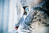
This is the first time I've tried drawing animals(birds, technically.) So tell me what you think.
Methinks the wings of the left one need to be improved, though I'm not sure how.

P.S. I'm sorry for the bad quality, my scanner isn't working.


EDIT: I put up a smaller picture.
Attachments
01142010060.jpg
01142010060.jpg (33.95 KiB) Viewed 349 times
~
Pretending in words was too tentative, too vulnerable, too embarrassing to let anyone know.
- Ian McEwan in Atonement

sachi: influencing others since GOD KNOWS WHEN.


User avatar
547 Reviews

Supporter


Gender: Female
Points: 49345
Reviews: 547
Thu Jan 14, 2010 5:39 pm
captain.classy says...


This was very cute.

1. The parrot on the left looks old and worn out. If you meant to do that on purpose, I say hey! good job. But, if not, you should fix its droopy eyes and wrinkled face.

2. The parrot on the right looks pissed. Like, truly mad. I think it's the lines under the eye and the angle of the eye.

3. Parrots are known to be colorful and beautiful. If you want to really capture the beauty of parrots, I would suggest coloring it.

Bravo!

Classy


User avatar
878 Reviews

Supporter


Gender: Female
Points: 35199
Reviews: 878
Fri Jan 15, 2010 5:16 pm
Demeter says...


Hey Lava!

Overall, very nice job -- especially if you drew them without looking at a picture of a parrot. I don't know whether or not you did, but it's nice all the same.

The position of the left one looks a bit awkward. I think it's because you drew it sort of looking over its shoulder, which is difficult to draw realistically. Therefore, I prefer the parrot on the right, the measures look fine and it's all in all very well drawn. I like the shading in both parrots; it also makes me imagine the pictures are coloured. I agree with Classy though, you should definitely colour them!

Haha, I also like the branches they're sitting on.

Keep drawing!


Demeter
x
"Your jokes are scarier than your earrings." -Twit

"14. Pretend like you would want him even if he wasn't a prince. (Yeah, right.)" -How to Make a Guy Like You - Disney Princess Style

Got YWS?


User avatar
763 Reviews

Supporter


Gender: Female
Points: 3888
Reviews: 763
Sun Jan 17, 2010 4:20 am
Lava says...


Thanks Classy and Demi!
I drew the one on the left without seeing. I looked at a photo of a parrot for the right one. ><
~
Pretending in words was too tentative, too vulnerable, too embarrassing to let anyone know.
- Ian McEwan in Atonement

sachi: influencing others since GOD KNOWS WHEN.


User avatar
113 Reviews


Gender: Female
Points: 11393
Reviews: 113
Mon Jan 18, 2010 7:32 am
Mo. says...


Wow. This is your first attempt at drawing birds? They are fantastic!

I think the bird on the right needs more shading on the wing, and also, maybe a little more detail - just to make it more realistic.

The shading is really good, and the tree is really nice too!
I agree with everyone else, you should give it some colour! :D

Keep writing... er... drawing! :D

~Mo.
Mo. was here. :) mwahahaha


User avatar
193 Reviews


Gender: Female
Points: 23443
Reviews: 193
Mon Jan 18, 2010 4:44 pm
Lydia1995 says...


Hello!

Wow. Well done! This is your first attempt at drawing birds well its amazing so well done!
The only problem is one if the birds head looks a bit odd. Other than that though great! Paticularly considering that it is your first attempt!

Usually at ethis point I would say Keep Writing but that dosn't really fit so errr...
Keep Drawing! :D
~Lydia
Thinking about what you COULD achieve will get you no where. You've got to chase your dreams.
http://www.youngwriterssociety.com/viewtopic.php?f=188&t=92400 - Need a review?


User avatar
816 Reviews


Gender: Female
Points: 44887
Reviews: 816
Mon Jan 18, 2010 9:31 pm
Shearwater says...


Hi Lava!
I have to say this is still pretty awesome, none the less.
It sort of reminds me of a drawing I would see out of coloring book, but a lot better lol.
Left Parrot: I think the head needs to be bigger and possibly more shading with the tail. But shading really depends on what color the bird is, dark/warm colors need darker shading compared to cool colors.
Right Parrot: I think this one looks just fine the way it is. :D
Honestly, these are great! I think if you were aiming for a more realistic kind of look-I would suggest a lot more shading and going into the detail of the feathers and colors. Making sure every shade matches the color so it sort of resembles a black and white photo. But I like the way this is drawn, haha.
Keep it up!

~Pink
There are three rules for writing a novel. Unfortunately, no one knows what they are.
-W. Somerset Maugham


User avatar
27 Reviews


Gender: Female
Points: 3573
Reviews: 27
Tue Jan 19, 2010 5:59 am
Genevieve :P says...


Hello, woah, you're indeed good a drawing.

They are GORGEOUS! I love them, you really have talent. I love the colours in the background, they really bring the birds into focus. The feathers look really good, well done.

Thanks for posting. Keep drawing.

~Gen :P
Thanks to Kamas who drew my avvie


I'm lost within the magnificence of my pancakes, taken over by complete silence, only interrupted by the sound of my munching!
:smt103 :smt081


User avatar
336 Reviews


Gender: Female
Points: 805
Reviews: 336
Tue Jan 19, 2010 6:58 am
Jas says...


I have never reviewed ctures before even though Ive taken alot of them :p

From my humble mind, really good! I liked the parrot on the right more though :)


~Jasmine Bells~
Peace, Love, Writing and Chocolate
I am nothing
but a mouthful of 'sorry's, half-hearted
apologies that roll of my tongue, smoothquick, like 'r's
or maybe like pocket candy
that's just a bit too sweet.

~*~


User avatar
1464 Reviews


Gender: Female
Points: 15394
Reviews: 1464
Wed Jan 20, 2010 6:10 pm
Juniper says...


Hey, Lava,

This is good. I think it could be improved if you strengthen your lines and add shading; dark for the underside of the branch and the lower parts of the birds; it'd add a touch of realism to this, and make it more appreciative, while adding depth. :)

June
"I'd steal somebody's purse if I could google it and then download it." -- Firestarter


User avatar
57 Reviews


Gender: None specified
Points: 1202
Reviews: 57
Sun Oct 31, 2010 1:12 am
WaywardBird says...


Not bad, not bad at all. The wings on the left, the right wing seems to extend too much to the left, and the beak curvature is a little off. (I mean by that the beak on the right has more arc than the beak on the left, which is more square.) But very nice, very real-cartoon, like some un-angle-ish anime.
Latina est TUMOROSUS senes ita sortem.


User avatar
189 Reviews


Gender: None specified
Points: 4166
Reviews: 189
Sun Oct 31, 2010 5:11 pm
vox nihili says...


Kudos on the birds! They're magnificent. It feels like they're looking at me. I especially love the shading in the darker feathers of the left bird.


The bird on the right's feathers appear too heavily penciled in. The heavy outline of all the feathers takes away from the graceful shape of the bird's wing. Also, some of the twigs on the tree look like they were done in a hurry. A good background is really important to a picture--if it doesn't look as real as the foreground, the picture loses that sense of realism.

Also, the lines of the tree branch just to the left of the left parrot disappear before you actually get to the bird. It makes it look a bit like he's sitting in thin air instead of holding onto a tree limb.

In the paler sections of feathers, you still need some texture. Not a stark outline like the other feathers--just a few very faint, swooping lines to give the impression of feathers there.

Finally, I keep trying to see it in color. It's really a wonderful piece, the only little details that could use work are miniscule. Please try doing a version of it in color! It's absolutely gorgeous.

~Vox


User avatar
106 Reviews


Gender: Female
Points: 3649
Reviews: 106
Mon Nov 01, 2010 6:37 am
IgnisandGlacialis says...


CUTE!!!
This drawing brought a smile to my face. I do love the tails and the branch, and just about everything ... :D
I'm sorry this has been absolutely pointless, but it's the thought that counts, right?
God bless, and keep drawing (you've obviously got talent),
Ignis :pirate3:
The POTATO of DOOM

A thousand times it calls your name
A thousand times you hear it
And fools are those who heed its call
But fools are those who fear it.


The Interesting Thoughts of Edward Monkton


don't try me bro
— Seirre