These are both based off of real people/their photographs. Agh, I hate the quality! I wish I could send these drawings through my dad's scanner, but alas, these drawings are right in my sketchbook! Please review! Thanks!
Nice work once again, I really must say. You are really talented.
PICTURE ONE: I like this picture a lot. My favorite parts are the hair and the eyes. As for the lightning bolt down the face, I'm not sure that it works for me. I think you should erase the line inbetween the girls parted lips,because it looks like the lightning bolt has stiched them together! Maybe make the nose more semetrical. Other than that, I like this one.
PICTURE TWO:
I love this one! The eyes and facial expression are fantastic. I would say the only glaring issue is the nose, because one nostril seems to be off. I know it's supposed to be viewed at a slant, but right now it looks just a tad crooked. The eyebrows are good too.
OVERALL:
Good job. I wish I could give you something more in depth, but drawing isn't my forte. But really excellent, KD.
Thank you, Esther! Your review made my day. @ The Lighting Bolt- Oh my. That does look freakish, doesn't it? Hehe. My bad! Once again, thanks for the great review! ~KD
Hi KD! Wow, you are super talented - you clearly have loads of potential in your drawing to improve still though
It's obvious that you're amazing at eyes; in both pictures they are very expressive and realistic (I think it's the shading that does it), and you have very good proportions overall. The slight hollowing of the cheek in the first one is amazing! It gives a subtle idea of face shape and is pretty awesome cause you haven't gone overboard and made her look skeletal or anything.
The only thing you seem to find consistently difficult is noses - they both look quite strange. People often draw noses with very obvious nostrils but this tends to make faces look quite odd. It's hard to pick up how to draw noses less strangely because when you look at a picture to reference you are kind of ... hard to explain ... perception tends to be clouded by how you already know a nose is. (does that make sense?) So people tend to emphasis things that shouldn't necessarily be emphasised. (For example this nose!) Luckily yours are much better than that example but hopefully it explains what I'm trying to say? Sometimes people will draw what they expect to see rather than what is actually there.
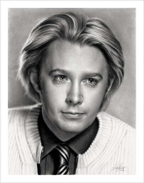
Here's some examples of stylised/simplified noses that hopefully should help you. But generally, noses are very hard to conquer because to make them completely realistic so much detailed shading is needed and it's very easy to end up with something strange. I always spend the most time on noses So stylised noses are generally better and easier for most people unless you want to end up drawing something soulless like this. (I mean seriously. Just take a photo if you want a portait like that!!)
I don't think I have ever talked about noses for so long in my life. Hopefully it was actually helpful and not just an incomprehensible ramble about noses....
~Dashka
(EDIT: I share your pain over the trauma of trying to scan pictures from a sketchbook )
Elizabeth: "There will come a moment when you will have a chance to show it. To do the right thing." Jack: "I love those moments. I like to wave at them as they pass by."
Wow! You're really good!! I like the second one the best. It's so realistic...her features and everything....wow. Keep it up!!! :]
I dare you to move I dare you to move I dare you to lift yourself up off the floor I dare you to move I dare you to move Like today never happened Today never happened... Before. ---Dare you to move by, Switchfoot---
First One: I like the lightning idea. It's good. However you need to work on it. The blue is fine, but it doesn't give out the stick-out impact you probably intended with everything else in pencil shades. The eyes are very expressive. Good! The sleek hairdo could do with some highlights and streaks. It would make this look much better.
Picture 2: Well, I like this better, because the face seems more 'real.' The other one seems more doll-like while this is better. The lips here have been drawn well, but are tilted at an odd angle. If you could just rotate it, it would be so much better Good work with the hair and the eyes. Now, the top-most curve of the head could do with a wee bit of work. Instead of smoothing out the shading, add some flyaway strands and such to give it a better effect.
Ja, so keep drawing. Once again, good work from you.
Cheers, ~Lava
~ Pretending in words was too tentative, too vulnerable, too embarrassing to let anyone know. - Ian McEwan in Atonement
I have to say, you did really good on these, haha. The first one is pretty amusing and you did good on, except I think it would be better if the nose was changed, because currently it looks like she has a swollen nose.
I love the hair and the facial expression on the second one. She looks kind of like she is seeking something or she is determined. And for both of them I really like the eyes and the lips.
Keep up the great work! ^_^
~Heather
[Griffinkeeper] 10:45 pm: The guard appears "We have weasels now!" [Firearris] 10:45 pm: askes the guard for the weasel! [Griffinkeeper] 10:45 pm: The guard gives Firearris the Weasel. [Firearris] 10:46 pm: aquires the weasel and renames it "Cat" Take that, Lumi.