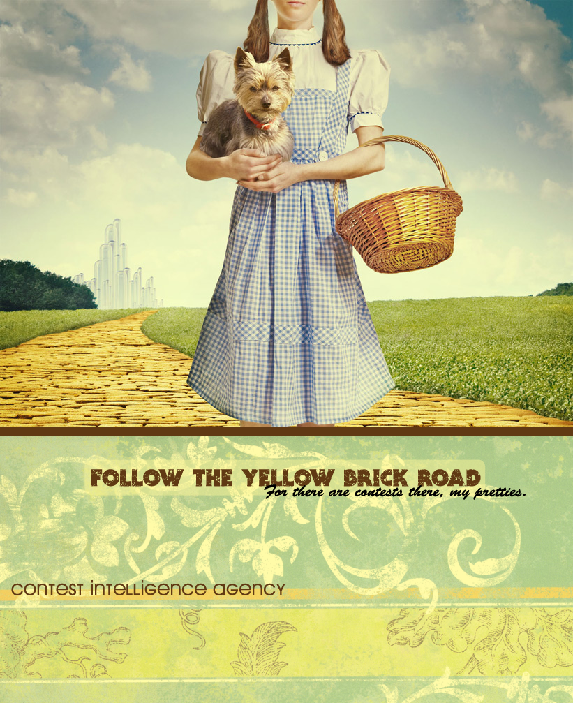
Maybe if you moved the text down under "Follow the Yellow Brick Road?" Some of the higher-arcing letters clash with it. And maybe a little to the right, so that the subheading doesn't start in the middle of the heading, to give it a more natural visual flow, rather than finishing the big text and having to backtrack to read the small text.
Also, it's Contest Improvement Agency, not Intelligence Agency.
[and Toto looks pissed. xD]
Other than that! A fabulous poster. Yay for Wizard of Oz references, no? ^_^
*gives Cal cookies*
-:pirate3:
"2-4-6-8! I like to delegate!" -Meshugenah "Teague: Stomping on your dreams since 1992." -Sachiko "So I'm looking at FLT and am reminded of a sandwich." -Jabber
you might want to get a better picture of the wizard of oz. im not trying to be mean but my mom is a huge wizard of oz fan and that doens't look like anything she owns. Plus toto is a scottie and his fur should be black.
'Follow the Yellow Brick Road' is fine but,
'for there are contests there, my pretties' doesnt sound good maybe change it to:
I dunno about everyone else, but I think this looks astonishingly good!
This looks brilliant, really good job. Not much I can see besides that.
I'm
an Atheist, a young teen girl, someone who loves Harry Potter and hates Twilight, someone who doesn't see deepness in everything, a person who has never suffered from any diseases of any sort.
I'm average, but...
Eh, I'm holding the contest, so maybe listen to my ideas? xD
The girl looks awful from the neck up. The ponytails are obviously cropped and the neck is skinny and it just looks fake. I'd replace it with a different picture.
Also, it's slightly obvious that the dog and basket were added in. Can you smooth it at all?
Other than that? I loved it. The part with the text especially - it's gorgeous. And then the background. xD
The text sounds a little odd. I do think 'Contests await you, my pretties' better, but did you just play on a line from the movie? If so, I'd keep it the way you have it - connect it to the movie more.
Good post but there are many mistakes. Most of which others have pointed out like the hands look like a mans and the words underneath the picture. But there is another thing that needs to be shown. The basket looks like its cut into the hand of Dorothy. and Toto looks so pissed off as you said so. anyway nice photoshopping.
-- Who is not Insane one man ask, the answer being a fool. Are you Insane the same man asks, - "Oh yes!. The Mad Hatter being saner!"