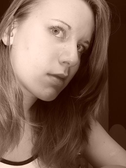
It's not a bad picture, and you're a very pretty girl, so I guess my gripe is that it doesn't look like art, or any type of photographic study. Just a pretty picture of a pretty girl that would look nice on facebook or myspace.
I recommend a different angle or background. Try to give the picture a story in some way or another, if you really want to add interest.
G'luck!
Got YWS?
"Most of us have far more courage than we ever dreamed we possessed."
- Dale Carnegie
I think there needs to be a theme to this. I mean your a pretty girl, but I don't see the message behind it. Look up Deviant art, the pictures of models are doing certain things (or the setting) which help give us a good idea of the overall theme of the picture.
But you are pretty, I give you that XD
"To the edge of the universe and back. Endure and survive."
Well, I know nothing about art, so I'll just tell you what I think.
I really like the colour, it starts with t, if I remember correctly. But I don't like the way your head it tilted so that we can barely see one of your eyes.
But you're really pretty!
*Don't expect to see me around much in the next couple of weeks. School has started again, and it'll be a couple of weeks before I've settled in. If you've asked me for a critique, you will get it, but not for a little while. Sorry*
Did you use the sepia option? Looks like it. I'd suggest upping the contrast on this and maybe doing it in black and white.
I think it's got that myspace feel because you're not looking at the camera, you're looking away... like most people in their myspace pictures.
This is a good picture though but maybe do up with the contrast so some parts stand out more and it's just not allowing your eyes to go everywhere at once.
It needs something in the background. Maybe something like flowers contrasting or something, but something very contractive (word?) that will look good in sepia.
May I suggest either having someone else take it or taking one or something else for a more "artistic" affect?
This is amazing, Tiffany. I love the details into this. Like Via said, try to add some context to the backround. It's good, but it's plain. Other than that, good work. And you are very pretty.