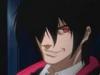
Here I'll post my random colorysketchythings that I've deemed not too hazardous to your eyesight.
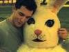
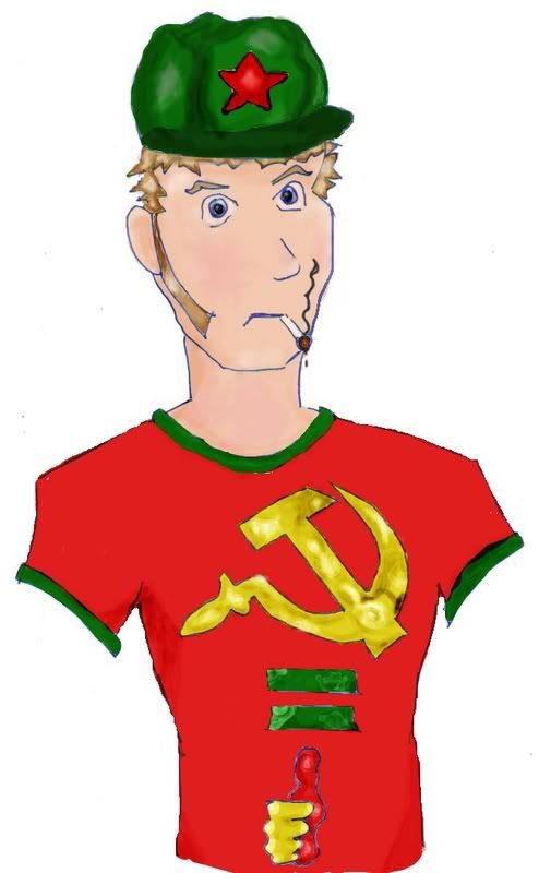
My conceptual version of Common_Sense, a member over at TW
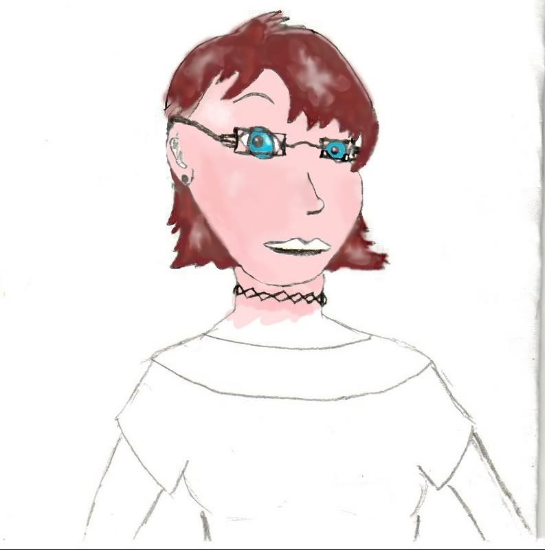
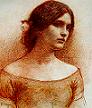
The unfinished MC in my yet-to-be-written story
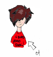
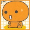
I only did the coloring on this, lineart was done by Stirly. 'Twas her imagined version of me before she saw a picture xD
The good parts of a book may be only something a writer is lucky enough to overhear or it may be the wreck of his whole damn life — and one is as good as the other.
Ernest Hemingway
First guy is missing a few parts. His neck is to far to the left. The right side of his face is to big as well, doesn't match the left. And i think we would see his ear.
Colours are cool though.
The lady, Her arms are different widths. Her eyes are two different sizes and odd shapes. nice effect with the glasses though. Her ear has no top and it seems she is bald back there as well.
And the last one is hysterical. The Hair colouring is uber cool and the shirt is hysterical.
"Maybe Senpai ate Yuka-tan's last bon-bon?" ----Stupei, Ace Defective
1: Your lines a little too rigid, try smoothing them out some (and giving him arms) =]
2: This really needs to be clearer. The shading in the hair just kind of makes it look incomplete, or like someone through white paint on her.
3: From what I can tell, with it being so little, this was is okay. The shading in the hair is much better than that in the previous one, that's for sure.
I like the last one best *so cute* and the first one, as well. Your MC looks like a neat person, but the chin is too small and some of the proportions are a little weird. She looks as if she'd be a great MC, though!
I agree with what the others said...also, the cigarette smoke on number 1. looks too much like a part of the lines on his face. But pleasant to look at!
~The Kool One
"Two things are infinite: the universe and human stupidity; and I'm not sure about the universe."
~Albert Einstein