I am nothing but a mouthful of 'sorry's, half-hearted apologies that roll of my tongue, smoothquick, like 'r's or maybe like pocket candy that's just a bit too sweet.
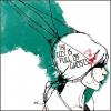
the first is very rigid in its lines. Obviously, this was intentional, but the contrast of the deep black shadows, extremely stark and definite just feels a bit off to me with the sweet and simple handwriting, kinda soft. You have some great shadowing, especially in the bits of pale pencil where they've been sharpened, but the shadows are just a bit too dark for me, and take away from that nice quality.
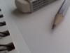
The next one I like much better; it's a whole lot of fun and you used colors wonderfully. However, again for the sake of the over-contrasted whatnots, maybe tone down the super official looking YWS text? Just a thought.
I love the first one, but, like Persy mentioned, the rigidity and shadowed quality of the pencils contrasts a bit too sharply with the placid blue background and delicate writing. My tips would be to either get rid of the pencils and fill up the space with something a bit more complementary, or to change the writing and background to match the starkness of the pencils.
There's not as much to say about the second one. It's a bit bright for my taste, but I'm sure that's just me. The one thing that bugs me is the font color of the writing - black just seems a bit too out of place amidst the light-colored background.
I so wish I was home with my PS for this contest. But fate has Her way.
Second : I like the colorful-ness and the mixing swirlies but to be honest, this won't work as a YWLJ cover for me. It's bordering on juvenile whimsies and while I really love this, I don't think it's going to 'cover' the Journal.
Un: On the whole, this will work as a good cover. Much better than No. deux. I shall get into the nitty-gritty of this. I like the rigid-ness! It's kinds neat. Though, you should work on a little cleaning around the shadows and edges. I notices a white space below the black pointy part. And blue pointy being too straightly cute off at the bottom doesn't work for me. Background: Maybe you could add a very very mild self design? Or change the hue of the blue a bit. Or a very mild gradient. That way it won't seem like there's nothing going on in the bg; yet it won't be too.. (umm.. I don't know the word in English that I want to say.) Font: Love the YWS font! Except the spacing between 'Y' and 'o' and 'W' and 'r' seem a little wide due to perception. (Why am I so nitpicky?) LJ : LOVELOVE! Maybe bold it a bit?
G'luck!
~Lava
~ Pretending in words was too tentative, too vulnerable, too embarrassing to let anyone know. - Ian McEwan in Atonement
How did you do this? Personally I prefer the first one as it's simpler and there is less to look at. The second one fo me is too busy but they are both amazing. -Wolfie
I'm going to say one thing before I start: You're talented and don't stop being a wonderful artist!
Now for my dislikes:
1) I don't really like the background color of the first one. I'm not a huge artist, but it seems a little too rigid and dark for such a literary society we have on this website. I also don't really like the pure straightness of the pencils. Yes, they look cool, but maybe if you could create more of a Picasso effect, it would really embody the imaginations we have here. We're trying to get people to really take a look at the magazine, not just skip through it at a waiting room.
2) for the second one, the swirls and color choices remind me of a schizophrenic or LSD effect. It's cool, but it's in your face and actually kind of uncomfortable to look at. It's kind of patel colors, so maybe a bit darker. Not much, but a little bit.
My likes:
1) The color choices of the pencils are nice. They're not the generic R.O.Y. G. B.I.V. that we often see. Also, the fonts are cool. If it's your handwriting (then pretty handwriting, by the way!), then it's got the artsy, yet put together feel.
2) For the second one, I like the splash of magenta in the off-center. It gives a wacky, yet cool, feel.
"The core of the human spirit comes from new experiences."
I've done very few artsy reviews, but I'll try my best.
Cover #1
So, I'm not going to ramble on about the shading because I think some have already made that rather clear. But it is something important that you should really consider adjusting. It makes the pencils seem a little blockier and makes the cover assume a rather more darkening look. Which isn't what I think you were trying to do? Additionally, the blue background is a little too "electric blue" for me. It kind of pops out more than it should and somehow manages to make the cover a little less joyful. The colours are really nice, but some are far too eccentric for tastes. Nonetheless, I really liked the concept you were aiming at, with the pencils and all. I'm going to rebel and say that, overall, cover number one is my favourite of the two.
Cover #2
This cover, personally, is practically a total opposite of the first cover. It's a little more "freestyle", if you know what I mean. And the first was more angular, more technical, more particular. This one just seems a little all over the place and it looks like not much effort was put into it, unfortunately. I'm sure you took time to make this nice, but I'm not a fan of it at all. There is too much white and the swirls, I find, take away from the text and it distracts me far too much. It's not a cover I'd like to see for a book. The swirls are all over the place and it looks extremely disorganized... It looks a tad childish. Maybe whimsical, but not exactly or in the way I view "whimsical".
Overall, I much preferred the first cover over the second. With a few fixes, the first could be amazing and I'd be pleased to see that one as the YWLJ cover. It's actually really nice. As for the second cover, you know what I think about it. And the font choices were exceptional. I particularly liked how "Literary Journal" was in a cursive font, differentiating it from the professional Young Writers Society title. Very well done.
I really like both... the second one reminds me of several book covers I have for some classic books, but it's much more funky and colorful and I like it. However, I think for my first pick, I would choose the first cover. I love the scribbled font and the colors of the pencils. It makes it very vibrant!
With that said, I think the first cover doesn't have the right background yet. I'm not sure what would look better, because I am definitely not an artist, but it doesn't quite look right. However, maybe it might be neat to try out the background blue of this site? That might be the very thing that you need.
Good luck! <3
Ubi caritas est vera, Deus ibi est.
"The mark of your ignorance is the depth of your belief in injustice and tragedy. What the caterpillar calls the end of the world, the Master calls the butterfly." ~ Richard Bach
I like both of these, though the first is defineately my fav as the second is just a little too busy in a slightly messy way. It's fun and it's colourful but I think it's too much, especially with that wacky font you're using lower down!
The first one then. I love the brightness of the pencils and variety of colours so kudos there, but I think the cover would be more professional if you used a slightly darker blue for the background. It's just a little too glaringly bright and oh I just read Snoink's suggestion. Yes! Listen to her and use the YWS one, that's slightly toned down and would certainly reflect the site. Now oddly I like the fonts with this background, I think perhaps because they're not too block or too spray-painty like they were in the second. Maybe you could add just a little something else though. I'd love to see the pencils having a slanted format so they went from right to left, getting shorter as they reacher the other side. Then you'd have a space under literary where you could maybe just add some other small detail. I don't know what to suggest for that though so I'm not very helpful xD I think this is my favourite of the ones I've seen around the site so far though.


Gender:
Points: 49068
Reviews: 373