Some "Burning Bridges" Art

3 posts
User avatar
Gender None specified
Points 771
Reviews 180
Here is a black-and-white pencil and prismacolor black pencil drawing of a character (Ed Harker) from my scripts for the drama "Burning Bridges", as I see him. :| Sorry if his arms look a bit off. Anyway, I tried for a 'slightly realistic anime' look. Any tips would be appreciated.

Ed Harker.jpg
Ed Harker.jpg (22.22 KiB) Viewed 187 times


And here are Ed Harker and Lisa Rodriguez (Tarka). The photo quality is a bit bad...and I had to cut some off, to make it look straight (OCD, yes). Hm. Anyway, tips for this one would be good, too. (Done with prismacolor and watercolor pencils, as well as regular old pencils.)

Ed and Lisa.jpg
Ed and Lisa.jpg (52.38 KiB) Viewed 187 times


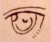
And here's an up-close anime face...possibly belonging to the minor character, Candace Hunter. Maybe. I haven't really decided, but... (Done with prismacolor pencils, watercolor pencils, and regular old pencils.)

Amber-Eyed Manga Girl.jpg
Amber-Eyed Manga Girl.jpg (15.63 KiB) Viewed 187 times


Anyway, I'll add to this with more artwork (maybe?) as I continue to flesh out the world I created...for kicks. *nods*
My SPD senses are tingling.


User avatar
Gender Male
Points 2743
Reviews 5
The key to drawing anime, or cartoons is all about the proportion, for body language is a major key element of portraying emotion without words. And If a I do say so myself, you've managed to achieve proper proportion in your work so far, which is amazing. As you stated, the arms are a bit off, I would offer some tips and tricks, but I'm probably the worst sketchiest you'll ever encounter. The textures you created with your medium are entrancing though, and the colors really work well together. So all in all, a success! Congrats!
With friends and courage one can stand against all foes, for neither man nor God can conquer those who are not alone

"109 in the sky but the pigs won't quit"

GLBT it doesn't matterone thing doesn't change who we are


User avatar
Gender Female
Points 32546
Reviews 739
Hi!
I really like these because they give off a lot of personality.
Proportions are very hard to make perfect. For me, anything from the neck down becomes iffy x) On this, sweater and jeans look a bit bulky in proportion to his head. You don't necessarily need to make the clothes tighter, but a few fold lines might make the clothes look more realistic. All in all, I love his expression and this is a good drawing.
Second pic, great emotion coming from the both of them. I like the girl's pose, it's really good that you're trying different positions. The best thing about this is that they seem like real people. The background is a little blurry, and honestly I can't really tell what it is X) But from what I can see, more even coloring would make the background colors look more solid.
Last pic, not bad, but it is a pretty simple design :) I encourage you to try adding a little more detail to your drawings so that you get the hang of getting things to look more realistic. It takes me hours nowadays to crank out a drawing, just because I put lots of detail into it x)
Overall, great job! Honestly, your characters look so interesting that I think I'll go check out your novel (if you have it posted somewhere, that is).
If you have any questions/comments for me send me a PM!
Have an awesome day,
~blacksheep
The bad news is we don't have any control.
The good news is we can't make any mistakes.
-Chuck Palahniuk


u can't have villains exist just 2 b villains
— ShadowVyper
