This is what I've been working on for the past few days, so I just wanted to see if I could get any feedback from it (particularly on the man!) ^^ I hope you like it
Hiya Synnoev, Gsp here and I'll be your reviewer today!
I really like this piece. It's very detailed, and you have talent. I did notice a couple of things that could use changing, though.
The woman's right leg looks odd, misshapen in a way, and it's small compared to the other one. It would look a lot nicer if you changed it. Beautiful detail on the eyes.
Now that I'm looking at the close-up, that line on her neck looks... odd. I would change the angle it's at if I were you.
Other than that, I really didn't see much wrong with this picture.
Happy YWSing, and keep up the good work!
~Gsp.
Just another quack spoutingpsychobabble.
"If I win, I'm a prodigy. If I lose, then I'm mad. That's the way history is written."
Hi!! I love your style I've never seen anything like it. All your drawings have been this way. Shading and color on her dress- gorgeous. Shading and coloring of the skin- gorgeous. Rose in her hair- amazing. I could never draw flowers. Their expressions- adorable. Very well done. Even the cloud in the background looks great!
I'm glad you have the close up. When looking at the guy, I got the feeling that something was off, and from the close up I think I'm able to spot it. It's his hair; where it starts to grow, and how it falls around his face. Profile is tough. Now, I'm pretty sure that most guys part their hair somewhere in the center of their heads, or right down the middle. Not from a spot so close to their forehead. It looks like you were trying to get it to sweep back nicely behind his ear, but then it goes over his ear, and the extra strand around the edges make it look less clean. Sorry if I'm not explaining this well x) But basically it looks like you tried to cross sleek and smooth hair with piecey, easy-going hair. That, and the placement of the part was off. Besides that though, I think all of his other features are very nice. Only his hair was a bit distracting.
Another great pic from you! I can see you're improving! ~blacksheep
The bad news is we don't have any control. The good news is we can't make any mistakes. -Chuck Palahniuk
BEAUTIFUL expression on the girl's face. Also, the shading has improved massively. The shadows from the dress onto her legs, the wrinkles in her dress...amazing. However, she could do with eyebrows.
The guy is done fairly well, proportions-wise, however his lack of eyebrows is a bit bothersome to me and his face is a bit...well...clay-like. It needs some sharper, more masculine angles, I think. (And stubble would be neat.) Of course, that's my idea of 'perfection'. I see plenty of guys that look like him. (But they aren't male models.) Also, the line of his pants needs to be a little less 'seen' in my opinion. Guys pants tend to hang lower. They aren't as tight fit around the hip-and-thigh region. For obvious reasons. Also, his back leg is fatter than his front one. Of course that could be due to shadows and such, but...still.
Anyway, I like the photo in its completeness. The clouds are a personal fave. VERY well done. (They make me think of the cover of the Postal Service's album.)
Close Up Version:
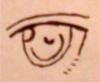
The girl's eyes. They are epicness squared. The mouth is also better. However, the nostrils on the nose are a bit off-kilter. Hm. Oh, and the hands meeting up (the farthest right finger) and the dress meeting her arm get pixel-y at points. Maybe try and smooth them out a bit if possible? Otherwise, the guy's mouth needs a bit more color and his ear could be closer--head shorter width-wise. I mean, the top of the head is round, but then you get that sort-of-flat-plane leading down to your spine.
Y'know, sometimes a family is a mutant superhuman clown with cartoony powers, a hyperactive shapeshifter created in a lab, the ghost of an artificially created being who only exists for exposition, a cat who is an eldritch god for some reason, and an emo guy who doesn't canonically exist — GengarIsBestBoy