I need to pick two out of these pictures or at least narrow the selection down for a photography exhibit that is local and should be fun to participate in. These are the ones I have narrowed them down to.
Thanks for looking at these every one, critiques would be awesome but even just mentioning the number of the one you like would be great too.
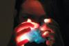
I like how the first one is kind of mysterious, but still looks real. The second one is awesome! The way the house and trees are reflective gives off a illusion-like look. I like how the third is black and white; really good image. The fourth is really cute, with good light. The foggy background in the fifth gives a really cool effect. The sixth is kind of old-timey looking; very cool. I like how the horse looks so relaxed. And the little girl is so cute!
So...I think I'd go with two and five. Hope this helped!
1st: I like this one, really cool and definitely one of my favorites. 2nd: This one's nice too, but not my favorite. 3rd: I like the black-and-white, but still not a favorite of mine because it lacks any real point of interest. 4th: Oh, sheep! This one's cool, I like it. 5th: Not so much a fan of this one. Too much empty space, and not focused enough on the subjects. 6th: This one's got a cool old-fashioned theme that's nice. 7th: I love horses, and this is such a pretty picture; all the same, not my favorite, just because horses are such common subjects. 8th: This one's really sweet, and might also be a favorite of mine.
If I were to pick favorites, I'd say...1st and 8th.
Reading is one form of escape. Running for your life is another. ~Lemony Snicket
These were so good that I had a hard time choosing but overall I liked numbers 4 and 5 (: Because when i see them they mke me feel free and happy inside xD Good work!!
My fave three - 1,5,6. Sorry I couldn't stick to two. Quick comments:
#1. Beautiful. Love the lighting and it would make a great poster/something that conveys a deep message. <3 #2. I love the mirrored symmetry, but it seems like too much for me. My eyes seem restless. #3. Would've preferred a better focus, and maybe a smaller area. #4. Love it, except I can't really see the dark one's face. #5. I love the colours and feel of this. Only thing I wish is for it to be mildly cropped. There is too much space for me at the bottom and right. #6. Love this! #7. Love this too. #8. Love the idea, angle and all that. Only problem is, there's too many stems and it tends to shift my focus away from the girl. I would have preferred if you had looked for a tiny gap to give us a little more of the girl. Or maybe blurred wither background or foreground.
Hope to've helped. ^^ Cheers, ~Lava
~ Pretending in words was too tentative, too vulnerable, too embarrassing to let anyone know. - Ian McEwan in Atonement
Wow, these are really great, the first one is pretty good, maybe just a little too dark. The second one is my absolute favorite, because it's very very interesting, and it made me stop and stare at it for a long time! The third one is fine, maybe not the clearest crisp picture though. The sheep picture was fine, but probably not the best. The next one, with the birds was my second favorite. This picture was so beautiful! The next one was okay, the man in the picture might have been a little blurry, and not the most focused. The horse was okay. Last but not least, the one with the girl in the flowers was very sweet. This is my third favorite picture. Although, I wish I could have seen the girl a little more, through the flowers.
So, I would choose the 2nd and 5th.
Don't walk in front of me: I may not follow Don't walk behind me: I may not lead Just walk beside me and hold my hand
I can do all things through Christ who strengthens me.
My goodness, these are all amazing. I don't know how you'll choose. But I'll try to help if I can!
1. I really love this one. Definitely among my favorites. The light is great and I love how you can only see the face. 2. This is so cool. It looks like a strange illusion, and the reflections are nearly perfect. My one nitpick about this would be the leaf in the bottom right corner. If you choose this I would advise removing that. 3. This one is really pretty, but it feels a little blown out. The white is a little too bright and there aren't enough details. 4. This looks quite nice, with the light sort of framing the sheep. For a sheep picture, it's really good, but there's just nothing exceptional about it. 5. Love this one. It's so simple and the colors are perfect. The reflection really makes it. I like the slight blur of the birds' wings that shows motion, yet it's perfectly focused. 6. There is some really beautiful scenery here, but it just seems a little off. It's focused on the trees in the background, and then there is this random guy in the foreground. If he was your main subject, and I'm guessing that he was, you should have focused on him. 7. This is beautiful. Also a favorite. The light is amazing and the black and white definitely makes it. Getting rid of the line on the bottom would be extra great, but I don't think it's necessary. 8. This is nice, the focus and colors are good, but I don't particularly like it. I think it might look better focused on the little girl, since she seems to be the main subject, and it's a little strange as is.
Overall, wonderful pictures. I think I'll have to go with 1 and 5 for my top choices, but 7 is a very close third. Good luck with choosing and have fun with that exhibition!
1. Lighting is awesome, and really sets a mood. I'm not sure what kind of photography exhibit you want to participate in, but in my opinion, this picture isn't one I would bring to that kind of thing. It's still beautiful.
2. I love this one as well, and the colors are just blowing me away. But again, the reflection in the water is just distracting for me, and it's keeping me from focusing on the little house.
3. I commented on this one before.
4. Love this one! It makes me think about a french saying. This one is definitely one of my favorite.
5. Another one that's pretty good.
6. I love the colors. This one is another one of my favorite.
7. Do I have to repeat you take great photos?
8. I like this one as well, but I find the red cup a little bit distracting.
Basically, I would choose #4 and 6... I think. But they are all great, so I wouldn't worry about taking something that's bad.
Keep up the good work!
-Other One
Behind every mask, lies a man that can't live in his own skin. - Woe is Me <3 Need a reviewer? I don't bite, I promise. ---> viewtopic.php?f=188&t=76466
Hiyaaaaaa Well I'm just gonna say the two which I think you should use and why (if you want a review of the others, just message me ) Right. My favourite two would have to be the horse + sheep ones. With the sheep one I think you should crop the crap at the top, 'cause it's distracting, and just keep to the aspect ratio! Maybe more contrast on the horse one... But yeah, I think they're the best. So aye. USE ;D
hey tabitha. i really liked your pics. first: cool, i love how the darkness added a touch of mystery and creativity to the pic. second: sorry, i cant view your second pic. third: maybe it's beautiful if it isn't in black and white? fourth: i love the sheep. cool. but there's something in the lighting. fifth: this is simple, cute, and beautiful. sixth: nothing much in this. it didn't interest me. seventh: beautiful. eight: definitely my favorite. i love how her dress contrasts with the green environment.
i particularly loved the first and last. keep it up.
You've got the key to my heart..but have you forgotten about a duplicate? Sorry. I've already given it to someone else.