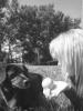
Clarissa's Sketch 3.jpg (166.65 KiB) Viewed 221 times
"She walks in Beauty, like the night,Of cloudless limes and starry skies;And all that's best of dark and bright, Meet in her aspect and her eyes:Thus mellowed to that tender light, Which Heaven to gaudy day denies." -George Gordon Lord Byron
This was good. I liked the softness to it, it gave it a kinda mellow feeling, which I think is what you were aiming for. I like the tree, though the people could use a bit of work. I'm not that much of an artist, so maybe someone else can help you better, but the people seemed a bit awkward and unnatural. Also, the moon was good, just it seemed to pop out farther than everything else because of how you shaded. Everything else seemed very 2-D, and that was a bit like "Hello! I'm the moon!" Anyway, not sure if that was any help, but good job!
1. The moon seems out of place, it's just there. It bothers me.
2. It was nice and sweet and soft and romantic.
3. The trees could use more leaves.
4. The sky could be a bit darker if possible.
5. Show us what they're looking at; it could be several things.
6. The fallen leaves should be in a pattern of some sort, perhaps a semi-circle around the couple for symbolism?
7. The canopy of the tree could use more detail.
8. Good shading!
It was a great piece of art! It looks like it was hard; sorry for critiquing roughly, but it's a good start!
Oh I like this, the couple is done really nice.
They are simple, not a lot of detail, but the way you positioned them made it romantic.
I also like the leaves that have fallen on the ground beside them, it makes the tree fit right in.
Another great thing, is the shading of the sky, it fit with the shading thought the rest of the picture, great job.
I thought the lines on the top of the hill looked like they were done a little carelessly, the one line, on the hill closest to the tree looks out of place.
The overall tone of this is really nice, and soft, which is great.
I think the moon would be even better if the night sky went up further, it would look like if fit better.
Great job, love the leaves!
Keep up the good work.
If I myself, ever made a CD, I'd put that couple on the front!
=]
- The sky is a bit too "high". If they're looking into the distance, the sky should come down a bit more. For now, it's more of a ceiling than a sky. The sky can meet or almost meet land in a drawing . I totally love how you filled in the sky, though.
- The moon is a little unround. It should be more rounded than that . I find that half moons/crescents are easier to draw.
- The leaves seem lonely! The leaves on the ground should have more surrounding detail, dear. Maybe grass?
The couple is well drawn, though! A bit of color and shading would add the perfect touch to this, dear!
Keep it up-- well done!
June
"I'd steal somebody's purse if I could google it and then download it." -- Firestarter


Gender:
Points: 890
Reviews: 7