Hey Zolen! Aley here to review.
I think your charcoal work is nice, but a bit underwhelming. I really like that you managed to get the values so dark on the one side, and that the light side really seems to help balance that out You have a good balance to the piece and the range of hues is nicely displayed. I think the problem comes with the concept of the piece. You're working with the medium well, you have a good grasp of balance, but there's nothing really going on.
To me, a piece of art needs something to focus on and a background to focus against. Right now, we have two things that are rather background oriented. You have the cliff-looking thing with the three spikes on the cliff, and the potential ferris wheel, and a white space. If you want us to focus on the pokey things, you're going to need to give us something more to work with about what they are. It's a bit too abstract to really catch and keep my attention for long.
My suggestion for how to fix it would be to give us a recognizable shape somewhere that the pointy things are pointing so that our eye travels through the piece rather than just focusing on the pointy things. We need somewhere to move or we're going to look at that, say "Oh, okay, got it," and move on. You could do this by adding other objects in the dark area, making something pop in the light area that's a recognizable shape, or just by adding more gentle squiggly lines which are darker and in some sort of pattern to lead us into the spikey thing rather than just the few at the end of it which leave us hanging near the center of the piece.
Also watch the composition. You're getting dangerously close to having something smack dab in the middle of the page which makes for a hard depth of field and tends to block a piece's motion through the entire thing and just leave people focused on the center.
This is an acrylic piece.
Spoiler






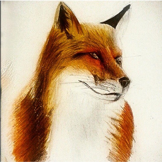 Colour pencil advice please!