dono those drawings rock, i see you have improved the old drawings and added some new ones. You are an awsome artist dude, keep it up.
Life's a B*tch, slap it upside the head.
Dargquon Ql'deleodna: (n) "Dar-qu-on Kel-del-ode-na" something i made up that sounded cool, partially based off of the Drow Drizzt Do'Urden's name style
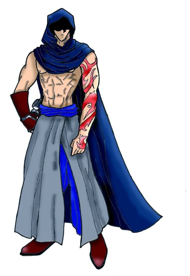
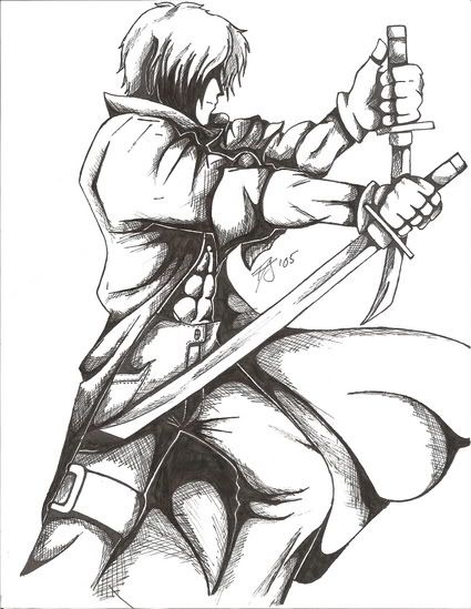
My favorite is the last one. He looks cool and colected, I like his pose, the way the cloths wrinkle... The stomach muscles look a little overdone though. Kinda gross. Sorry. I just think it would look better if he had a tunic on or something.
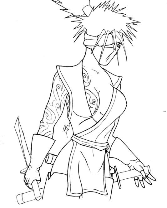
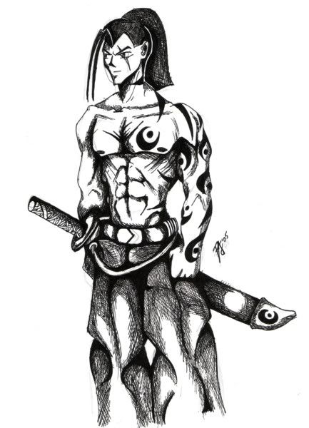
I like the anime-looking one with the funky hair. His face is beautiful, the tatoos look awesome too. *cough* Eh heh heh heh.... Umm.... Anyway.
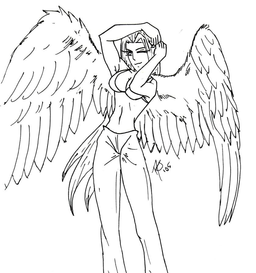
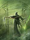
Your angel looks pretty too. Her wings, especially.
Jennafina's Love Your Body Already Dammit Campaign
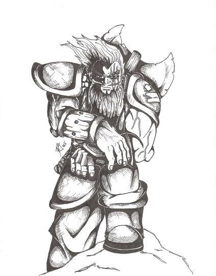
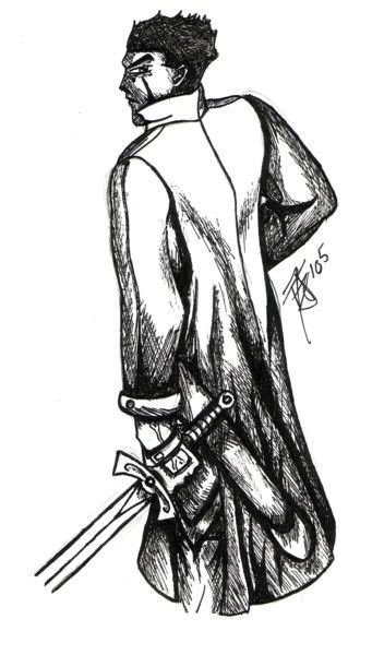
You know I love your drawings! Especially that last one and the dwarf-ish one with the ax... But you already know that, since they are worthy enought to be showcased on my wall!
this person's head gear with the sash over one eye and thingy over mouth, reminds me of one of the characters from a show called Naruto, yet his name eludes me.
Life's a B*tch, slap it upside the head.
Dargquon Ql'deleodna: (n) "Dar-qu-on Kel-del-ode-na" something i made up that sounded cool, partially based off of the Drow Drizzt Do'Urden's name style
Dargquon Ql'deleodna: (n) "Dar-qu-on Kel-del-ode-na" something i made up that sounded cool, partially based off of the Drow Drizzt Do'Urden's name style
So... for the last one, wheres your light source coming from?
The shading is nice (I like cross hatching), but the way you did it makes no sense.
It doesnt even look like it comes from 2 sides because of the way you shaded it.
The way he has his right arm locked straight out doesnt look right. It isnt too defensive and looks nowhere near offensive.
If you had drawn his arm down by his side instead of straight out it would have been nicer.
His cape flows right and his hair doesnt.
Thats it for critisism. On the last one. Because otherwise Im too lazy.
You shouldn't judge a book by it's cover, instead, you should read every single book to see what every book is about before you even come close to judging its viability.
It may not look offensive or defensive, but it looks cool .
As for the shading, I see what Sponson means, but only in a few places. For the most part, it looks just fine, with the light source coming from above. His arms could use a bit more shading on the bottom, and for his cape, it would look better if you found some reference material, because the shading doesn't really match what it should look like. The legs below the knees could probably use a wee bit more shading, too.
I just assumed that there was a gust of wind around his legs and not around his head. It happens sometimes...
Yes, sometimes a bit too often if you know what I mean.
And yes it does look cool, but to me cool with a bit of "that doesnt look right" touch.
Im going to assume that those extremely hard pecks are his armor.
You shouldn't judge a book by it's cover, instead, you should read every single book to see what every book is about before you even come close to judging its viability.
WOW! That bearded guy with the axe was awesome. You put a lot of detail into him. It must have taken a long time to do that....or did it? I don't know I'm just guessing.
Hire people to crit your work! Get paid to crit other people's work!
The YWS crit shop:forum/viewtopic.php?t=8018


Gender:
Points: 6371
Reviews: 576