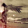
That's not bad! The legs and arms are proportioned a little awkwardly, though. Her ears are also too high, and one wing is slightly larger than the other. The hands are a bit small, but I think you did pretty well on them.
I love the necklace and the fabric of her dress. Nice work!
*anti-pop
...Bitter cold, it grows changing holds cynicism the new norm... -Libretto
Awe she's cute. It might be better if you put a bit more detail into it. Color may or may not work depending on what colors you use. And you might want to darken the wings a bit. You can draw girl!
Driver picks the music, shotgun shuts his cake hole. -Dean, Supernatural
Aww. She's pretty. You've done a good job. But her face seems a bit odd. Use a face grid to work out where to put the eyes, nose and lips so they look well basically more like a face. I'm rubbish at explaining things. Oh and use your ELBOW not your hand to draw the outline, or it gives off this too rough effect. I got practically battered for doing that by my Art teacher in like 2nd year.
Oh and with the shading I would say bring out the shadows more but make sure there is PLENTY of white. It gives a good effect.
Haha, I know what you mean. People isn't really my area. I draw landscapes and this is new. Thanks for the help. I though, personally, love the rough effect. The stupid scanner keeps on lighting up the drawing.
As your pretty, so be wise, Wolves may lurk in every guise.
Not bad. The chin needs some work as it seems a bit out of shape (doesn't have that smoothness to it). The arms also do not seem that consistent. It seems to start off slim and then it gets quite big. You need to fix that. Also, the nose doesn't have that roundness to it.
That is all.
Andy.
"To the edge of the universe and back. Endure and survive."
Wow, not bad. I will give you my critiques first and then more praise.
1. The way you have drawn her arms makes her look hunched over.
2. Her ears are a little uneven and one ankle is slightly bigger than the other.
3. The hands are a little too small
Now the praise.
1. I love the dress, the simplicity of it fits the character; a fairy.
2. The hairstyle is beautiful, I like the curls coming down the sides of her head.
3. The accent of the moon necklace is perfect. It once again fits the character; a fairy.
4. Lastly the shading in your drawing is excellent. I myself always have troubles shading. I always either want to shade too much or too little. Your picture has the right amount especially the wings. Wings are supposed to look almost transparent and through your shading that is displayed.
Overall I really like the picture. There are some small details you can improve on as mentioned above but good job. I look foward to seeing some more of your art work.
*annmarielovesbooks*
"Insanity is best served w/cheese." - Alicia Archangel


Gender:
Points: 9917
Reviews: 297