Hmmm the pictures are all very cool. But the words in some seem a bit out of place, I would suggest making them more in the corners and take out some of the unnecessary words. Otherwise *thumbs up*
These are all really good and I especially like the Alice Cullen one with the gold eye. Very bold.
I don't particularly like the one with the Krypton - the words seem out of place and a bit squashed. Perhaps try improving that one the most - the colours are a bit iffy as well.
1. It's not the best caption and it would be better if half the bowl wasn't cut off but it's pretty and colourful.
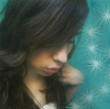
2. The trouble with this one is the colouring. The skin colour is too pale and wishy washy to really keep the viewer's attention and the eye is out of focus which only really leaves the words to look at and they're nothing fascinating.
3. This was in nice though it makes no sense if you haven't read Twilight, haha *has not read it* but I love the focus on the eye and the colour is great, especially against the black and white contrast. I'm not sure about having 'Twilight' in red, in fact I'd suggest perhaps a violet and that's not the best choice of font.
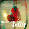
4. I don't like this one. The words are too lengthy and not witty or interesting enough and the heart in the corner verges on random, in fact, it passes random.
5. For Twilight fans, slightly amusing (I know enough to recognise the name) but for others, it's closer to 'what?!' and yes in that immature, teenage tone. The border is nice and clean though.
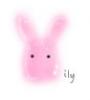
6. Love the font type and the colour but your background isn't enough of a contrast to the paw print for it to stand out.
These are cool! I like the golden-eye one. Its pretty. Did you make it yourself, or did you use an image from something else? Either way, I like it. The second one is pretty too. Cool work x
"Sometimes we see a cloud that's dragonish,
A vapour sometimes like a bear or lion,
A towered citadel, a pendant rock,
A forked mountain, or blue promontory,
With trees upon't that nod unto the world,And mock our eyes with air.."
The one about kryptonite is cute. The pencil one is amusing. The others are okay.
I can see how you incorporated the actual parts from Twilight. *thumbs up*
As for the actual graphics, wow, you must be good at Photoshop or whatever application you used. :]
I really like the Alice one--it's very bold and the eye color makes the viewer's attention come to it. I don't get the first one though, and the text seems a bit out of place. And I like the last two on your second post, especially the ring. It made me laugh. I like the pencil one. I thought that on the one with the radioactivity needed less text--i'd suggest just having the last bit in there: "Kryptonite dosen't bother me either".


Gender:
Points: 890
Reviews: 41