Wow. That's...a lot of a statue What are these for? Anything particular?
Hehe. They are all pretty good! My favorites are 1 and 4.
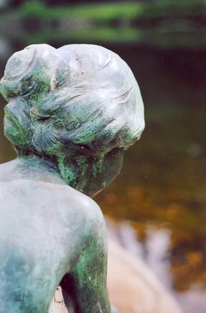
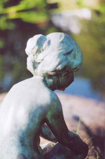
1: It's the closest close up. It's very easy to see the wear on the statue and you can't see that on any other photo as well. You may think that's a bad thing, but it shows the life of the statue and that's actually a very good thing! Only thing I disliked was the total lack of focus on the background.
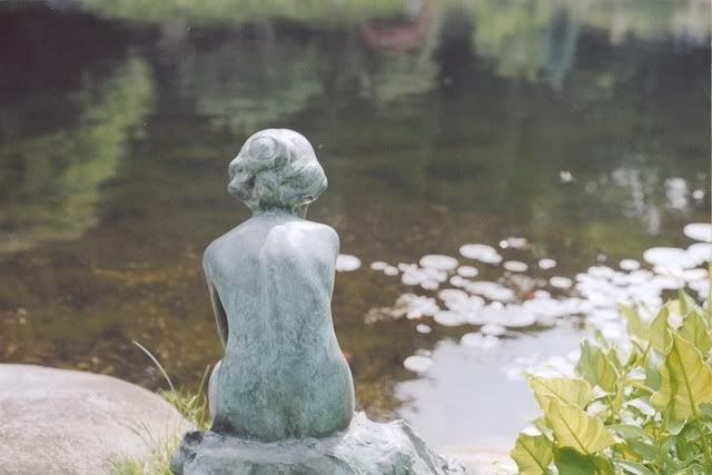
4: This one gives the affect that the statue is actually "thinking" yet shows the beautiful pond as well...and the random goldfish :]
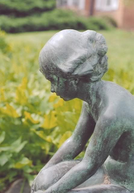
Numkbers one to four are my favourite, the others didn't really draw my interest. For number three you could crop to get rid of the building, or go back there so it just the leaves in the background.
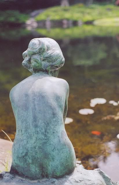
These are all really nice shots, Colly. I think the last one is my least favorite, because it looks like it should be a painting rather than a photo, but I love all the others. The angle, focus, and lighting are all great. So pretty!
Got YWS?
"Most of us have far more courage than we ever dreamed we possessed."
- Dale Carnegie
1. I love the contrast between the bronze-orange of the water and the green-blue of the statue, very nice!
2. This one feels a bit washed out to me... especially the water in the lower right corner. Can you increase the contrast?
3. Again, not enough contrast, methinks. The background is bright and the statue is bright... doesn't work that well.
4. I like this one a lot (like everyone else ) because--I'll give you three guesses--YES! The contrast! The statue is glowing-white, and the waters deep and dark. Nice.
5. The statue is too bright, and it doesn't seem in-focus. I do like the water dripping from her chin, though.
6. The statue is bright here... but so is the bush in the background. Not enough contrast for my liking.
Nice pictures, though. Especially the contrast-y ones.
First: The close up of the statue is very pretty and I like the little bit of lake or river or whatever that is you can see behind it. It makes it more beautiful, if you ask me.
Fourth: Very good shot. I like how you can see the statue's whole body and then a lot of the lake. Can you tell I'm a fan of water, yet? XD
Last: I like this side shot...especially the whole bluriness of the background. I think it makes the statue stand out a bit more. The only thing I'm not really diggin' in this picture is that random white spot. I think it's the sky...
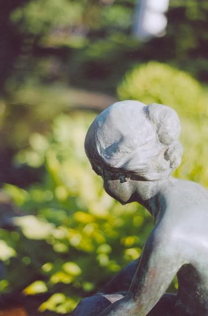
The others didn't really catch my attention...wait. The second one is pretty good, too. These are really good photographs... Yay you?
-MID
"The things that we're frightened of, or told to be frightened of, are not necessarily the things that we need to fear."
-Michael Moore
Even with a still subject you seem to be able to really bring her to life and help your audience connect with the subject you've chosen. The numerous angles that you've given her is something that someone who saw her in person would not see unless they were looking through your eyes. Good job.
Wowza. I really love #1, 2, and 5. I love how you can see the spider web on the 5th one. The first one, I love how close it is and how much wear you can see, in contrast to the background. And the second one... something about people standing next to water, even if they're statues. I just like it. xD
I have no real complaints... they're all wonderful. The ones I pointed out above were just my favourites. I really like how even though it's the same statue, each photograph takes on its own unique flair and personality. It's a wonderful touch. ^^
I enjoy your photography, Cade! =D
-Saint Razorblade
The Official YWS Pirate
"2-4-6-8! I like to delegate!" -Meshugenah "Teague: Stomping on your dreams since 1992." -Sachiko "So I'm looking at FLT and am reminded of a sandwich." -Jabber
The first picture is my favorite. I love how the statue is in focus, but the background is somewhat blurry. This seems to draw attention to the details of the "hair".
The rest are to blurry for my taste, but still better than I could ever do lol


Gender:
Points: 5890
Reviews: 758