
Can you tutor me in drawing? My school art teacher is so critical. What museum would you put this in, given the chance?

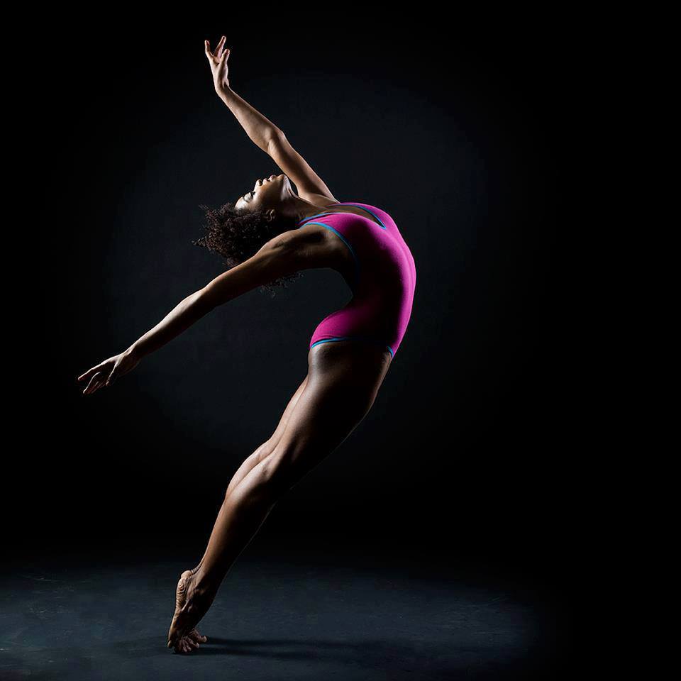
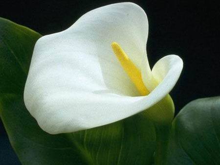
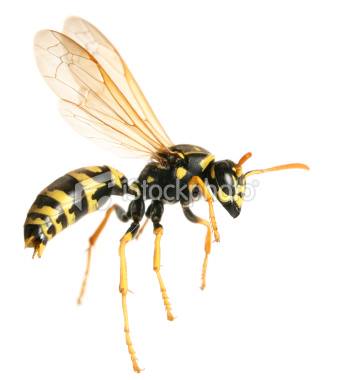
I got inspiration from various photos from Google Images (shown below) to create my vision:
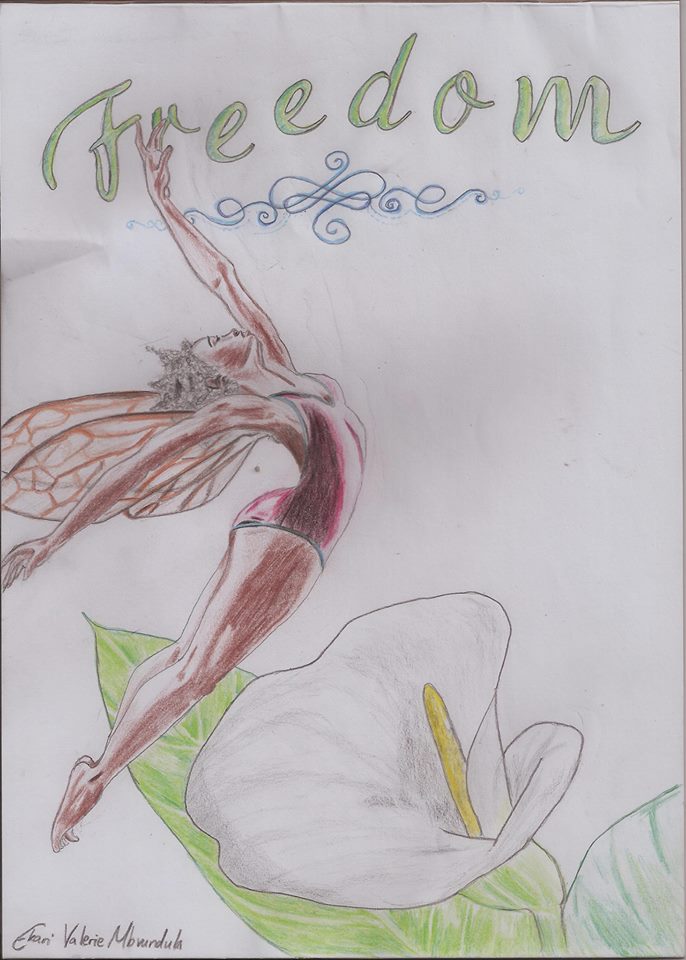
Can you tutor me in drawing? My school art teacher is so critical. What museum would you put this in, given the chance?

Wow! Beautiful drawing And great job showing The detail on the toes! I love how you combined the wasp wings with the dancer. It makes the art look so majestic and pretty with the flower. Keep up the good work! Corgisrock22
First of all, great job making all those separate items come together. The final product mirrors the concepts quite well. The arm closest to us an issue though. The muscles of the bicep and shoulder don't really come together and flow very well. It sort of makes it look like she is thin and stringy. The detail work on the face, hands, outline are phenomenal. The way the hair is lighter gives it a cool mystical feel. The flower below her could use a bit of darkening. The strong shadows on the woman and the lighter shadows on the flower contrast each other too much for my taste. I would suggest darkening the flower's existing shadowy areas to give the piece a sense of wholeness. The wings are also well done. You did a good job showing the bottom of the further wing through the other. All of this is just my personal view, so don't be influenced to change it if you think it's perfect. Overall, a splendid piece of artwork. Keep up the good work!
Hello~
Considering this is a "work" and works need reviews, I'm here to give you a friendly critique on the art.
I think you have a really good idea here using these things to put them together with the reference pieces. You've got a very good concept and I like the idea behind the execution.
I do have some critiques though. While, for the most part, your female's structure is good, the legs are good, the hands are good, the feet could use some more stress, but are pretty decent, and the incorporation of the wings into the figure is well done, you do have some problems with the form. The biggest problem is the shoulder closest to us. You've cut off too much of the muscle under the shoulder which gives it this really circular feel for her closer arm that almost makes it look like it's broken. If you look at the reference image, you can see that the muscle on the arm lines up with the muscle of her breasts differently. You've got the shoulder too high for the reference piece. The other arm looks good.
As for your feet, the biggest thing is the expression of the toes. Our dancer might be on her toes, but she is really straining them and spreading them out to keep herself balanced. That adds a very nice contrast to the plane expression of her feet and provides us with more of a three dimensional view of them. For instance, examine the pinkie toe and the big toe relationship. Looking at that is going to hopefully show you more of what I mean.
As for your heels, the heel doesn't curve out like that, but the tendon back there swoops into the heel giving a stronger connection between the ankle and the foot.
Now seeing as this is colored pencil, I'll give you a tip for erasing that you might not have heard before. You can try it out on something else since this is a good piece and you need to explore. Colored pencil lays down in the fiber catching on the paper and rubbing into it. To get it out of the paper, you have to lift up the delicate fibers and pull out the pigment that way. The best way to do this without completely ruining everything is not to erase, which can grind it in farther, but to use masking tape and gently stick it to the paper, then pull it off again. That will get a good chunk of the extra pigment off as long as you haven't completely pushed down all the fiber yet and made the paper shiny.
So that's two things: tips to erase colored pencil, tips on your structure for your dancer.
I have something else I'd like to tell you about the use of colored pencil, mostly, that you're not stretching as many boundaries as you could be. You started playing with the colors in the leafs of the Calla Lilly which is really wonderful, but you stopped just as soon as you started. What I see you doing in the Calla Lilly is layering your colored pencils. That's the technique professional artists use to get rich vibrant colors, but they go to the extreme. They don't just lay down green for green leaves, but blues, and yellows, and browns, and reds too! Look at the color as if it's not just green, but look at what color the shadows are creating, and what color the highlights are creating. I'll give you a hint: usually the shadows will be the opposite of the highlights, so if your shadows are blue because you're using warm light [indoor light] then your highlights will be more yellowy or orangey.
In this case with the Calla Lilly you're working with a white flower, which can be really tricky because you have to pick up on the subtle changes in color. Take a look by the stamen Do you see the yellow in there? I know you do because I can see just a HINT of yellow in your picture, but you held back! DX Don't hold back! Really go for it! The yellow is reflecting onto the white flower because of the yellow stamen, and making the whole area glow! There is also the light coming through the base of the flower from the green that's darkening the area.
Of course, the biggest thing I can say is that you use too much black in your colors on the flower. Honestly, you shouldn't have to have a black colored pencil aside from the darkest of darks. Believe it or not, if you gently layer colors with colored pencils, you can get any color in the spectrum just with red, yellow, and blue. It's called a primary tertiary color scheme. For example, I used it here: Touch of Art Explore with your colors and see what you can get! It'll be a lot of fun and if you apply that knowledge softly enough, you can really make your Calla Lilly pop off the page.
I suppose the last thing I have to critique is the outlines. In my book, outlines are just a 'no no' sort of thing. If you're drawing this first, or tracing the pictures, then you use a light colored pencil, or you erase your outline as you go. The reason being because naturally the world is not outlined. The sharp clean edges we see are just from changes in the lights fed to our receptors. If you've got something where you have a highlight against a white background, the best way to change that is to change the background.
As an artist, I know that the background is an important thing. It gives a sense of groundedness to a picture, and provides something interesting to capture and trail the eye through the image without losing space. It also provides shadows to bring things to life and draw out the image.
In this image, you have a lot of lights next to your white, and those areas should be a darker background. Not only will it make your colors pop but if you use contrast to your advantage, like a redder black near the green, and a bluer black near the orange, then you can pop the image without needing anything but dark.
Overall, you clearly don't have to do anything with this if you don't want to. It's completely up to you and what you choose to do, but I do hope that some of the tips I've offered will give you something to explore in new pieces.

This is beautiful, it's amazing what ones mind can do. Just viewing separate images and weaving them together was really creative of you. The color shading is amazing, I hope to see you art in the near future!
This is beautiful! I gasped when the picture formed, merging the three solitary topics perfectly together. Your image was great, for a pencil drawing, and you can be a real artist someday. The colors were great and the arms were excellently sculpted, and I think you captured every detail to catch. Keep drawing, etherealember! Keep writing, too!
-wisegirl22

That's beautiful! Your art style is excellent. The concept is interesting and not one I'm really good at. I personally suggest inking your drawings; it makes them show up better. Overall excellent.
Very beautifull! I love how you encorporated all of the images into one, you should make more!

120,187 Literary Works • 648,980 Reviews


Points: 1476
Reviews: 221
Donate