
Please review and point out any mistakes you see x)

b&w version

lineart


Cadi wrote:Hey Sheep
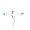
This is a really good picture, in all three versions. You've got the shading done nicely in both non-lineart ones, and the lineart itself is awesome too. The flowing hair and scarf look great, and both people are nicely in proportion.
In terms of the pose, this is a good, natural pose, but it looks a little off. I think that the way you could improve this would be to think about people as being squishier. For example, where the guy is holding the girl, she looks a bit like she's made of wood or something, and isn't squishing in at all in response to the force where his hands are. I think a small change to places where forces are being exerted on the people would be all that's needed to make this absolutely perfect.
Happy drawing!

120,141 Literary Works • 648,784 Reviews
Gender:
Points: 32546
Reviews: 739