z

Young Writers Society


I'm actually quite fond of these pics ^.^


User avatar
121 Reviews


Gender: Female
Points: 1683
Reviews: 121
Fri Dec 14, 2007 1:02 am
little.angelfire says...


This is the most recent of the two that I'm posting. I had a little trouble with the feet, but I think they didn't turn out to terribly.

Image

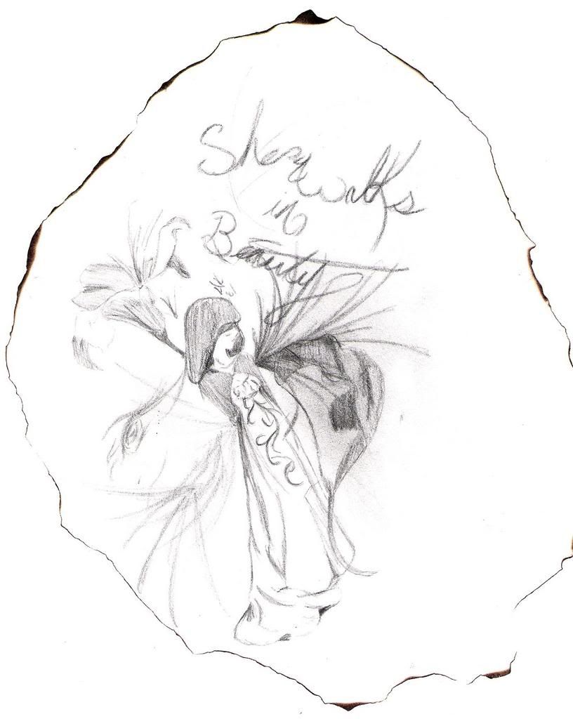
This one I did for a British Literature presentation that I did a couple days ago. I read the poem, "She Walks in Beauty" by Lord Byron, and this is the pic I came up with for it. (I burned the edges of the paper to give it a neat kind of border look)

Image

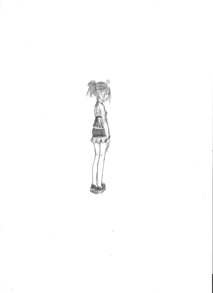
yep, I like these ^.^

--meow
Climb inside my belly button beanbag plastic world!


User avatar
411 Reviews


Gender: Female
Points: 1040
Reviews: 411
Fri Dec 14, 2007 6:57 am
Sohini says...


The fitsr pic is really neat and kind of mysterious. I like the girl's posture.

The second one, well, I can't say much bout it other than the burnt edges is a cool way to border things!

I think it would be better if you had cropped the sides of the 1st pic to get more attention to the figure and less to the white background, it looks rather empty.
Calvin : You can't just turn on creativity like a faucet. You have to be in the right mood.
Hobbes : What mood is that?
Calvin : Last-minute panic.


User avatar
896 Reviews

Supporter


Gender: Female
Points: 240
Reviews: 896
Fri Dec 14, 2007 7:53 am
PenguinAttack says...


In contridiction... I *Love* how empty the first one is. She looks so lonely, it's awesome.

I also like the second, not just for the burnt edges, (they're awesome lol) but it's a little whimscal and I like it.

I love your drawings. ^^

*HeartS* Le Penguin.
I like you as an enemy, but I love you as a friend.


User avatar
35 Reviews


Gender: Female
Points: 439
Reviews: 35
Fri Dec 14, 2007 1:50 pm
HybridHead says...


The first one: I LOVE IT!!!!!!!!!!!! IT'S AWESOME!!!!!!!!!!!! I am so not bothered about the excessive white space of its background because that makes this so contemporary and yes, LONELY. :D

The second one: I like the flowers and I love her dress. However, her cape and face could be touched up a little, making them more realistic. And maybe, the cursive handwriting of "She Walks In Beauty" can be improved.
I love Jesus.


User avatar
2631 Reviews

Supporter


Gender: Female
Points: 6235
Reviews: 2631
Fri Dec 14, 2007 3:33 pm
Rydia says...


The first one is very beautiful and I think the feet are fine but there's something not quite right with her hand and wrist. I think the bracelet draws attention to it as well. Also, the dip in the left leg is a bit strange but I love how you've done her hair and face.

The second is a little hard to see. The dress and flowers are gorgeous and you've got some wonderful detail there but I'm not fond of her head. And I agree that the writing could be a little better. I think you need more space between she and walks.
Writing Gooder

~Previously KittyKatSparklesExplosion15~

The light shines brightest in the darkest places.


User avatar
1176 Reviews

Supporter


Gender: Female
Points: 1979
Reviews: 1176
Fri Dec 14, 2007 5:32 pm
Twit says...


The first one is really nice, and like Pingu said, she looks real small and lonely. The second one I can't make head or tail of. :?
"TV makes sense. It has logic, structure, rules, and likeable leading men. In life, we have this."


#TNT


User avatar
694 Reviews


Gender: Female
Points: 3654
Reviews: 694
Fri Dec 14, 2007 11:09 pm
Via says...


The first is best, I think. Though her arm is much too long...and a little too straight? I'm not really sure how she is supposed to be standing though, because her torso is facing right but her legs/butt are facing the back...? A little too turned, I think.

The second one I can't really say much on because the lines aren't clear enough to see anything.

They are good starter pieces, but could use a little work too.

May want to consider cropping, though...a lot of white!
My Literary and Arts Blog

"I think I'd miss you even if we'd never met." -The Wedding Date


User avatar
99 Reviews


Gender: Female
Points: 1210
Reviews: 99
Sun Dec 16, 2007 5:15 am
Monki says...


Okay, I liked both of these also. What are you not good at?! Okay, for #1 I have no issues at all. It looks completely realistic. Except I would love to see if it looks better colored or just how it is. :) For #2, everything's good. Presonally, I like the handwriting how it is. My only issue is that the picture isn't very clear, but I suppose it could just be from the scanner. Good job!

~Monki
Tom Riddle: "You read my diary?"
Harry Potter: "At first, I did not know it was your diary. I thought it was a very sad, handwritten book."


User avatar
121 Reviews


Gender: Female
Points: 1683
Reviews: 121
Sun Dec 16, 2007 7:14 am
little.angelfire says...


thanks for the comments ^.^

note: You'll probly never see my work completely colored. I might add a dash somewhere, but just for affect, and that's it. I'm more partial to shading for some reason. Perhaps because I'm very bad with coloring and choosing colors? XD

But yeah, I really like these pics ^.^

The first pic you'll see again when I'm finished with it again *is adding a background to it*...I just have to come up with a background for it...might be a while...

--meow
Climb inside my belly button beanbag plastic world!


User avatar
8 Reviews


Gender: Female
Points: 890
Reviews: 8
Sun Dec 16, 2007 8:28 pm
Faerlan says...


I love the flowers in the second one, they really capture how paper-like they are. The 'in' also has really nice lettering, but that doesn't show up on the other words. I love the first picture, the person seams really 'real' and not out of proportion or anything. There's a portrait one of my art teachers told my class about, where the subject was made to sit cross legged on a chair in the bottom of the portrait, so she seamed really small. The picture reminded me of that, but I think there was a little too much white space around the edge. Well done!


Alexa, are there European frat boys
— Carina