

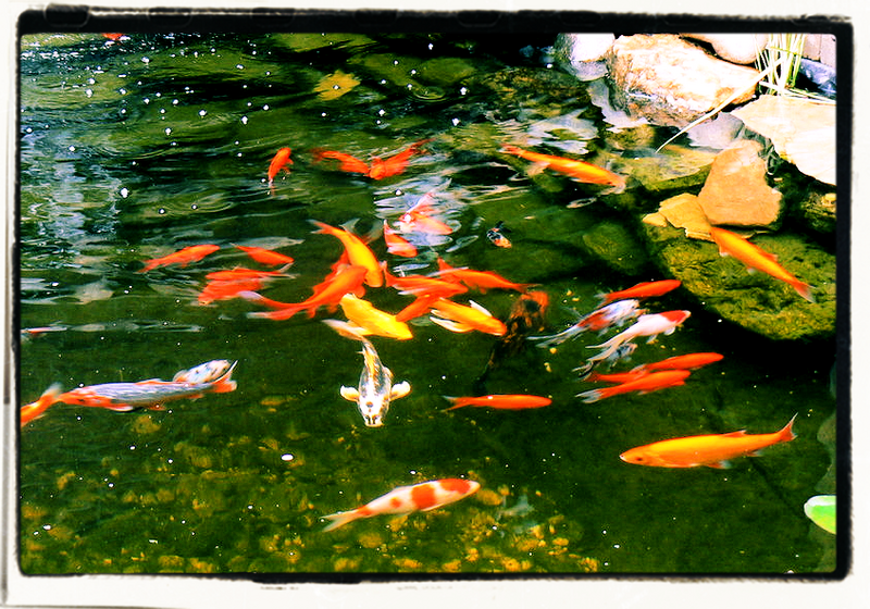
Old Time Fishes
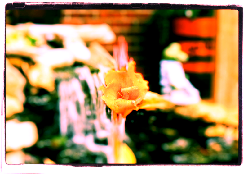
Fleur
I like the one with the fish more. My titles aren't very good, though.
Click on the image to see them larger. [and better]
Step Up
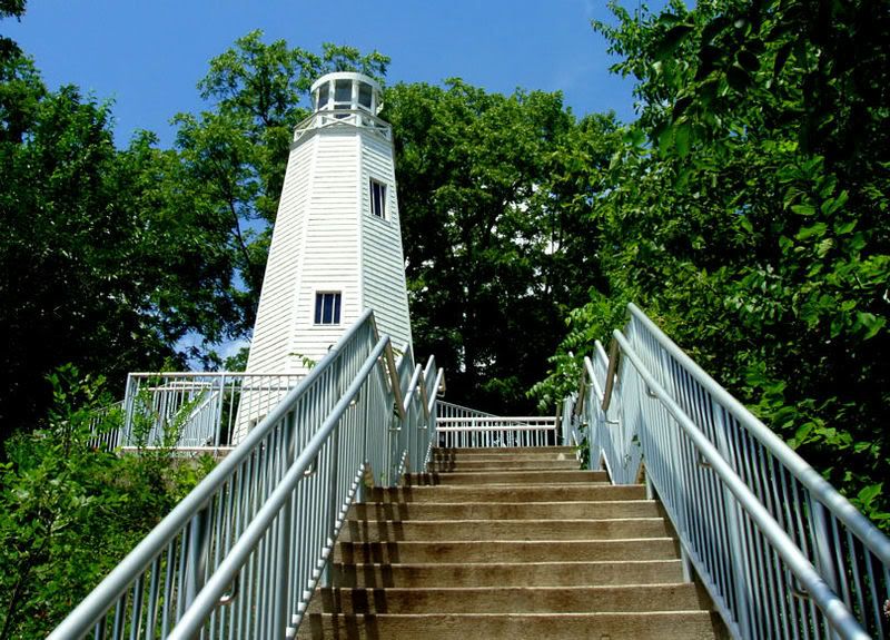
Not as edited as the other two, I just ran a filter over it to bring out the greens. I liked it as is.
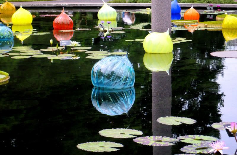
In memoriam

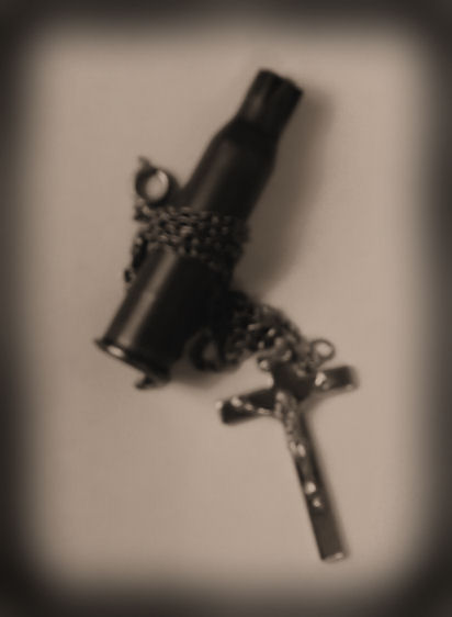
Carry My Pain I
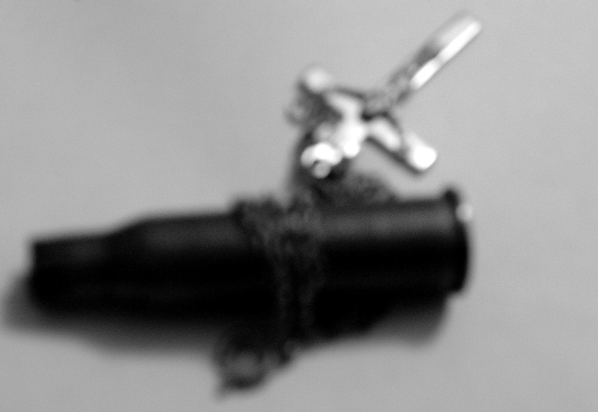
Carry My Pain II


Gender:
Points: 32885
Reviews: 2058