z

Young Writers Society


My Photography.


User avatar
19 Reviews


Gender: Female
Points: 890
Reviews: 19
Fri Jun 08, 2007 9:48 pm
triggerfingerxx says...


I'll add stuff as I go on, because my deviantart is kind of messed up right now and I only have two pictures up, due to the fact that I deleted everything before.

Anyway...Here's two of my pictures.

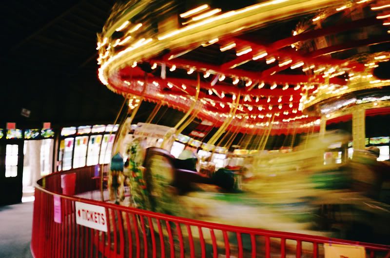
The first one's called "Trying to Escape" because the horses look like theyre trying to escape, it sort reflects what I was feeling at the time.
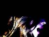
The second one is called "Never wanna let you go".

Image

^this one, a guy almost bought at the wadworth exhibit that me and my friends made.
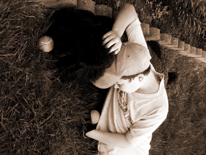
Image

^models:
-My dog
-My cousin
Whaa???


User avatar
694 Reviews


Gender: Female
Points: 3654
Reviews: 694
Fri Jun 08, 2007 10:04 pm
Via says...


I definitely like the first one the best, but it reminds me of a final fantasy sort of thing. It's pretty sweet.

The second one is okay. I'm not sure that the coloring on the boy was particularly great, i.e. the hat is very close to the color of his skin. And the dog is a little hard to see...as in I can't find his face. It's cute, but the tone is a little off. Still good though!
My Literary and Arts Blog

"I think I'd miss you even if we'd never met." -The Wedding Date


User avatar
2058 Reviews


Gender: Male
Points: 32885
Reviews: 2058
Fri Jun 08, 2007 10:12 pm
Emerson says...


The first one is so cool... The merry go round is...bending. It looks like its running through time (<- that makes no sense) and makes me think of Something Wicked This way Comes even if I did hate that book. I love the picture.
“It's necessary to have wished for death in order to know how good it is to live.”
― Alexandre Dumas, The Count of Monte Cristo


User avatar
117 Reviews


Gender: Female
Points: 890
Reviews: 117
Fri Jun 08, 2007 10:28 pm
oregongirl says...


I loved these photographs! :D Great Job! I especially like the second one. I don't know why but I liked it!

Good job!

Demi/OG/oregon
OREGONGIRL


User avatar
316 Reviews


Gender: Male
Points: 890
Reviews: 316
Sat Jun 09, 2007 12:39 am
whence says...


Dude...that first one is freaking awesome.

Very good.
The good parts of a book may be only something a writer is lucky enough to overhear or it may be the wreck of his whole damn life — and one is as good as the other.
Ernest Hemingway


Random avatar


Gender: Female
Points: 890
Reviews: 125
Sat Jun 09, 2007 3:51 am
SASSYLADY333 says...


I really liked the first one! Good job, second one needs some orginality, some how it feels like I've seen it before. [ sappy comercials]. I think if you changed the coloring a bit, it would be fanastic. First is very :P engaging.


User avatar
798 Reviews


Gender: Female
Points: 17580
Reviews: 798
Sat Jun 09, 2007 4:22 am
Areida says...


The seocond one is neat for the different emotions or stories you could find within it, but the first one is even cooler, just because I'm amazed at how well you captured that image. Did you do anything to it or did it just turn out like that?
Got YWS?

"Most of us have far more courage than we ever dreamed we possessed."
- Dale Carnegie


User avatar
820 Reviews


Gender: Female
Points: 890
Reviews: 820
Sat Jun 09, 2007 11:26 am
Myth says...


First photo is brilliant, brings the excitement of the fair alive. The colours blending as it goes faster is super!
.: ₪ :.

'...'


User avatar
2631 Reviews

Supporter


Gender: Female
Points: 6235
Reviews: 2631
Sat Jun 09, 2007 12:04 pm
Rydia says...


The first one really does look like that Horse is running away and the second is nice but not as good.
Writing Gooder

~Previously KittyKatSparklesExplosion15~

The light shines brightest in the darkest places.


User avatar
160 Reviews


Gender: None specified
Points: 1840
Reviews: 160
Sat Jun 09, 2007 12:18 pm
Loose says...


I like them, theyre very good. The sort of stuff I saw at the year 12 art show I went to with my art class. :D


User avatar
381 Reviews


Gender: Female
Points: 1144
Reviews: 381
Sat Jun 09, 2007 5:02 pm
Fand says...


I think the first one would be better if any part of it was in focus. I know the carousel isn't supposed to be, and that works beautifully--but the background's all blurry and out of focus. That really doesn't work quite so well.
Bitter Charlie :: Shady Grove, CA :: FreeRice (162,000/1,000,000)


User avatar
130 Reviews


Gender: Male
Points: 2399
Reviews: 130
Mon Jan 14, 2008 12:52 am
scotty.knows says...


I like the first one. The distortion is fascinatingly mesmerizing... was it an accident of the camera or did you photoshop it?

The second one was good too, though. I like the moody introspectiveness it portrays. Very dramatic/cover of an emo CD. I wasn't quite certain what he was holding on to, at first, I just thought it was a dark spot, but once I squinted, it looks more like a giant ball of lint.

I still liked it.

Don't take that the wrong way... I liked it. :)
'Merikuh!


User avatar
42 Reviews


Gender: Female
Points: 890
Reviews: 42
Mon Jan 14, 2008 1:44 am
jessiieeboo says...


I love the first one.
The colors capture my eye.
Very nice.
Keep up the great work.
peace love +& respect,
jess♥


Random avatar


Gender: Male
Points: 890
Reviews: 3
Mon Jan 14, 2008 2:34 am
thinkarete says...


the first piece was very creative, i immediately thought of a short narrative that could perfectly accompany it.
the second piece to me was nostalgic in a sense, reminiscent of small town 1950 America.


User avatar
441 Reviews


Gender: Female
Points: 890
Reviews: 441
Mon Jan 14, 2008 5:13 am
Gwenevire says...


I love them.
The mary go round is so cool looking. It looks like its about to spin right off of its hinges. I can't really see the horses. I like how you say they look like they are going to escape. Its cool.
The second one is nice. But I can't really see the dog. Its so true dogs are the best.
Nice work!
Genevieve


"I'd be a quote vigilante. A literary Batman. Someone had better be quoting me now!"
— Feltrix